Truth in advertising disclaimer: Roberta wrote the catalog essay for this show. While I try to report things as I see them, I felt you ought to know that fact. –l.r.
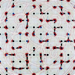
Low Buried Wild, by W.C. Richardson, oil, acrylic and alkyd resin on canvas, 77 x 77 inches
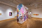
A lot of friends, people of all different tastes and interests, who stopped by ORDER(ed) at Gallery Siano, told me what a great show it was. It’s a group show of abstract art made with a system, no two systems alike. Although all of the artists are cranked by their systematic approach to art making, most of them also have broader subjects in mind.
The artists were all brought together by Ann Arbor artist and curator Julie Karabenick, who has long had an interest in geometric abstractions (she herself paints them and is in the exhibit). A psychologist by training, Karabenick is intrigued by the long history of abstract pattern in art making and its continuing hold on the human mind, perhaps reflecting something basic to our mental make-up. The show in Philadelphia is her second exhibit of this sort of work; the first was in New York. Karabenick is also one of the founding editors of an on-line site, Geoform, that features artists who make this kind of art.
ORDER(ed) is a smart mix of local and non-local artists, three of whom have shows up in Philadelphia galleries right now–Cheryl Goldsleger at Gallery Joe (see post) and local artists Tremain Smith (at Rosenfeld), and Steven Baris at Pentimenti (see post).
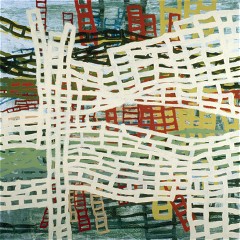
Folding in on History, by Tim McFarlane, acrylic on canvas, 36 x 36 inches
But smartest of all is the content–abstract but ordered and organized, the marks restrained and inspired by some self-imposed logic that, at its best, becomes allusive as well as great to look at.
Some of the pieces I liked for their allusive qualities–I’m thinking here of Philadelphia artist Tim McFarlane’s wobbly layers of grids that look like netty rope ladders for climbing up to a ship deck, and W.C. Richardson’s swooping paths and junctions, looking like a cross between a subway map and a plan for park paths (image at top of post). Both of these artists play tricks of their own sort with color. Richardson’s blue/green glow from under a white scrim of paint suggests the instability of air to me. But the red-and-black junctions and the smooth path outlines hold the instability in control. And McFarlane’s ladders move back and forth with color and placement, suggesting compression, companionship and space in one fell swoop.
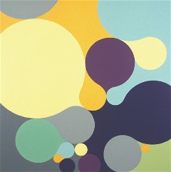
Mercuree, by Julie Gross, oil on linen, 32 x 32 inches
Humor is another thing that attracts me in some of the work in this show, as in Julie Gross’ inflated balloons, squeezing the air out of one another as they spread into the empty spaces. The stylish ’50s decoration colors give the work another layer of humor. Steven Baris is another artist who captures some humor in his floating blocks of color, some floating close, some far, some confounding normal judgment of what’s near and far, but always looking a little floaty and disembodied. And Laurie Fendrich uses geometric shapes in intense colors to create anthropomorphic critter forms that disintegrate into pixillation (image below). With dry-brushed edges in other tones, she buffers the interfaces between the eye-popping colors and controlled edges. The other artist who seems in touch with humor is Burton Kramer. More on him lower down.
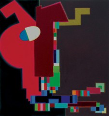
His Usual Philosophic Composure, by Laurie Fendrich, oil on canvas, 36 x 34 inches
Most of the other work in ORDER(ed) has spatial, spiritual and/or musical references. Local artists Alex Queral and Tremain Smith stick to a system to break through to the other side. Queral’s painting breaks through to an intense white light at the end of a grisaille, wild cubist tunnel. Smith’s glow emerges through layers of encaustic restricted by a grid that suggests doorways, walls and floor plans.
Joanne Mattera’s encaustic doorways and local guy Vincent Romaniello’s grisaille, painty windows surrounded by black also suggest something luminous in the great beyond. Both artists pit the irregular passages of paint against the expectation of organization and regularity. Romaniello’s luminous portals are grittier and suggest dirt and rain and television static. Mattera’s rich colors and marks are closer to ecstatic.
Cheryl Goldsleger’s geometric labyrinths remind me of parterre gardening, Gail Gregg’s stripes look like furrows and paths, and Grace DeGennaro’s layered, radiating circles are perpetual eye-teasers, challenging the geometry of the circles with the geometry of their points of intersection.
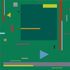
Bouree 2D, by Burton Kramer, acrylic on canvas
Kramer’s light-hearted, dance-like garden (Versailles meets the Legend of Zelda) moves to a jazzy rhythm, and its title, Bouree 2D, is a clear dance and music reference. The objects in this garden are unabashedly flat, the dashes of color looking like bits of cut paper to be moved around. The balance and interaction of the objects makes me think of Mondrian. Howard R. Barnhart paints shaped and layered panels with colors and forms that suggest musical chords and music notation. Mark Brown’s austere, grisaille vertical stripes are inspired by music and a wintery landscape; Karebenick’s own rectilinear paintings suggest a musically organized modernist cityscape; and Marjorie Mikasen’s geometric forms made me think of slants of light falling on a church congregation.
At a moment in art making when recognizable subject matter, realism and narrative are king, this show is a fine reminder that abstraction is not necessarily difficult or only for a few art intellectuals versed in the history of Modernism. The paintings illuminate one another, and even the most austere work gets a boost from its neighbors.
On Romaniello’s Romanblog, you can find some nice installation shots of the exhibit and as well as listen to Roberta’s introductory remarks at a panel discussion at Siano last weekend.


