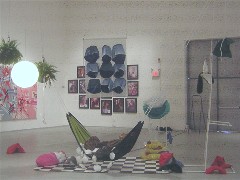
Space for Living installation by Emmy Hoy
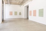
The Penn MFA show, curated this year by ICA Senior Curator Ingrid Schaffner, fills the huge Icebox Project Space this year. The students knew from the git-go that this was where they would show, and wooo, the museum-sized/New York gallery-sized work holds the space.
Enjoy much of it though I did, some of the intimate work in the side gallery–dubbed the Drawing Center–thrilled me the most.
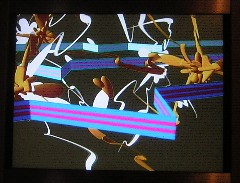
A video from Nathan Wasserbauer
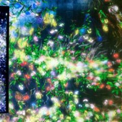
In the Drawing Center, three short-short videos practically stole the show. Nathan Wasserbauer’s animation of the same sorts of lines and shapes in his paintings take on speed, drama and intensity when he puts them in motion in Pow-Splat technicolor.
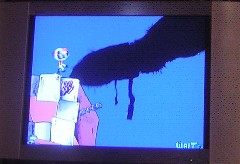
Still from Ian Eckert video
Ian Eckert’s takes his painting imagery of a sad sack trying to hold on to unstable precipice, adds a beast and comes out with everyman in an unsafe world.
And Phillip Adams poses a banjo player on a white square mat, puts a box over his head and has him perform. Adams’ charcoal portrait, Brother, Can You Spare a Dime, of a banjo-playing Allen Greenspan was also at Arcadia’s Works on Paper exhibit this year; he now has a video playing in the ICA open video call series).
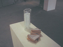
This glass of milk and sandwich, stitched together by Emmy Hoy, is one of the pieces in the Drawing Center show
There were lots of drawings, too, many of them preparatory work for the large canvases in the Icebox Project Space. It was interesting to see the evidence of the process as well as related smaller work.
In the not-a-drawing category, Emmy Hoy’s sewn sandwich and glass of milk (a hand-made plastic tube filled with some white stuff–fabric?)tickled me.

Space for Living installation by Emmy Hoy
Her large installation served as an anchor for the BIG ART show in the big space, due to its wit and its central placement. Called Space for Living, it’s a bunch of utterly useless, stylish home decor items (except, maybe for the drooping hammock, which is so stuffed with pillows there’s no space left for the human). They are arranged in a way that suggests the photos of living arrangements in ridiculously small spaces in catalogs. The installation out-Ikeas Ikea, with its unstable shelves and “space-saving” pulleys. The piece de resistance for me was the three-D, hand-sewn wall hanging, with a grid of space-wasting protrusions, but the decorative bottles filled with what looked like bright white fetuses in formaldehyde came in a close second.
Part of why I liked this piece, besides its exuberance, was its take on space, commerce and culture. I don’t know if its humor is for the ages, but at this moment, it is right on target. I also welcomed the humor in a show that was filled with serious work, funereal takes on a world and a human race in danger.
The exhibit had a lot of work I could talk about:
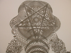
detail of Hunter Stabler’s Sonic Pretzel Mastadon, hand cut paper, 3 x 4 feet
—Hunter Stabler, who had a terrific show at Pageant (see posts here and here), offers another chance to see some of the same body of work if you missed it.
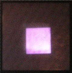
The Eye, by Jonathon Cancro, video projection on plexi, 4 x 4 foot, 8-minute loop
—Jonathon Cancro’s luminous projections–of a bowl of light and of a square that began as a parallelogram–lent some spiritual buzz–we watched him rehanging his plexi screen, and asked if he was going to the James Turrell lecture next week.
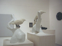
Ophyrsia superciliosa and Psephotus polcherrimus by Pernot Hudson, hydrocal, sugar enamel and wax, each a little over two feet high, with two of Hudson’s paintings, oil on board, in the background in the back, one of them titled the Boehm Bird.
–and Pernot Hudson’s installation of his takes on family kitsch strike a nice balance between disgust and embrace. Hudson was gallery sitting while we were there and he filled us in a little (it never hurts).
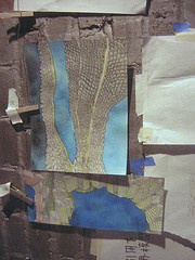
Some drawings in an installation by Tadashi Moriyama
Besides showing a wonderful large painting, Tadashi Moriyama filled a small room with small drawings, each one a gem that tries to come to grips with a world he can’t quite put his arms around. The picture postcard sizes felt right in keeping with a young man on an odyssey. The whole space, with its river of time and space flowing on the wall and floor and its sense of impending chaos, touched me deeply.
A bunch of the students were doing work that screamed their sources–Alex Katz and Elizabeth Peyton, Patty Chang, maybe Brian Alfred–but in thinking over the work, they all brought something new to the table. For example Sinae Lee’s Japanese mail-order bride obsession, expressed in a couple of videos, is on the verge of breaking out of its box and exploring larger themes. (Lee, by the way, has a swell video up in Voxumenta, this month).
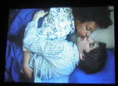
A still from However Circling, video by Zachary Yorke
Of the other videos in the main space, the brief drama of Zachary Yorke’s tender, off-balance story of a girl and a blind portrait artist held my interest and my eye with its color-and-composition savvy cinematography. I found it a relief, in a world of go-nowhere art videos, to see something with a narrative. Thomas Isaac also turned in something with a narrative base. Sure enough, Nadia Hironaka is on the faculty.
Faculty member Terry Adkins taught a class on sound that clearly influenced a number of videos–such as the terrific drums in Brent Wahl’s The Phantom Limb–check out the swell viewing box for this, as well as some terrific images, which I couldn’t quite make hang together.
And faculty member Josh Mosley also had his influence on the impressive animation work.
The glory of this show was the range of work–no longer does Penn graduate a class full of junior Neil Wellivers. Each student produced idiosyncratic work that seemed to be not too far from where the art world is right now. The exhibit held my interest for a couple of hours! And while I don’t think everything is fully cooked, I think it’s mostly cooking.
But on the down side, this is one of those shows that makes me question whether bigger is better. The largest pieces in the show were not necessarily the students’ strongest work. I understand the desire to have them challenged however to meet the exigencies of large spaces and art-world realities. But personally, I think bigger is best reserved for really big ideas that can’t be expressed any other way. It’s important for young artists to establish a track record of selling–selling smaller works at reasonable prices to normal people who have small walls to fill.
For more pictures and comments, check out both my Flickr site and Roberta’s. You can also see more at the Penn MFA website.


