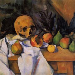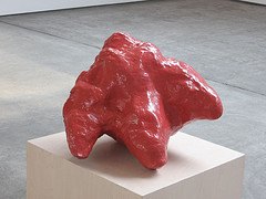
Natural Copies from the Coal Mines of Central Utah, by Allan McCollum
The hottest show we saw in Chelsea yesterday was the hottest in more ways than one–quality and temperature. We nearly died of the heat, and stayed in there as long as we could bear it.
“An Ongoing Low-Grade Mystery” was in Paula Cooper Gallery’s upstairs space on 21st, Street, across from the first-floor gallery. It was closed except by request. So we requested. Ooops. No air-conditioning.
Everything in the show, which was organized by Bob Nickas and is the third in a series of red shows by him, was, red–and worth a look.
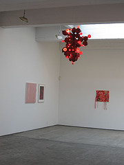
The “Coconut Chandelier” by collaborating team of Guyton/Walker was outstanding. In the right rear is “Anger, Anger” by Koether, from the ongoing series, The Necessity of Inconsistent Multi Fantasies, and at the far left rear, John M. Armleder’s Zack Wild III
I was crazy about the Coconut Chandelier, by Guyton/Walker (that’s two people–thumbs up for collaborators). It was beautiful, and my one shot of it failed to capture it adequately.
As a die-hard Allan McCollum fan, I admired his dinosaur foot-print fossil cast in lurid, plasticy red–the perfect anti-fossil.
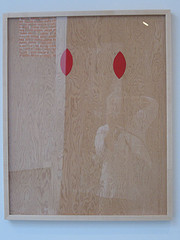
Red Knot Prototype by Sherry Levine, cassein on plywood (sorry about all the reflection)
And Sherrie Levine’s Red Knot Prototype made me laugh–always a plus in my book–for its conversation about materials and the overlooked, always a plus in my book.
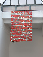
So did Jim Drain’s hanging fabric of bricks with heart shapes cut out, “Resistance Flag.” I started thinking about the Urs Fischer walls blown out at the Whitney Biennial, and how different that was from a brick wall gently sliced by heart shapes.
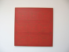
Dan Walsh had a beautiful painting of a grid of nested red squares outlined in green. The result was a first cousin to the Australian aboriginal paintings a block away at Robert Steele Gallery.
There was lots more to like. Jutta Koether’s “Anger, Anger,” an intense paint scribble with resin poured on top, other stuff embedded, reminded me of Isa Genzken. Also, William Eggleston’s red photo of a naked guy reminded me of Zoe Strauss–or maybe it’s vice versa since Eggleston came first.
And speaking of naked, we consulted The New Yorker listings, which used the word porn in describing two art shows. So we thought we’d see what we thought, since we tend to think harder when art makes us angry. Well, one show, photographs by Jeff Burton at Casey Kaplan, was so slight it didn’t even raise our temperature.
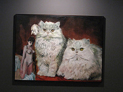
The other porno listing, paintings by Martin Eder at Marianne Boesky Gallery was pure kitsch. Girls and Miss Kitty-Kats. Lots of pink and fur. Girls and beaked birds. Bird with big breasts and a Walt Kelly clown. This work didn’t require much talking. We dismissed it and moved on.
What did get us talking and thinking was Loretta Lux at Yossi Milo Gallery (the exhibit just ended). Lux’s Photoshopping is not so subtle that you quite believe it, but it’s subtle enough to disturb. In a way the vibe in the work reminds me of Sally Mann’s portraits of her children, because in both cases, it’s the photographer, not the children, who have control over how the children are portrayed (in contrast to Sharon Lockhart‘s portraits of children, at Gladstone Gallery, in which the children project the self the want the world to see).
This control factor means that these photos, even though sex is not under discussion, come closer to pornography than Eder–who tries very hard–or Burton, who doesn’t try hard enough.
And it’s this control factor that makes the Julian Levy photographs of Frida Kahlo not pornography. Kahlo is definitely an in-charge-of-herself subject (see post here).
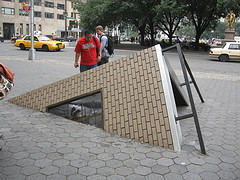
We also stopped at “Corner Plot,” Sarah Sze’s outdoor installation in Central Park (at Doris C. Freedman Plaza, 60th & Fifth Ave.). I liked watching pedestrians look askance at the work and try to decide whether or not to approach it.
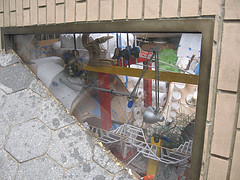
detail; the tilt of my camera reflects what you have to do with your head to get beyond the glass into the space with the installation inside
It’s sort of a Sarah Sze-in-a-box, a toppled-building time capsule filled with her usual array of disposables–styrofoam cups, cotton pads, matches, levels, clamps, pencils, etc. The toppled building, although matching Sze’s spinning-out-of-control infrastructure, was so clunky in shape that I had trouble getting past it to the juicy details of the interior–in spite of which I still enjoyed it. The piece is sponsored by the Public Art Fund, and I thought it worked well as a public sculpture–poking at the consciousness of passers-by.
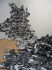
detail of Astrid Bowlby’s installation at BravinLee projects, which just opened Thursday
We went to admire Astrid Bowlby’s marvellous work up at BravinLee programs, part of an interesting drawing show.
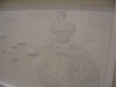
While we were there, we saw a number of other interesting works, including excellent pin-prick art by Amparo Sard. Check out my Flickr site for other pieces in this show as well as photos from the whole day, including some Richard Serra pieces with comments.
Look for Roberta’s post, coming soon. We really saw a lot of stuff, even though the heat dispirited us enough to feel like it was a wasted day.


