Kate Stewart
The unreal world of video fantasies and the real world of disasters–ecological, natural, and personal–hang side by side in Gouaches, a show of gouache paintings at the 40th Street AIR SPACE. The disaster work is by Kate Stewart; the video world is by Alex Paik. The paintings are outcomes from the artists’ participation in this round of the 40th Street Artists in Residence Program.
Stewart had a Fleisher Challenge in April 2005 (see post) and was in INHABIT, the apartment show of work by hot young artists, curated by Sean Stoops (see post).
Unlike so many of her paintings in the Challenge exhibit and unlike the installation in INHABIT, Stewart is working small here, with many of the paintings in the 10 or 12 inches range. I liked the way they packed in instability of space, indoors, outdoors, windows and the concept of paintings as windows onto not a lot of paper. I also thought these paintings were more varied than the ones Stewart showed at her Challenge exhibit.
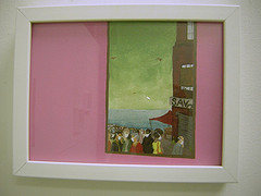
My favorite was Saved (at top), a view through a window showing people in protective face masks, birds wheeling in the green sky, while a boarded-up building has a hand-made sign, “Savd.” I loved the flat (any suggestion of ceilings and corners is actually a reflection) horrible but almost cheerful pink paint on the interior.
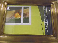
Catastrophic Insurance, by Kate Stewart
Some of the paintings included windows looking in, suggesting not just a reflection of natural disasters but also a vision into the truth of households–not so safe. The sunlit suburban aluminum siding with sharp, dark shadows in Catastrophic Insurance questions the safety of the suburban dream. The image is destabilized not just by the explosive window scene, but by the angle and the composition, the bulk of the painting surprisingly focusing on the siding.
Stewart also gets that destabilization across in the paintings looking out. The four square wall construction of the house is disrupted by spatial surprises–corners missing, and a sense of flatness. The spatial barrier between interior and exterior is also disrupted.
I thought these were terrific paintings, and their intimacy made them all the more successful.
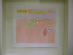
TKO (Mike Tyson’s Punch Out!, by Alex Paik)
Alex Paik’s abstractions of video game scenes are even smaller than Stewart’s. The pastel watery-ness of the medium has a sketchy quality. Without the zing of Paik’s acrylic, unnatural color choices, this series seems to be part of a thought process rather than a final product. However, I did think there was something pretty amusing about TKO, with the referee and fighters looking like shrubs in the abstracted ring.


