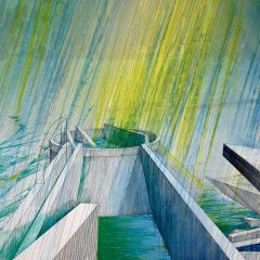
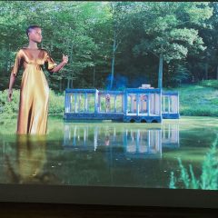
While their aesthetics differ wildly, Kate Stewart and Jessica Doyle, both formidable young painters and Penn grads, pair well together at Pageant. This in fact is another one of Pageant Director Daniel Dalseth‘s surprising pairings of apples and oranges that I’ve enjoyed this year.
I’m going to run just a few photos, and, because I’m crunching a deadline for a magazine piece, will add not a lot of commentary, except to say that that the show is pertinent especially in light of the other indoor mural show at the Philadelphia Art Alliance, Outside In. Walls and walls of color, shape, line and subject come together at Pageant and at the PAA for some nice indoor strolling.
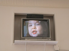
Jessica Doyle video at Pageant.
This video of Doyle’s daughter was tucked in a niche high above the gallery’s door and caught my peripheral vision before it registered. It’s kind of like a sweet goodbye.
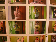
Doyle’s photo installation.
Doyle’s an autobiographical artist in the mode of Sarah McEneaney although Doyle, unlike McEneaney, uses photography and video as well as painting to tell stories. Here, she’s got a wall’s worth of self-portrait photos shot in what looks like her bathroom mirror. The display documents her and her daughter through her second pregnancy and the birth of her second child, who also shows up in the sequence. The obsession with body/self in these is very serious and very much a comment on who we are, something that’s more slippery than ever in this age of electronics and virtual selves.
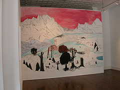
One of Doyle’s two murals at Pageant.
The artist’s dreamy, autobiographic murals are right in sync with alt-culture sketchbooks. Karen Kilimnick and Raymond Pettibon also come to mind…and Robyn O’Neal.
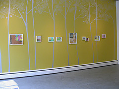
Kate Stewart’s small paintings weave inside and outside and surreal and real.
Stewart’s wall with silver trees puts everything in the realm of fairy tale.
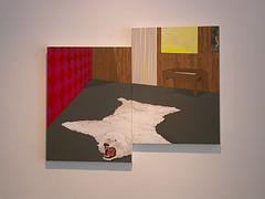
Kate Stewart painting
Stewart has a way of juxtaposing oddball imagery with mundane architectural space so that the whole is somewhat — although not obviously — off-kilter. Here she’s literally unbalanced the whole by aggregating two canvases. The result seems like it’s had a few bites taken out of it.
Good show. Good pairing. See more images at my flickr.


