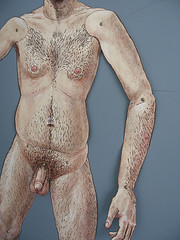
a detail of Russell Ihrig’s full-length self-portrait as a paper doll with moveable parts–yes, that part moves too, and is the only part that doesn’t lay flat on the door
The Cincinnati gallery Publico is showing its brand of exuberant artmaking at Vox Populi Gallery this month.
The show has three main events, all of them in some way referring to our do-it-yourself culture and the difference between hand-made and manufactured:
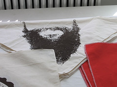
The merchandise table had this terrific bandana for disguise.
1) The gallery scene: The front room at Vox is filled with artifacts from the Publico lifestyle–a vitrine with show memorabilia, screenprinted posters from old shows, by Paul Coors (he has also shown in Philadelphia with Black Floor’s Nick Paparone)–see post), personalized Christmas gifts by Matt Coors to the rest of the members, and things for sale (my favorite item, a bandana with a beard silkscreened on–very funny for a first-rate stick-em-up). The exuberance and sense of fun here put to shame the dry ICA exhibit Make Your Own Life: Artists In and Out of Cologne. I think Publico’s documentation was also a lesson in scale. Small is better for documentation, unless it has lots of engaging art in it.
2)A warm welcome: The front door is an event all its own; a life-size nude self-portrait with paper-doll articulated limbs (and penis) by Russell Ihrig is so in your face and funny that it nearly steals the show, and that wouldn’t be so easy. I found it pretty hard to play with the moveable parts (I had a shy attack), but Matthew Suib, who was gallery sitting the day I visited, said others had played with it. The scale and the details are intimidating and endearing at the same time, and remind me of the huge Halloween skeletons people hang on their doors. The sly undercutting of girly paper dolls, puppets and female nudes offers lots to think about. (Ihrig, who is a pretty conceptual guy, has many great pieces in this show. I expecially loved his hilarious record of leisure-time hours spent, projected on the wall, for one).
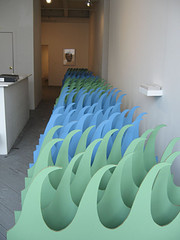
Perspective and means of manufacture are highlights in Standing/Drowning, by Matt Coors
3)The rest of it: There’s lots to look at and think about in this show. While not every piece is a hit, there are a lot of pieces, and a lot to think about. Matt Coors’ Standing/Drowning, an installation of green and blue waves is a simple concept elegantly executed with cardboard and paint. Its size puts the looker in a physical relationship with the waves, which seem to go on and on–and not. The waves are stylized and have some of that intimidating/endearing quality that Ihrig’s self-portrait has, although it’s less personal and breaks no taboos. Repetition is always a pleaser, and the art factory has spit this one out in a way that undercuts any suggestion of factory made.
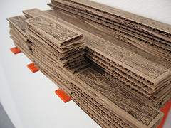
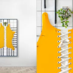
A detail from Cross Depot, by Matthew Waldbillig, a do-it-yourself kit for cross builders; of course the l-brackets are orange in Home Depot’s honor
Matthew Waldbillig’s Cross Depot mines the same issues about handmade and manufacturing by mocking do-it-yourself palace Home Depot at the same time that he’s mining crucifixion art. The high-tech little orange supports for the “wood,” the beautifully drawn woodgrain on the cardboard bits of wood, the nic box of nails all add up to more than just a joke about Home Depot for those of us who live in the land of the holy do-it-yourself ethic–and, he did it himself.
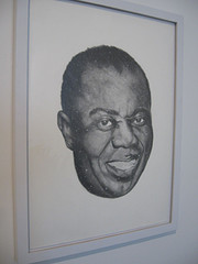
Wonderful World by Britni Bicknaver, graphite on paper
Britni Bicknaver’s Wonderful World graphite drawing of Louis Armstrong sprinkled with stars is a heartfelt beauty, but her American Indian Arrowheads made me think–of Vija Celmins’ cast rocks, that looked just like rocks. Bicknaver’s realistic-looking arrowheads are made of clay and are on display on the wall in a grid that resembles a traditional collector’s boxed display. Faux and real, value and labor, nature and art all come into play in this one. Can’t find an arrowhead for your collection; substitute a fake one that you make yourself.
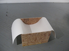
Untitled sculpture by Evan Commander challenges the traditional glorification implied in art displaybrain
Several pieces were about display of art, including ones by Evan Commander and Paul Coors. Beth Graves’ watercolor of a landscape in which the grafitti dominates comments on the landscape tradition, but here the landscape is dwarfed and the man-made wins; her 2-inch diameter divided plate of tiny crudites and dip is an ode to the perpetual dieter. Brian Nicely’s ironic motor-culture salute reduces the landscape to a deer on a wheel sleeve, a balloon and a drooping string of waving triangles (I don’t know what these are called, but they hang around the edge of every used-car lot in the country). I also liked his documentation of a performance, changing a street to a boulevard by placing a very small stand of trees in the center of the street and erecting a faux street sign. The mis-addressed envelope that must have inspired the action is part of the display.
It took me a while to find Dana Ward‘s Friday After Next. Was she worried that she wouldn’t have a piece for this show? I’m not sure of the significance of the title, or the little baby sneakers hanging off the wire. Looks like a salute to Philadelphia’s shoes-on-the-wire tradition. Do they also do this in Cincinnati?
For more images, visit my Flickr set here. And visit this show. Not every piece is a 10, but it’s a terrific show, and I didn’t mention many of the pieces worth time, thought and looking.


