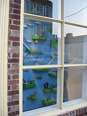
Bill Lohre’s Light Life and Airhas enough eye appeal to overcome reflections and draw into its magic world a casual passerby
What a great idea! Put art in a store front and bring art to the masses! Uh, but you better watch out.
Unless the installation has some juicy eye candy that can overcome both the mindset of pedestrians and distracting reflections, it doesn’t work. You can walk a pedestrian past a window installation but you can’t make him look.
I recently visited four different window art installations and find myself wondering in some of the cases, who would even stop for this? Windows and highbrow do not mix. Windows and subtle do not mix. Windows and obscure do not mix.
Pedestrians are on the march and rarely are willing to slow down, so you have to knock them over the head in a second or two. Once you’ve done that, you have to give them enough to slow them down and keep them looking. Subtlety can be in the complexity that the long stare offers, but not in the first POW.

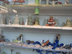
A detail from Bill Lohre’s Life, Light and Air, with multiple activities on astral planes
So thank you Bill Lohre for offering in Life, Light and Air (at the otherwise closed Spector Gallery) a primary-color, toy-like installation of life on floating clouds. It has sell-sell eye appeal and loads of content that kept me looking it its sweet little scenarios–reminders of how small we are in the larger universe, in the big blue sky. There is a cheerful optimism in the child-like scale and imagined scenarios, although life on some of the clouds has its ups and downs.

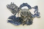
One of three strong sculptures in Linda Brenner’s Paulownia Project; it’s the window installation that falls short.
Reflections of the beautiful Parkway overwhelmed the Linda Brenner Paulownia Project at Moore College of Art and Design, a piece that would have looked great in a gallery setting. The wood sculptures of three carved branches painted with black rings are beautiful, suggestion veins and life force as well as a hint of mechanical power. They remind me of Syd Carpenter’s twisted clay ropes as well as Annabeth Rosen’s little clay tangles.
But the spareness and the low-key color of the pieces, along with the large graphic above, which would have floated in a white-box gallery, disappear and seem precious and too restrained in the window setting. Paulownias are not precious. They are a fast-growing tree native to China, with potential for solving our voracious need for wood without deracinating the planet. I’m happy to say the carvings themselves are not precious. The problem is the installation and the window.
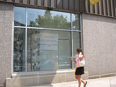
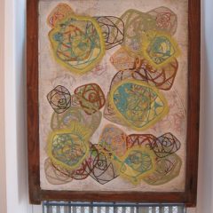
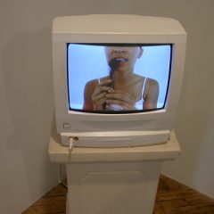
Michelle Soslau’s Window on Broad,at University of the Arts, includes three beautifully pieced, fabric columns that have a newspaper-page look as well as a papery bark look. Ultimately, a person and a dash of color on the streetscape easily overwhelmed the window. So did the words.
Because the streetscape is not just for artlovers, a window installation needs to keep that larger audience in mind. On that level, Michelle Soslau’s Window on Broad was just too high-minded and arty, Asian-inspired fabric columns pushed off to a corner while a difficult group of earnest words took center stage. She lost me.
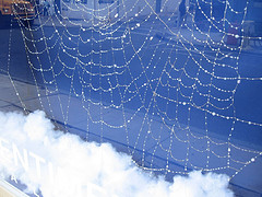
The webs of Caught Up, by Karen Rich Beall, re beautiful, but overwhelmed by the real world around them and the pretend world in the window.
And Karen Rich Beall’s Caught Up, two spider-web windows in Pentimenti’s front windows, were so delicate, the threads so difficult to see, the feel of the entire installation so fragile–they all got lost in the reflections when I saw them. I loved the threads and the sparkles, but the setting–by which I mean not just the reflective windows but also the paper backdrops, the absorbent cotton and the plastic grass–didn’t do justice to the delicate, carefully considered, and laboriously woven threads.
Like public art–well, as public art–windows need to be visual crowd pleasers that can overcome the static of reflections and a busy streetscape. Because window installations are temporary, they are not necessarily required to reflect public values, but they do need to get their ideas across to a public not necessarily committed to difficult philosophical discussions, let alone to looking at art.
The thing about windows is they suggest commercial enterprise. That is part of the tradition that needs to be incorporated into a window display. The work needs to call out loud for a second glance.


