Caitlin the intern took the East side and I took the West side of First Friday–hitting the Fabric Workshop and Museum, Vox Populi, Space 1026 and Black Floor. There was lots to look at, lots to ponder–and lots to love.
Paul Chan and the Fabric Workshop
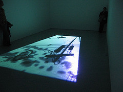
Paul Chan’s 1st Light (I don’t know how to make the word Light look crossed out; sorry) silenced the usually chatty gallery goers.
The excitement at the Fabric Workshop and Museum is Paul Chan. He’s showing 1st Light, a projected piece he had at the Whitney Biennial.
Unlike last time I saw it in the rush of the Whitney, this time I took it in. It’s the WTC apocalypse played out against the sky, with silhouettes of flying people diving to earth as objects like bicycles and pieces of the building float up and as birds fly across the transcendent sky. The pace is elegaic. The crowd of gallery goers stood silently watching. Me too.
A second piece, 4th Light, views the same event through the crossed mullions of a large window that wraps around the corner of the room. The idea is similar to the other piece, but not the same. And the sense of being a spectator behind the window reflects the reality so many office workers and residents faced on 9/11.
The use of silhouettes and light and floating turns the specific event into any disaster in any place, the interruption to daily life familiar and unfamiliar all at once.
The exhibit also includes drawings for the pieces as well as a couple of drawings of trash remaining after the Republican Convention of 2004.
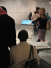
Jean Shin’s TEXTile, created at the Fabric Workshop, allowed people to type letters onto a screen at the far end of the unrolling “paper”.
Jean Shin’s piece upstairs, TEXTile, is an interactive meditation on computers. Sit and type. Enough sitting and typing already. I watch people sitting and typing on TV detective shows. I watch them in the movies. Stop. The installation also included a couple of videos of keyboards in action, the rapid depression of letters too quick for a viewer to keep up. The words stayed inaccessible and indecipherable, just beyond reach, and reminded me a little of Ann Hamilton’s disappearing letters. This was my favorite part of Shin’s installation. I also liked the clicking noise of the computer keys on the soundtrack.
At Vox, Adams, Suib, and Wylie with Vicars
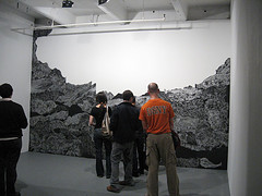
Amy Adams’ undead was a walk-into mountain range, black against a glowing sky.
Downstairs at Vox Populi Gallery, Amy Adams’installation, an imaginary landscape is built up of silver marks on black paper. Called “undead,” it’s the mural in the Chinese Restaurant, not to mention the silhouetted witch against the moon, reimagined. The large paper sheets, layered with a touch of 3-D, create a mountainous silhouette against a glowing white-wall sky. Adams creates a dramatic example of repetitive mark making that leads to a sense of land folding and heaving as well as a sense of time spent making the marks. She has created something from nothing, thereby suggesting both at once.
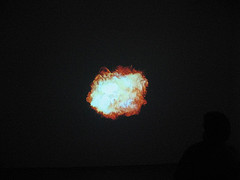
Matthew Suib’s fire mandala made me think of Tony Oursler’s couch potato at the Met.
Music continues to be a concern of visual artists these days. Adams played some music–a tape she spliced from discarded audio tapes she picks up from the streets of Philadelphia. And in the next room Matthew Suib has included some exotic stoner music to go with his installation Purified by Fire, which includes a churning mandala of fire projected onto the wall. It’s mesmerizing, and the highlight of his installation. I missed his special screening, also fire related. Maybe that was the highlight, but I can’t really say. Sorreee. Anyone see it who wants to report in the comments below?
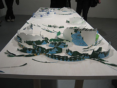
Wylie and Vicars collaborated on the larger installation. this table-top landscape uses label imagery.
The physical presence of Eva Wylie with Rebecca Vicars’ installation Flourescapes and Mirth was removed from the oven before the cake had risen. I did love the idea of using and redrawing the imagery from water bottles (Deer Park and Poland Springs), and I loved including the price code in the landscape on the table top. But all in all, the installation lacked coherence.
Music carried over into the video lounge, where David Dyment’s video posts a series of questions drawn from the artist’s pop-music CD-and-record collection. It didn’t rise above the banality of its sources. The motion medium of video doesn’t match the message–static words.
The Black Boy George at 1026
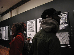
Everyone stopped and read and read and read Musson’s latest installation of Too Black for BET.
Words however at Space 1026 were over the top wonderful in Jayson Scott Musson’s exhibit, Too Black for BET “Episode 2: The Black Boy George” of posters and downloads of text messages on his cell phone(it’s episode 2 because there was an Too Black for BET episode 1 and he’s hoping to finish episode 3 by 2010).
The posters are take-no-prisoners rants that lance the soft underbellies of everyone and everything, posturers all, from vegetarians to bias in post-Katrina restoration efforts to loft-living yuppies to feminists and rappers. (Musson himself is known as PackofRats with the musical rap group Plastic Little, so there’s a big music connection here too). Alex Da Corte, who filled me in since I couldn’t find the artist, assured me that Musson is the sweetest, gentlest of people. Well, here’s one of his bad-boy outlets. The text messages, interspersed with the posters, hint at the ordinary person and his daily life, hidden behind the performing persona. And the persona sure makes all of our posturing, his own included, look damned stupid. I loved this. It’s a book.
Yurt, sweet yurt at Black Floor
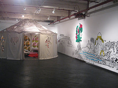
One Wall is an Edge, by Luren Jenison at Black Floor Gallery
Finally, Luren Jenison’s yurt and mural installation, One Wall is an Edge, at Black Floor offers a lot to look at during the first glance–a visual treat, the mural influenced by Mongolian and other Asian landscape traditions. I loved lots of the details, like the holes in the walls and the chance to enter the space. Ultimately, however, considering the themes of home and crossing borders, the imagery didn’t travel quite far enough.
All in all, as First Friday’s go, I have to sing this one’s praises.
For lots more images of all of these artists’ work, go to my First Friday Flickr set.


