If you are looking to make one last visit before shows closes this weekend, then the Challenge #1 exhibit at the Samuel S. Fleisher Art Memorial is a must-see. Artists Danielle Bursk, Robert Chaney, and Jay Oliver Cummings were three of 12 finalists selected from more than 300 applicants for the 29th season of the Challenge. Although there is no set theme for the exhibit, the work shares an aura of balance, structure, and color. Much of the artists’ work is in black, white, or a muted color like sky blue, and seems meticulous in composition and design.

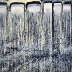
Danielle Bursk “The Golden Road to Unlimited Devotion.”
Danielle Bursk works in ink on a grand scale. Her indefinite forms are built up from hundreds of short strokes that, in combination, create a picture that has real weight to it. Bursk touches on the meaning of connection, and the fact that many small things can become one great thing. The art has implications for real life, in that memory and community are made up of many small fragments that add up to one big idea. There’s another song reference in the title of the picture above, see if you can catch it… okay, I’ll tell you: it’s a reference to a Grateful Dead song (thanks Greg), which should hint at the meditative effect of Bursk’s work.

Robert Chaney “Untitled”
Robert Chaney originally entered Challenge in the category of photography. He showed an especially large number of pieces that were small in scale. He works with Polaroids, which fade–like the moments the pictures capture.

Robert Chaney “Untitled”
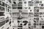
Chaney also exhibited graphite drawings, which share the same deserted, industrial feeling as his Polaroids. Although the drawings feature unknown places, and often join several different digital prints to create one skyline, all are strangely familiar, evoking the feeling in me of sharing a communal memory of time and space with other viewers. The composition of the art in both mediums in which he works reminded me of the Midwest, in that there was a lot of space and the presence of faded, soft colors.

Jay Oliver Cummings “16” for Building”
Cummings finds “beauty in the materials that make up the structures of our built environment” (from his bio at the gallery). His art has an obsessive approach to symmetry and balance, and uses found objects to create new art that is strongly remniscent of real building material. In one piece, ” 16″ for Building,” he pressed together pieces of sheetrock, which he laminated to look like 2×4’s (see above). These planks were then set 16″ inches apart, which is the standard spacing for building houses. Cummings is interested in the social aspect of buildings, and how the materials that we use affects how we judge one another. The exhibit was meticulous and, like the work of the other artists, timeless in its theme.
The exhibit had a very cohesive feel to it, addressing the community at large, and how we are socially related to one another. I enjoyed the feeling of interconnectedness that was evoked through each artist’s work. I found Bursk’s work to be especially innovative, and overall I strongly recommend the show.
Challenge #1 closes this Saturday, October 7th. Challenges #2 and #3 will follow at the Samuel S. Fleisher Art Gallery in the next couple of months.
Caitlin is the artblog intern.


