Post by Andrea Kirsh
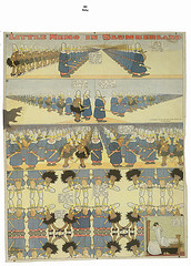
Winsor McKay’s Little Nemo in Slumberland, from Masters of American Comics
Mikhail Baryshnikov once said No dancer can watch Fred Astaire and not know that we all should have been in another business. Likewise, artists have long recognized the brilliance and virtuosity of comics artists from Winsor McCay and George Herriman to R. Crumb and Art Spiegelman. Museums are now catching on. You can see an extraordinary range of brilliant work in Masters of American Comics. Organized jointly by LA MoCA and UCLA’s Hammer Museum, it is currently on view in two parts: the early work at the Newark Museum, and work from the 1950s through the present at the Jewish Museum (through January 28, 2007).
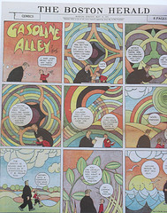
Gasoline Alley, 1931, by Frank King
An absolutely stunning catalogue accompanies the exhibition (distributed by Yale University Press). It includes luscious illustrations, a long introductory essay and short articles from various comics fans including artists, novelists, journalists and academics from varied fields; it would make a great Christmas (or Hanukah) present.
So far I’ve only seen the part at Jewish Museum, so I can only comment on their presentation. Three galleries show six artists (Will Eisner, Jack Kirby, Harvey Kurtzman, R. Crumb, Gary Panter and Chris Ware) hung as individual bodies of work. A fourth gallery is devoted to the development of the action figure during the 1940s and 50s, placing it within the political and social history of the period.
Comics and the Canon
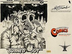
R. Crumb, downloadable poster from MAM.
The opening text states that the exhibition endeavors to establish a cannon of fourteen of the most influential artists working in the medium throughout the twentieth century. “Canon” has been a fraught concept in art history and literary studies in recent decades, attacked from all sides as exclusionary. Some scholars have turned to cultural studies, which specifically rejects the judgements of hierarchy and quality associated with bourgeois culture and museum values. Cultural historians and theorists take a broad interest in popular and high art; are museums getting in on the act? How do comics fit within art museums? When old enough, there’s no problem; Hogarth, Gilray, and Daumier all worked in cheaply-printed popular forms which now reside comfortably in museum print collections. Lots of other museum objects were once popular or even industrial products: historians now tell us that Greek figured ceramics, so highly-valued since they were excavated in the Eighteenth Century, were not prized as a high art form in Classical times. And museums change their ideas of collection worthy-ness: Japanese woodblock-illustrated books that entered museums through their libraries have been transferred to the Asian Art departments, just as 19th century books with printed photographic illustrations have found their way into photography departments. Ditto for Ed Ruscha’s soft-cover, off-set printed books of the early 60s.
Embrace the drawings, embrace the comics: Why no comics in the show?
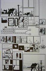
Chris Ware, from Jimmy Corrigan
But this exhibition, for the most part, does not exhibit comics; it exhibits drawings and studies for comics, with an occasional example of the real thing in table cases. Now the drawings and studies certainly have all the visual interest of the published versions and occasionally the great advantage of a larger scale, making them easier to read. I particularly found this true of Chris Ware’s work. I’ve long appreciated Ware’s great originality in choreographing imagery on the page as well as the poignancy of his mostly visual story-telling. His graphic inventiveness challenges conventions of reading as a strictly left-to-right, up-down sequence. But his published work is extraordinarily difficult on middle-aged eyes, and I give up quickly. In other examples the working drawings convey interesting information about the artists’ methods: a model sheet for Joe Simon and Jack Kirby’s Captain America was never intended for publication; it was drawn as a pattern for the characters’ outfits and relative sizes (necessary since the comics were produced by a workshop of draughtsmen). But this use of the drawings was infrequent. Mostly they were simply presented as if that was what comics artists made.
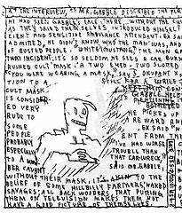
detail, Page 22 from Jimbo #6
Gary Panter’s Jimbo in Purgatory was new to me, and some of the most visually-sophisticated work in the exhibition. He created sequences of panels where the whole was greater than the sum of its parts, the background in each panel creating a mosaic that resolved into a page-sized image. He’s an artist who has clearly studied a long history of manuscript and book illustration and utilized it all. But with no example of the printed book and no reference to scale on the label (or in the catalogue), I have no idea how he intended it to look, since Panter does not work for a commercial publisher of standard-format (10 1/4″ x 6 7/8″) comics.
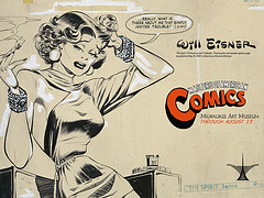
Will Eisner, downloadable poster.
When museums propose modern comics as an art form, mightn’t they show them as they are – a cheap and populist form? And a form to be appreciated page-by-page (with the longer ones), at a comfortable focal distance, and sitting down ? Why not include seats, and an abundant supply of the actual comics, which are available (cheaply), in original editions of contemporary work and in suitable reprints for much of the earlier material? And if they must exhibit the drawings, couldn’t they indicate their relation to, and the dimensions of, the published work?
The Catalog
Here the catalogue is more respectful, with details, enlarged to full-page size, which convey a marvelous idea of mass-market, half-tone color printing in all its Benday glory. The designers (Green Dragon Office) clearly appreciated their subject, and should get a hand of applause. John Carlin‘s article approaches both the visual and verbal artistry with scholarly appreciation and gives useful technical information on the mechanics of comics production, if you read the footnotes (I always do).
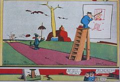
George Herriman’s Krazy Kat, 1941, with the woodpecker (lower panel, left) staring at the painting of the tree, ala Pliny who talks of birds pecking at a life-like painting of grapes.(lower panel, left).
My only complaint is that perhaps he held back in crediting the sophistication of artists such as George Herriman and Frank King; or was he afraid of sounding pedantic? In an episode of Krazy Kat (1941) which Carlin discusses as a marginal gloss on the meaning of the primary scenes (fig. 19), a woodpecker stares at a painting of a tree and Krazy comments but he’s a ‘ott krittik’ ain’t he?, to which Pupp responds Yes, but he’s also a ‘woodpecker.’ This refers to the earliest recorded writing about painterly realism, which Herriman clearly knew: Pliny, describing Xuexis’ painting of grapes that was so life-like that birds pecked at it. And Frank King makes keen art references in an episode of Gasoline Alley (1931) which Carlin says resembles modern art abstractions, particularly those of Robert Delaunay and Stanton McDonald-Wright (p. 64). In fact, King goes beyond resemblances; he directly cites a famous color diagram of J.F.L.Merimee’s 1830 painting manual, while in another episode of 1929 (fig. 202) King’s character, in the guise of describing the landscape, precisely outlines the nineteenth-century theory of complimentary colors that had such a major influence on Neoimpressionist painters. Populism with a wink.
I’m working on resources for seeing, and reading comics in Philadelphia. As they say, to be continued.
[Ed note: Masters of American Comics was also at the Milwaukee Art Museum, the only venue that housed the entire show in one place. I was fortunate enough to see it there. See my post on the New Jersey/New York split of the show and Art Spiegelman’s withdrawing his work in protest. And see here for more on comics and for my post on Spiegelman’s’s talk at Penn in 2005.]
–Andrea Kirsh is an art historian living in Philadelphia. See her newest Philadelphia Introductions piece on inLiquid.com.


