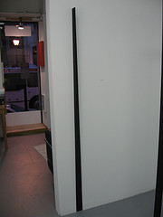
trp[04f], by William Cromar, starts as a stick and becomes a blade as it impreceptably curves toward the viewer at eye level, 72″ high, wood, pigment, casein, fasteners.
William Cromar keeps surprising me. I have yet to set out to see his work. Instead, I stumble upon it every once in a while. This time, I found it at Minimal Works Gallery, a new space up on Chestnut Street with windows too high to catch the eye of a casual walker. So I walked right by the place. Fortunately, George Collins at Art Around mentioned there was a gallery down the street.
Right now, Minimal’s Dennis Towers has a group show on the walls, with a some people I expected to see, like Doug Witmer and Joanne Mattera, and some people whose work was new to me, most of the work interesting but crowded together in a small space.

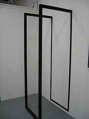
phe[01a], Pigment, Casein, Poplar and Fasteners, 74″ tall
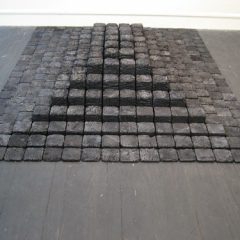
And then there was Cromar’s stuff, creating its own presence and breathing room within the crowded space. I wasn’t really expecting to see William Cromar sculptures. As ever, they are elegant and thoughtful, conceptual and pared down, their presence posing questions about space and architecture and their relationship to the body.
At the same time that the sculptures create a quiet space of their own.
I can’t believe Cromar isn’t more of a presence on the local art scene.
My own memories of Cromar work I loved includes redrain in 2005 at aFSe Gallery–a wedge of red wax-tipped strings hung from the gallery ceiling, transforming the space within the wedge and the spaces around and beneath the wedge. I also remember with fondness halfwayhouse, interlocking frames of a white and a black house, that showed in the upstairs space at Nexus, in the inLiquid Solo Exhibition Series in 2003. It seemed to reference Ben Franklin’s ghost house by architect Robert Venturi at Franklin Court, at the same time that it raised issues of race in America. Cromar also had a Fleisher Challenge in 1998.

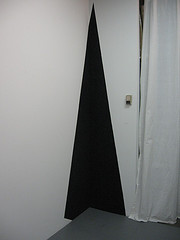
tac, by William Cromar, painted directly on the wall, a sort of black hole that’s there and not there, that’s in the corner–and not in the corner, and creating its own corner.
Cromar’s linear pieces at Minimal Works make me think of shoji screens and calligraphy. Perfectly finished in a matte black, a stick embedded in the wall challenges perception of the plumb of the walls at the same time that it subtly approaches the viewer at eye level. An installation of a painted corner challenges perception of where the corner turns at the same time it creates a space for a body. It also feels like it is a body. A phone booth sized framework challenges the expectations of 90 degree angles at the same time that it creates a body-sized space.
In some ways his work brings to mind Siah Armajani’s architectural sculpture, which also rethinks the angles we use to build, and also creates space for bodies. But Cromar’s work is so pared down to simple gestures and frameworks that the pieces become gestures of architecture, and what-is-its of a very different sort.


