“Did you know Grand Central is a Terminal and not a station?” asked Cate who had just learned this interesting bit of information. Hmmm. Well maybe. A terminal, Cate explained, is not a pass-through station like 30th Street Station, Philadelphia, where you can get trains passing through en route to points north, south, east or west. All the train routes in a terminal begin and end there. Very European, I thought. Like in Paris, where Gare du Nord is where you go to take a North-bound train and Gare du Sud is for the South-bound ones.
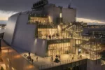
Stella, Cate and I were on our way to Whitney Museum at Altria on Friday, Dec. 29,to see the small exhibit “Burgeoning Geometries.” Altria is right across the street from Grand Central and since Stella hadn’t been inside ever and I hadn’t been there since almost forever we decided to duck in for a little taste of history and to observe the grand old space. What none of us knew was that the hall was decked with what turned out to be a terrific light show commissioned by the MTA Arts for Transit.
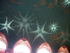
Kaleidoscopic images projected on the Grand Central Terminal ceiling. This one is based on the Chrysler Building’s art deco spire.
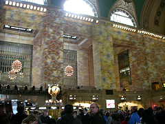
Projections on the walls moved left, right, up and down and were dizzying to watch. Like marble come to life.
Two artists, Fredrich Forester and Sabine Weissinger of Casa Magica, made kaleidoscopic fantasy images of architectural and other wonders in Manhattan (the Chrysler building, the Grand Central, New York’s yellow taxis) and project them on the walls and ceiling. There was music, too, but most of the impact was in the swirling arrangements on the walls and ceiling. My photos don’t do it justice. The hall was packed with lookers and travelers and the totality was nicely New York — bustling and bigger than big.
Whitney at Altria
At the Whitney a tour group in the lobby was getting an earful of some neighborhood history. The acoustics were bad and we just wanted to see the art anyway so we avoided the crowd and made our way around them to the art. But when I took out my camera a big guard wearing a park ranger’s hat wagged a finger at me and said “no photos.” I was incredulous but he was really adamant so I put the camera away ….until he was out of range and I could get some shots of the Phoebe Washburn piece Minor In-House Brain Storm, a tour de force installation of a formidable scrapwood shack containing a toxic looking man-made pond inside.
“That’s what the world’s going to be like in ten years,” said Stella, sounding the eco-alarm bell all of us are feeling in our guts. I scooped up a couple pastel-colored rocks for my art artifact collection. They were strewn here and there like litter, so a few won’t be missed.
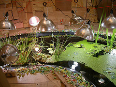
Phoebe Washburn, Minor In-House Brain Storm, 2006, detail, interior
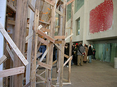
Phoebe Washburn Minor In-House Brain Storm from the outside, with the tour group in the lobby of the Whitney at Altria.
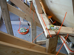
Phoebe washburn, Nest of electrical cord held in place by colored rocks.
I don’t have much to say about the work in the show. Mostly, all of it seems to express the art world’s hot new (although really not new) technique, accumulation. Many, many little things put together to make a bigger thing all of which seems to reflect our overwrought times. It’s Decor that refers to decor and that expresses a suffocating overabundancE: 21st century Rococo. To me it all seems kind of backward-looking. It’s a fear-of-the-future that wasn’t around as much ten years ago but feels now like its hit market saturation. I like it but I’m waiting for it to pass.
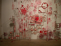
Diana Cooper’s Emerger, 2004-2006, paper, felt, vinyl, wood, acrylic, ink, foamcore and map pins. Whitney at Altria.
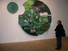
Jane South, Untitled (tracing Parameters) 2006. hand-cut and folded paper, ink, acrylic, graphite and balsa wood.Whitney at Altria
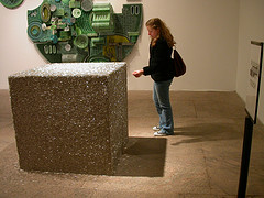
Stella with Tara Donovan’s untitled pins and Jane South’s piece in the background.
I couldn’t take any shots of Jason Rogenes‘ piece because it was right in front of the guard and that was a shame because it’s a great piece. The tower of strofoam packaging material for electronics surrounded by cardboard “2x4s” was the high point of the show. James Wagner has some great photos from Altria on his blog. Be sure to check it out.
Through the Glass with reflections
Barneys
Stella, who loves Barneys, said, “I really don’t care if we go to Barneys,” at which point I said, “I want to go to Barneys…there’s art there!” The Barneys/Andy Warhol tribute in the windows is what I had in mind. We went, we saw and we snapped lots of nice pix. I believe the display was in collaboration with the Warhol Museum, because many of the drawings, objects and photos seemed authentic. I had read they were selling $12 cans of Campbell’s soup inside so we went in to search but they were sold out (!!!). I really wanted to see a $12 can of Campbell’s soup.
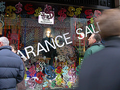
Andy the Social Butterfly window at Barneys
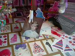
Andy’s childhood window at Barneys
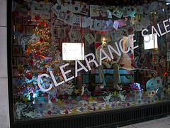
Andy mania at Barneys
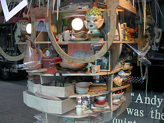
Andy the collector. Doesn’t all that look like authentic collectibles from his collection?
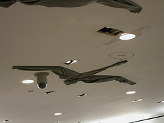
Inside Barneys, the ceiling in the jeans department was covered with a flock of faux grey geese made from grey jeans. I kind of liked that.
Louis Vuitton
Cate had heard there was art in the Louis Vuitton boutique windows on 5th Ave. and 57th so we went up there to look and found Olafur Eliasson‘s flower-jewel-lights there. From across the street, Cate said, “They look like tanning salon lights” and they may well have been. The pieces (there were maybe 4 all together) were part of a fundraiser for Ethiopian refugees. Eliasson’s piece at Arcadia was terrific and this was just window dressing. Oh well it was for a cause.
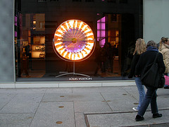
Olafur Eliasson at Louis Vuitton
9 West 57th
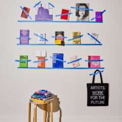
Further on down 57th St. we saw this oddity that made me pull the camera out. It looked like a painting behind clear plastic held in place by blue tape. And by gum that’s what it was. A gentleman was painting the floor grey in the space which looked like it was going to be a new art space. We waved to the worker and he seemed amused as we gaped and took his picture.
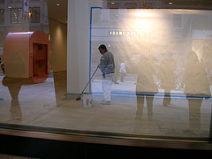
9 West 57th St. Painting with blue tape and plastic sheeting.
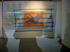
Painting and blue tape, 9 West 57th.
Art in the Atrium
It’s one of my favorite spaces to see art is the public atrium at 57th and Madison that adjoins Trump Tower. We’ve seen Tim Hawkinson‘s art and almost saw Moriko Mori‘s brain scanner art machine in this space, and right now what’s there are a couple of Claes Oldenburg/Coosje van Brugen pop art pieces. They’re shiny and full of pep and a nice addition to the space.
However, there’s also a floor-bound Donald Judd piece and we all recoiled at its ugliness. I am not a fan of Judd’s but I never would have said his work was ugly. And from what I’ve heard he was a stickler for keeping his works in good repair and shiny the way he liked them to be so he must have had a thought about their beauty. This piece — it was made of what looked like concrete — was nicked and grimy in spots and I felt sorry for it. And couldn’t wait to get out of its big presence.
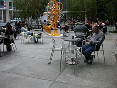
Oldenburg/van Bruggen’s french horns in the 57th St. atrium.
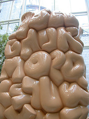
Oldenburg/van Brugen’s alphabet on a stick. Pop art ages so well doesn’t it?
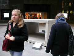
Donald Judd piece in the atrium.
We also went to Gallery Saint Etienne to see a fantasy/outsider art show and more on that in another post.


