Cate. Then we schmoozed with bloggers Barry Hoggard and James Wagner. We finished up with a little more art.
After people, photos ruled.
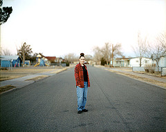
Richard Renaldi’s exhibit, The Plains, of 18 photographs at Yossi Milo Gallery set us talking, trying to decode why and how they differed from Zoe Strauss’s photographs. After all, both photographers are doing portraits of people in their habitats, as well as non-peopled photos of the habitats themselves.
We talked about Renaldi’s subjects’ vulnerability and lack of Philly blue-collar attytood. Rinaldi uses an 8 x 10″ camera with hood, and each photo requires time and patience–for the photographer and the subject. I loved the portraits. The landscapes seemed more documentary and less compelling. (See Roberta’s recent book review of his new book, Richard Renaldi: Figure and Ground. The exhibit opening was yesterday night, and Cate, who had Renaldi as a student, headed for the festivities after she left us).
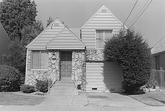
Richmond, California, by Henry Wessel, 1989, gelatin silver print
Other great photographs we saw and loved were by long-time San Francisco photographer Henry Wessel at Charles Cowles Gallery, witty views of Americana in its ordinariness. These photos do not focus on tricks of scale; they are just sharp observations, like photos riffing off real estate snapshots of homes, to casual still lifes of dirty dishes or a room service tray. The photographs cover more than 30 years, and include black and white as well as color.
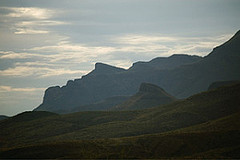
One of the photos in The Lower 48, by Matthew Day Jackson
Matthew Day Jackson, the sculptor who made the conestoga wagon at last year’s Whitney Biennial, had a mini-exhibit of photographs at Perry Rubenstein’s auxiliary gallery that started out looking like just another Flickr travel set. We were ready to leave when Cate saw the photos had a visual theme–a sort of puzzle for the viewer to find (I’m not telling). The exhibit, The Lower 48, includes a photo from each of the first 48 states that fits the game. We left exhilerated by our success.
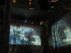
Sleepwalkers, in the MOMA garden, photograph by Cate Fallon
After darkness fell, we headed up to the Doug Aitken Sleepwalkers at MoMA. Roberta told you how cold and grouchy she got. Honestly she and Cate were so cold, their harmonic shuddering sent shock waves through the air. But I wasn’t cold, yet. In fact, I was quite enjoying myself, trying to see how the channels matched and differed.
We tried the front of MoMA, where there was one channel–not enough–and the garden where there were four–too many. We also tried the side of MoMA, where there were two channels–just right. We should have stayed there, but I was greedy to see the most we could see all at once.
The theme is people who work at night–the ordinariness of their routines and the spectacular visuals their ordinary lives suggest. The men’s faces are more compelling than the women’s, or maybe that’s just my taste. It was a little cold to have too many thoughts, though. And we were too cold to take out our cell phones and dial for sound. Last week we would have been warmer and more patient. So we walked away to get to sleep asap.
Compared to Aitken’s installation at the Fabric Workshop and Museum, this was less jittery. There were still changes in pace and parallel lives. But the jazzy hipness is toned down. The pace was varied, but all in all it was more lyrical.


