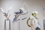
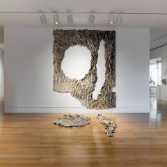
I stopped in at Tower Gallery on Friday to see Alexis Granwell and Hedwige Jacobs‘ works. Granwell’s big installation piece, Navigating the Ecstasy I and II was leaving for Delaware on Saturday so I wanted to catch it before it left to be in the DCCA’s Annual Members’ Juried Exhibition, opening jan. 26 and juried by PAFA’s Alex Baker. Another Granwell sculpture will be installed at Tower for the duration of that show Tower Gallerist Jenney Jaskey told me.
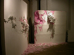
Alexis Granwell, Navigating the Ecstasy, I and II
Navigating the Ecstasy, two small walls each made of foam, wood, wire, fabric and paint and each distressed and gouged as if eaten by a giant rat, reminds me how lovable and detestable is the impulse to decor. This piece, in which the gouged areas have been painted pink is like decor gone bad, like the cake on Miss Havisham’s wedding table, repulsive and poignant for all its dashed hopes and angry dreams.
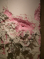
detail, Navigating the Ecstasy
Granwell had some drawings and prints as well, abstract works with thunderous titles about falling to pieces and tunneling. The 2nd year Penn MFA student was just in to take some pictures when I was visiting and she mentioned that two more Penn MFA students in her year were also in the DCCA show.
Hedwige Jacobs’ drawings are the basis for a 45-second animation that I saw on gallerist Jaskey’s computer since the AV equipment was not working properly. The drawings are line drawings with collage elements and it’s the animation that takes the idea to another level. This is another excellent Jacobs’ animation — although it’s a big departure from what I’ve seen before. Here, the subject matter differs in that its focus is on one solitary figure in a void of space, and not a multitude of figures in some kind of implied real space. And the one female figure, nude and looking like a young pre-pubescent alien steps through a limited set of defensive crouches all the while beset by things like roads, tunnels and and in one case an old-fashioned china doll.
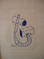
Jacobs drawing at Tower Gallery
I would not have called Jacobs’ past works jolly–they;ve always seemed edgy to me. But the ones I’ve seen imply an eye focused on the outer world of communities and societies and about social issues pertinent to civilization (like green space versus overcrowding for example, in a piece I remember from the Green show at Klein Gallery.) This new work, called Second Impression, turns the focus inward and reflects a heated concern with the body as affected by outer pressures, obstacles and events.
The piece is very dark and quirky. The female is reeling from things beyond her control. The use of the doll in particular reminded me of Kate Moran‘s damaged and vulnerable Victorian-looking dolls.
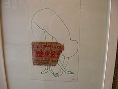
Hedwige Jacobs drawing with marker on paper and cut fabric–the logo from a pair of Levis jeans.
I do have a second impression of Jacob’s piece. And all because she’s inserted one inspired and comic moment that implies freedom, humor, escape — things that don’t negate the dark imagery but do wonders to undercut it (whether intended or not).
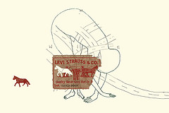
Still from Jacobs’ animation showing the horse trotting out of the Levi’s logo. Thanks to the artist and gallerist Jaskey for the image!
At one point, a small horse, the iconic horse from the Levi’s jeans’ logo, is cut free from his or her moorings in the advertising scheme and trots away across the screen. This almost Chaplin-like moment, like when the comic eats his shoe strings for dinner as if its spaghetti, creates a mental space for the viewer to consider the improbable for its comic touch even though underneath there is poignance.
Chaplin was full of darkness but people mostly remember the antic bits. In Jacobs’ piece, too, it’s the little horse I will remember, and all the hope it represents.


