Rivane Neuenschwander
Zé Carioca no. 4, A Volta de Zé Carioca [The Return of Zé Carioca] (1960). Ediçao Histórica, Ed. Abril. (detail) 2004
Synthetic polymer paint on comic book pages
Thirteen images, each 6 ¼ x 4” (15.9 x 10.2 cm)
The Museum of Modern Art, New York. Fund for the Twenty-First Century, 2005
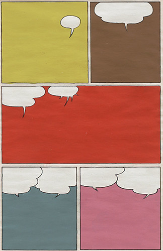
The primary image used for the press material promoting Comic Abstraction at MoMA is Ribane Neuenschwander‘s Zé Carioca no. 4, A Volta de Zé Carioca, a panel cartoon with all content extracted from the panels and with the word bubbles denuded of words. The image, which is nice and pop and quickly communicates the idea of comics turned into something else, is on the show’s catalog cover and on MoMA’s main web page describing the show. It was at the top of Roberta Smith’s review of the show in the NY Times. It’s the show’s brand.
Ze Carioca is immediately understandable as an image. And it communicates a Post-Modern Seinfeldian ode to nothingness. It’s a light-hearted image in my book and a mystifying choice for a show that actually states that it’s a roundup of art dealing with war and global conflict, racial stereotyping and the loss of innocence.
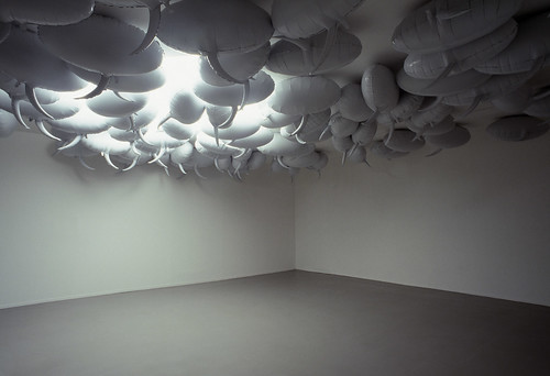
Philippe Parreno
Speech Bubbles. 1997
Mylar and helium
Each 42 1/8 x 46 x 15 ¾” (107 x 117 x 40 cm)
Installation view at the Musée d’Art Moderne de la Ville de Paris, 2002
Frac Nord-Pas de Calais, Dunkirk, France
© 2007 Philippe Parreno
Courtesy the artist and Friedrich Petzel Gallery, New York
I don’t mean to whine or to critique the curating, something I don’t ordinarily do but the show’s got me a little bit annoyed — starting with that problematic choice of the brand image, to a couple other things which I will tick off below. Mostly, you can go see this show and enjoy it. But try to avoid going at a time when crowds will be there (weekends, free nights) since this show has a lot of very large works and it’s installed in too small a space. On the random Thursday in March when we visited MoMA it wasn’t too terrible but with more of a crowd it might be a big problem. Regardless of crowding, several of the biggest works are situated such that you can’t step back far enough to see them properly. And the space has several partition walls that don’t allow you a sweeping view that might have been nice.
This bothered me: there is a hint that we are creating a new art historical category — comic abstraction. I register this with ambivalence, since I’m wary of labels in general. I am thrilled that nobody has a term for our post-post modern times. I think that’s just great. We don’t need a label because we’re basically un-labelable at the moment.
Julie Mehretu
Retopistics: A Renegade Excavation, 2001
Ink and synthetic polymer paint on canvas
8′ 6 3/8″ x 18′ (260 x 549 cm)
Dimitris Daskalopoulos Collection, Greece
© 2007 Julie Mehretu, courtesy The Project, New York
Then there is this: I’ve never considered Polly Apfelbaum and Julie Mehretu‘s art particularly comic. Quite the opposite. They both make works that are pretty darned serious. So I have to question their inclusion in this show,no matter what the overt references to comic explosions (Mehretu) or Powder Puff Girls (Apfelbaum).
Apfelbaum may be truly high on Blossom the Powder Puff girl and Merehtu may really be referencing comic explosions but to put them in this context is to miss a lot about the work: In the case of Mehretu, the architectural underpinnings which in my mind are core aspects of how she’s critiquing our overplanned and underthought 21st Century world; and in the case of Apfelbaum, the strong references to painting, to minimalism, to fiber art, to craft and process which are much more important contexts for her work than the comic one.
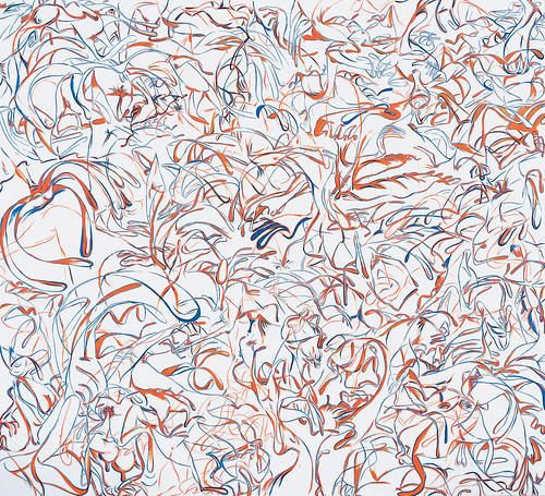
Sue Williams
Mom’s Foot Blue and Orange. 1997
Oil and synthetic polymer paint on canvas
8’ 2” x 9’ (248.9 x 274.3 cm)
The Museum of Modern Art, New York. Carlos and Alison Spear Gómez Fund, Marcia Riklis Fund, and an anonymous fund, 1997
© 2007 Sue William
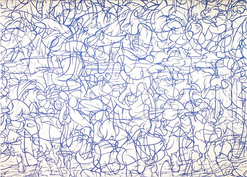
There is an unfortunate sameness factor as some works echo each other’s motifs almost too closely. Sue Williams‘ big gestural painting Mom’s Foot Blue and Orange, 1997 (8’2″x9’) looks decidedly like Arturo Herrera‘s Untitled 2001, a mural (13′ 3 1/2″x 22’ 7 1/2″) of gestural swoops and biomorphic shapes all made with one shade of blue paint. And vice-versa, Herrera’s work looks like Williams’s. I realize that Picasso’s cubist works and Braque’s cubist works look remarkably alike and that sometimes great ideas are in the air and used by more than one artist. But in the context of this exhibit’s close quarters, the points of similarity didn’t serve either artist well and the similarity becomes a curiosity.
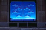
Philippe Pareno‘s sculptural balloon Speech Bubbles, 1997, too, echo almost too perfectly the empty speech bubbles of Neuenschwander’s Ze Carioca. Parreno’s speech bubbles, by the way, were in the ICA’s Big Nothing show in 2004.
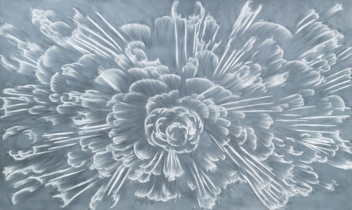
Gary Simmons
boom. 1996/2003
White pigment and pastel on blackboard-paint primed panel
10′ 5 1/8″ x 17′ 4 7/8″ (317.8 x 530.5 cm)
The Museum of Modern Art, New York. Gift of the Friends of Contemporary Drawing and of the Friends of Education of The Museum of Modern Art, 1999
© 2007 Gary Simmons
Here’s what I loved in the show: Gary Simmons‘ big wall drawing, boom, and Ellen Gallagher‘s Oh! Susanna, both of which have a comics-influenced comic-ness that is excellent. You could argue whether either one is abstract but indeed the imagery has been extracted from the comic book world and made to serve in a larger context in art that insists on its origins but then takes you elsewhere. Simmons, whose video performance piece Desert Blizzard (1997) I’d seen at the PMA several times (post here), is a poet no matter what his materials. Here, the blackboard-like drawing evokes not only an explosion but a kind of teen intervention on a chalk board when the teacher isn’t looking. Quiet instead of noisy, boom is subversive and about subversion and the more you look and think the more the work reveals itself.
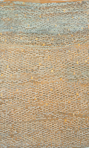
Ellen Gallagher, too, is a subversive who uses whatever materials suit to make a point. Her minimalist array of eyeballs here, like Simmons’ boom, stays rooted in the comics yet strays into an edgier plane where meaning is for the viewer to decide.
Comics are a huge influence on art and this exhibit is one cut at a way to look at that influence. The show leaves out some artists (where’s Elizabeth Murray for example or Tom Nozkowski), and puts in a few I am scratching my head at (Mehretu and Apfelbaum). And just for point of comparison I would have like to see some figurative comics-influenced artists like Carroll Dunham thrown in. Why keep them out if their works have something to do with a broader idea about war, conflict or social commentary. A label can sometimes be too tight a porthole through which to see what’s really interesting.
Comic Abstraction: Image-Breaking, Image-Making
March 4–June 11, 2007
MOMA. See the exhibit on line including many images and some interviews with the artists.


