Before the daffodills bloom I want to quickly post a few pictures from our trip to New York.
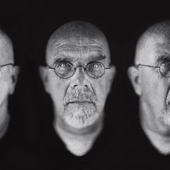
The day was notable for the Jeff Wall exhibit at MoMA which Libby told you about but also for a few other things, like running into a couple of large Chuck Close prints at Max Lang Gallery (in a show that also includes works by Franz Gertsch).
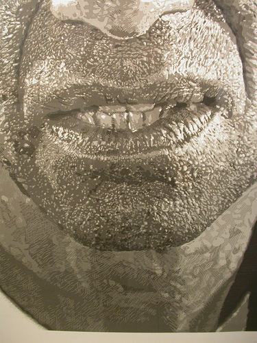
Chuck Close, Alex, Reduction Print, detail
There is no arguing with Close’s power as a portraitist. Here, Alex Katz never looked so difficult, tetchy, serpentine, and compelling. And Lyle (photographer Lyle Ashton Harris I believe) makes your heart melt–his open face, liquid eyes, earnest almost child-like engagement with you are such that you want to have a conversation immediately.
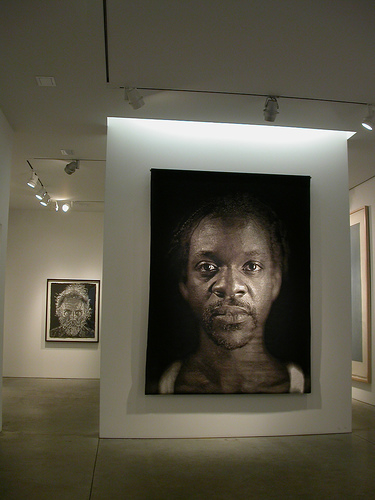
Chuck Close, Lyle
Ruud Van Empel at Stux
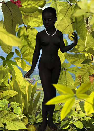
Venus #2 2006
Cibachrome
118,9 x 84,1 cm
46.81 x 33.11 inches
Unlike Close’s portraits which have the feel of the interaction between sitter and artist and are all about human interaction and humanity, Dutch artist Ruud Van Empel‘s works are concept-driven. While they have the format of portraiture they are too generic to be portraits. Instead the chill works seem all about corruption, trickery and the seduction of the mediated image. Van Empel’s children, placed in Edenic scenes and sometimes dressed in Sunday-go-to-church finery, are representatives of an idea of perfection. But the level of faux is ratcheted up so high that you begin to wonder if the children are Adam, Eve — or the snake. Are we being corrupted by them? We are surely meant to be seduced.
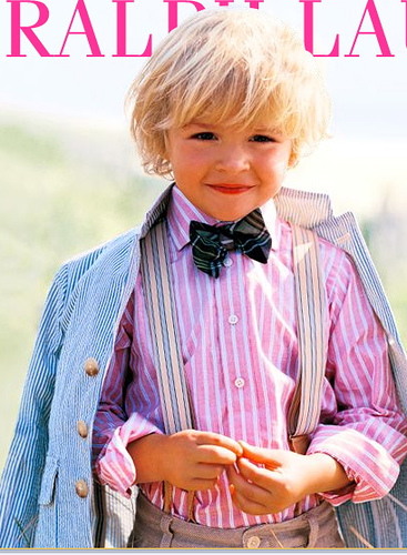
The most obvious point of comparison is with Ralph Lauren‘s current campaign for his children’s clothing line. Lauren’s blonde-haired children are as impossibly perfect as Van Empels. In both worlds, the level of false comfort, seduction and luxe is ludicrous and unbelievable.
Speaking of luxe, Loretta Lux is another obvious comparison. While her children start out as individuals, Lux too is making icons of generic types.
In all three cases, the work is eye candy, some of it powerfully sweet, some of it tart as a Jolly Rancher.
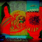
Tony Oursler at Lehman Maupin
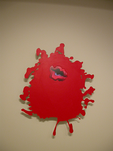
Tony Oursler. Red, Love Hurts. aluminum, acrylic, LDC screen, DVD player
This was a disappointing show. Oursler is best as a provocateur and these works are pleasant but not provocative. The format is part of the problem. The bright-colored splat pushes them dangerously close to Nickelodeon’s goo factor but it’s also an art reference(paint splat). Neither connection works for Oursler whose usual m.o. is angst-driven gothic ambiance. The other problem is the lack of audio something the artist uses to good effect in other works, with words that are interior monologs or free-floating rants. These works probably would look great on any wall in anybody’s house. And that’s fine. But encountering a Tony Oursler show without the usual Oursler punch was like seeing a master take a walk in the park–not so memorable.
The shows mentioned above closed recently.


