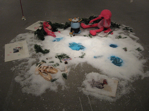
Switzerland, the Pink Panther & Peter Sellers & Boris & Natasha & Gelsey Kirkland in Siberia, 1991, mixed media instllation, dimnesions variable–layers of ballet and movie romanticism go into this childlike dream of impossible, wonderful lives that even include a fondue set.
Linda Harris the security guard grabbed my hand when I walked into the Karen Kilimnik exhibit at the Institute of Contemporary Art and started a conversation as she pulled me along from piece to piece. She was excited at the same time that she was irritated. What was Kilimnik saying, exactly?
As I got the tour, here are some of the ideas that were popping in my mind:
Anna Nicole Smith
Dan Imus
Paul Simon‘s Boy in the Bubble lyric, “The way the camera follows us in slo-mo, the way we look to us all.”
Britney Spears
Sanjaya
This is what Kilimnik is in part examining. We love the glamor; she loves the glamor. Then we love the hurtful gossip about the glamor; she loves it too. Our culture specializes in this strange personal relationship to celebrity and news. We admire, we desire, we hate it, we are it. We make believe we know these folks. “I’m sure she took the drugs.” “Can you believe how much weight she lost?”
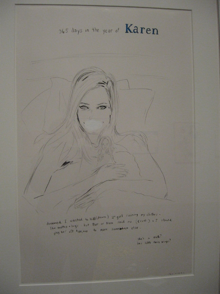
The Clothing Sprite, 2001, crayon & acrylic on paper, 35 x 23″
It’s shallow but we want the 15 minutes. And we want to bring down those who have it with gossip and hurtful words, poking into the private lives of those who have lost all privacy in the grinder of public celebrity. It’s Anna Nicole Smith wrapped up with a bow, tacky and riveting all at once. Even the massacre at Virginia Tech becomes part of our personal loss. We live in other people’s pain, scrutinize the crime photos.
Kilimnik’s show embodies these issues. It’s tacky. It’s compelling. It’s ugly. It’s beautiful. It’s passe. It’s au courant. It’s about celebrities, and fan-dom, and it’s all about her.
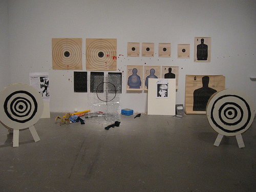
I Don’t Like Mondays, the Boomtown Rats, Shooting Spree, or Schoolyard Massacre, shooting targets, chicken wire, cassette player, cassette, clothing, photocopies, styrofoam, foam core, wiffle ball and bat, badminton racket, baton, mechanical toy dog, toy guns, lunchbox, jump rope, rubber ball, pencils, notebooks, gravel, pushpins, acrylic paint and sound.
It’s lots to think about. So Linda and I thought about it together for a while.
The show is the first American survey for the internationally recognized Kilimnik, who is also a Philadelphia native and still lives around here. It’s an enormous exhibit, taking up the two main spaces at the ICA–on the first and second floors, including drawings, paintings, installations, and videos. The list of works in the show is as thick as a notebook! This is Kilimnik’s second appearance at the ICA. In 1992 she was part of the ICA’s “Investigations” series of emerging artists work. I specifically recall the scatter art piece “Paris is Burning,” which is not included in this exhibit.
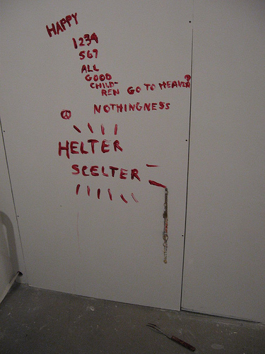
Helter Skelter, 1992, acrylic, costume jewelry, turkey fork, variation of 3
This survey exhibit includes not just the worshipful/snide portraits of Twiggy and Kate Moss. It also includes Helter Skelter, a recreation of the Charles Manson murder scene (a hot subject these days; Alyse Bernstein also has a Manson murder scene recreation of sorts at Showroom–post here, the InLiquid exhibit at the Crane Art Center–see images of Bernstein’s hook rugs of the Manson murder victims here).
There’s a recreation of a schoolyard shooting, I Don’t Like Mondays…, including a related newspaper story and targets galore. And there’s a puddle of pills and white powder in Drugs.
There’s a ghoulish quality to our interest in the dark side, and Kilimnik is Charon guiding us into Hades–not that we really need guiding. We already are there. And that is part of what this art is about.
Kilimnik is the ultimate fan. But she’s not an innocent fan. Neither are the rest of us. We are all voracious stalkers, filled with desire for some life that isn’t ours, for some tragedy that isn’t ours. And we’re all modeling ourselves on some impossible ideal that we want to tear down at the same time that we are trying to live up to it.
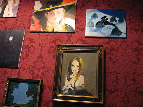
detail of interior of The red room in modern Architecture, by Karen Kilimnik. The dude in the hat is Leonardo diCaprio as Prince Charming
This worship of success takes on other trappings as well as celebrity, as in her Red Room–its full name is “The red room in modern Architecture.” It’s filled with the marks of one brand of success–flocked wallpaper, academy-style installation of oil paintings that quote from art history and the media until they create an impression of Old Master wealth.
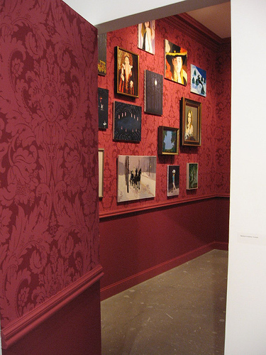
the room is an enclosure floating in the huge, white-box gallery space.
It’s a romantic vision of what wealth could buy. But the room is “in modern Architecture,” i.e. in the middle of a white-box gallery that is another brand of success. It’s almost as if Kilimnik is undermining her real success and opting for the dream world. Red Room is the centerpiece of the downstairs installations.
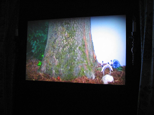
Tiny ballet dancers (look closely lower right) from classic footage are montaged onto a romantic sylvan scene. Birds chirp. The video is inside a pristine white folly.
The upstairs centerpiece is “The bluebird in the folly,” an enclosed garden gazebo with a video within depicting a collage of classic ballet footage onto a romantic wild garden setting. I’m reminded of Hilary Harp and Suzie Silver‘s bacchanal videos in the woods with the mix of theatricality and desire for some dream world that never was–except Harp and Silver keep some sort of sense of humor. I’m also reminded of Justine Kurland’s dreamy nudist utopias with their back-to-nature romanticism. The upstairs guard (he told me his name but I forgot it) said the folly was his dream house, a perfect place. It is installed in a room with pale blue paint and white moldings as well as traditional paintings of objects of desire. The paintings, like the ones in the Red Room, have the smell of Old Master wealthy conservatism.
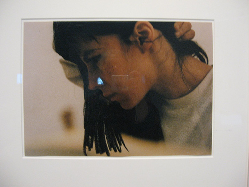
My Nose Job to Look Like Brunette Model from 60s Who was Sick, 1990, c-print, 17 x 21 inches
Nearby, in a white-box section, hang a row of self-portrait photos in which she role plays–but although these are influenced by Cindy Sherman, there’s no real attempt to be who she is portraying. The same gentleman who said he loved the folly said, “It’s as though she’s looking in the mirror.” That’s just right. It’s as though she’s a 10-year-old looking in the mirror. There’s a childishness in this work, a direct channel to the dreamings of a girl who’s trying to figure out how to be the objects of her desire–how to be perfect, how to be thin, how to be famous. Nearby is a 6-hour video in which Kilminik uses and distresses the movie Heathers, the ultimate movie about teen desire to be in with the in crowd and then discovering the in crowd is not such a nice place to be. That child-like yearning is also all over the pieces that relate to the romanticism of ballet–a cruel faux life in which perfection includes bulimia and bunions.
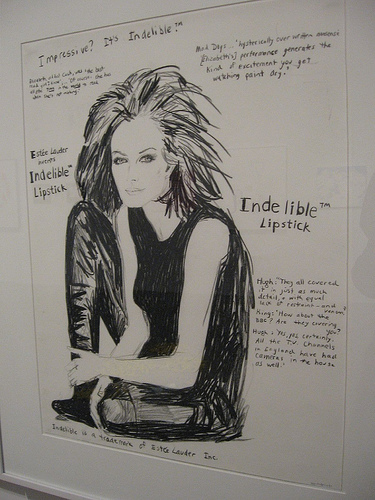
Indelible, 1997, crayon on paper, 35 1/4″ x 29 1/2″ framed
I think this is an amazing show. I totally buy into the cheesy, stylized fashion-model style drawing of celebrities that come straight out of the old, hand-drawn fashion ads that used to run in the Sunday New York Times. They remind me of early Andy Warhol when he made fashion drawings for a living, and they also relate to the fashion-inspired vacancy of Elizabeth Peyton. The writing, some of it supporting the glam images, some of it undermining the glam, is part and parcel of this tradition of drawing for the fashion industry.
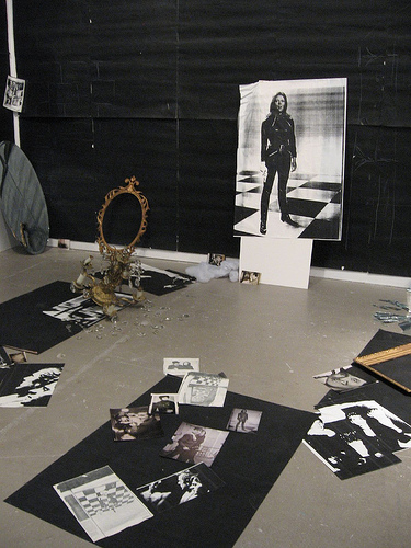
detail, The Hellfire Club episode of the Avengers, 1989, mixed media installation, variable dimensions, variation 1
I’m feeling bad that I didn’t mention Kilimnik’s classic scatter art installation of the Avengers–another example of an unachievable, romanticized fashionable ideal that includes cool killings. So there it is. I can make the same points I’ve been making all along. It’s a perfect fit with all the other work here. See all of it and have fun.


