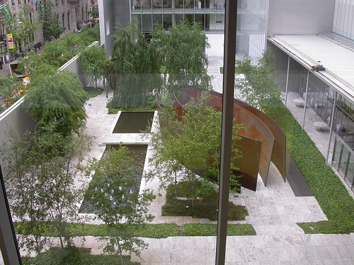
Richard Serra sculptures in the Sculpture Garden, MoMA. Note the photographer on the roof taking overhead pictures.
MoMA was packed last Thursday. I said to Steve remember when we used to come visit the old MoMA, the little squishy MoMA? We would make trips to New York from Madison all the time in the late 1970s. We were always there the week between Christmas and New Years, a high tourist invasion time. Yet our trips to MoMA — in my rosy memory — were not marred by uber-crowded conditions.
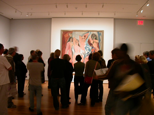
Crowd in front of Picasso’s Demoiselles D’Avignon, now celebrating its hundredth birthday.
Alas in the new MoMA, with thousands of square feet more space than in the old museum, the crowds are formidable, and apparently, ubiquitous. We got a nice unimpeded (well, except for a window) and uncrowded view of the Richard Serra sculptures in the Sculpture Garden then wandered around the museum dodging bodies in the photography section and the Modern Art section. When we got to the Contemporary Galleries, darn, they were closed for installation.
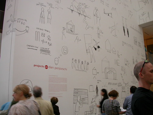
Dan Perjovischi’s wall writing project in the atrium.
A project of wall writing by Dan Perjovschi in the atrium is just this side of silly. OK, it is silly, and clunky and simplistic. Give me Dave Shrigley any day. This piece, which aspires to Schrigley-ness, doesn’t have the bite and wit.
Chelsea
Friday I walked around by myself and saw a lot of stuff. Here are some highlights:
Watch The Way Things Work
The Swiss artists Peter Fischli and David Weiss whose The Way Things Work video we all adore are showing photo stills from the piece and a 3-hour video Making Things Work at Matthew Marks.
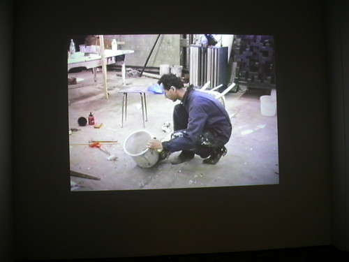
Either Fischli or Weiss trying to make things work at Matthew Marks
Making Things Work documents how they got the Rube Goldbergian array of hardware and garage toss-offs to make their magic. I sat through a little of the film and got the sense of how hard they worked then had enough. The photos are lovely still lives of object-groups. There must be a couple hundred photos and frankly I was overwhelmed after the first wall.
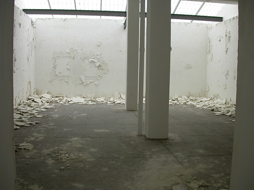
Andy Goldsworthy’s forlorn mess at Galerie Lelong.
Andy Goldsworthy plastered the walls with porcelain at Galerie Lelong. The process piece will crack, fall down, crumble and look like ….Eastern state Penitentiary which we know and love for its equally hellish and abject state. Goldsworthy probably wasn’t thinking prisons or war when he made the piece but White Walls, in our current day of total war, suggests thoughts of war, bombed out and abandoned buildings and (by their absence) refugees.
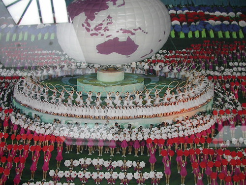
Andreas Gursky, Pyongyang. detail
There is a lot of interesting photography in New York right now. Not only our gal, Zoe Strauss, but Andreas Gursky at Matthew Marks Gallery with several works showing Formula One racing teams in the pit working on the cars and other shots taken in Korea at the Korean gymnastic games. As usual, Gursky’s works are beautiful and chilling, with their all too manic arrays of people and subject matter that questions contemporary values (cars, gasoline, winning, competition).
Kelli Connell‘s show at Yossi Milo is also great, the images playing with ideas of narcicism, doubling, seduction and secret lives. The occasional pixillation in the big digital prints — in some of the shadows on the character’s arms etc but never the faces — bothered me and I wondered if it was intentional and demonstrating (just in case you hadn’t noticed) that the entire photo was faux. Or whether the works had been printed too large.
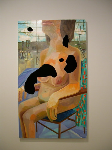
Dana Schutz is having a lot of fun. In her show at Zach Feuer she’s revisiting art history every which way and her works evoke not only Surrealism (what are those black Dalian holes anyway?) but Elvis on velvet with the real velvet panel hidden beneath the painting and poking through so perfectly. There was a Mona Lisa, there were a few that reminded me of David Hockney, there were studio nudes and a birth scene that featured a Hudson River landscape in the background.
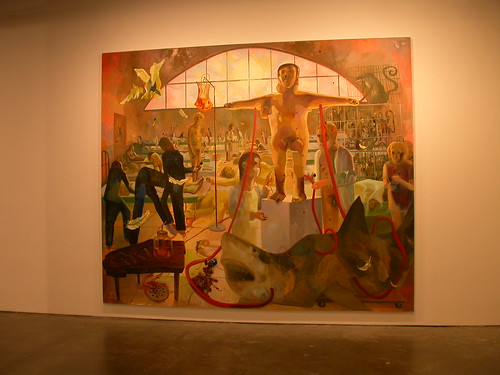
Dana Schutz, How We Cured the Plague.
When I was there someone asked the attendant at the desk how people were responding to the show and did there seem to be a favorite painting. The young woman said people liked How we Cured the Plague, the largest work and one that reminds me of Jeff Wall‘s set-up photographs as well as Charles Wilson Peale pulling back the curtain to reveal his academy of wonders.
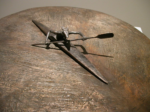
Jose Bedia at Galeria Ramis Barquet
Jose Bedia‘s paintings and sculpture at Ramis Barquet caught my eye as I wandered the streets. The sculpture held my attention far longer than the paintings did. The paintings, which in some cases evoke a breeching whale, in other cases devolve into impenetrable abstraction. The sculpture is crisp, iconic and direct. The journey through life is solitary and hard with moments of beauty.
Sean Landers‘ word art at Andrea Rosen left me cold. While in its grey color and scribbled block letters it reminded me ever so slightly of Cy Twombly the whole was less intriguing than a found grocery list. At least Christopher Wool comes out and says something with his words, Landers’s paintings are a muddle and you just don’t care what the words add up to.
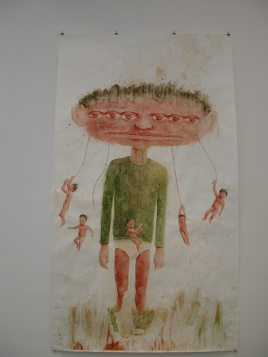
Michael Kalmbach at Robert Miller Gallery
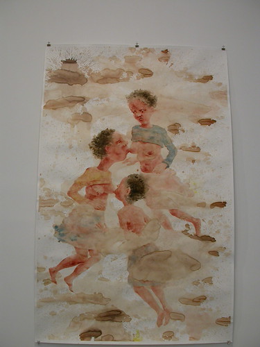
Finally, Michael Kalmbach‘s oversized illustrational drawings at Robert Miller are odd and somewhat disturbing. However, for all their dreaminess, the works are undercut by their large scale and by the way they are pinned to the wall. The imagery is intimate and book scale would have been perfect.
The works suggest play and their sometimes-splotchy sometimes-exact drawing style suggests kids’ paintings done by an adult. The subject matter is relationships and the human condition and we’re either all either suckling each other or living in explosion-filled voids conducive to crack-ups and ill health.


