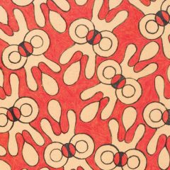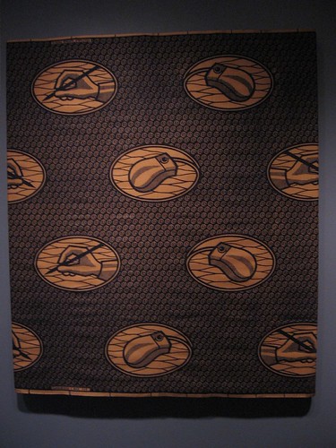
Factory-printed cloth, Nigeria, late 20th century
Here are a couple of great things I learned Sunday about traditional African art: white eyes on a mask mean communication with the spiritual world, or elongated female figures represent female beauty. I learned this from my friend Stefanie Taylor’s friend Bonnie Gottlieb. She’s a docent, and she took us–Stefanie, Paul, Murray and me–on our own private tour of both the Contemporary and traditional African art at the Smithsonian’s National Museum of African Art.

Stefanie sporting some of the jewelry she makes
Before we got there, however, we stopped at Stefanie’s gallery in Bethesda. The gallery is currently named Creative Partners, but it turns out that’s an unfortunate name for a gallery in this internet age when people troll searching for sex and pornography. “So, how creative are you?”
A name change is in the works.
Stefanie makes jewelry–big stuff. And I’ve been trying to get her to sell me something for years (I did buy some earrings, Sunday). Her work and that of another jewelry artist were the highlights for me.

Hogs and flags. I love the sweet little soldier doll on the back of the far left motorcycle.
Then we headed to the Mall. After we faced down the challenge of getting from the Metro train to the escalator at our stop, we paused to watch Rolling Thunder, the gray-haired ponytail set (description by Paul) on their motorcycles, coming to express support for the troops on Memorial Day weekend. Honestly, a lot of these guys looked pretty much like they did when they came home from Vietnam. According to the news reports, they were 100,000 strong. One of the cycles sported an old bumper sticker, “I’m not Fond’a Hanoi Jane,” preserved under lots of cellophane tape.
Disney-Tishman collection
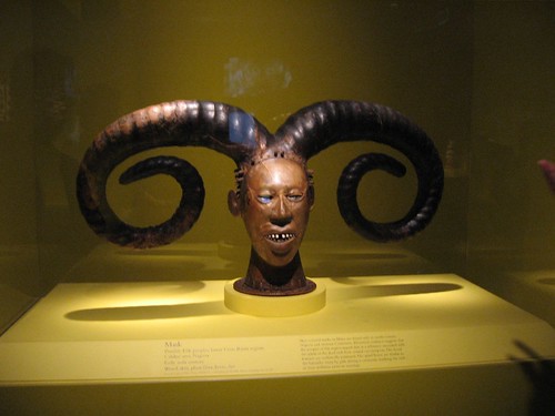
This mask is covered with stretched antelope skin. Men wear it on top of their head, their bodies covered with raffia, to honor the beauty of women.
Next, we met Bonnie for the African art. Bonnie was most knowledgable about the traditional work. She led us through a display of 88 objects selected from a 525-object collection, which was donated to the museum by the Walt Disney Company. Disney had bought Paul and Ruth Tishman’s collection of African art with the plan of displaying it at Epcot. Didn’t happen.
We also learned that many of the collection’s objects still haven’t been researched and explained. The curators are working on it. But the ones on display seemed to have quite a bit of information on their labels. As we looked, I had to keep reminding myself of what I learned from the Philadelphia Museum of Art’s fabulous Africa exhibit a couple of years ago–that African traditional art was made to be used, not admired on a pedestal in a vitrine. It didn’t stop me from admiring, however.
Contemporary African art
But it was the contemporary work that set me thinking about the links between what I was seeing in the museum and what I have been seeing in Philadelphia, lately. The contemporary work was in a couple of exhibits, with a lot of strong work in an exhibit of work with text, Inscribing Meaning: Writing + Graphic Systems in African Art.
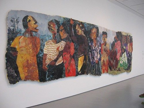
Some of the most exciting recent work came out of South Africa, reflecting the turmoil and excitement surrounding a society that reinvented its government and morals. A mural-sized collage of citizens in line to vote for the first time, after the dismantling of apartheid, was exuberant–a crowd pleaser. The artist, Kay Hassan, used scraps from a billboard near his studio, as well as staples. It seemed awfully fragile, as if that vote was here today, maybe gone tomorrow.
The nightmare of apartheid and the aftermath testimony for the Truth and Reconciliation Commission formed the basis for a number of dark pieces at the museum, including the suite of William Kentridge etchings based on Alfred Jarry’s Ubu Roi character. (I’ve got a little more about Kentridge later).
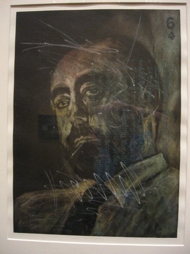
Kim Berman, Playing Cards of the Truth Commission, an Incomplete Deck, Scratching the Surface, mezzotint, drypoint, engraving on paper, South African, part of suite of 28 prints, 7 in the exhibit
Kim Berman’s scratched portraits of some of the bad actors of apartheid, depicted in Playing Cards of the Truth Commission, an Incomplete Deck, Scratching the Surface also reminded me of Kentridge, partly for the look of the work, and of course because of the subject matter. These were beauties with velvety blacks and great imagery. The people depicted were all famous, and Paul and Stefanie, who lived in South Africa during that period of governmental change, were familiar with a number of the people portrayed. I recognized only Botha. But no matter; the darkness of what’s going on here is material as well as textual, scratched into the images, which all are numbered playing cards (a pack of knaves).
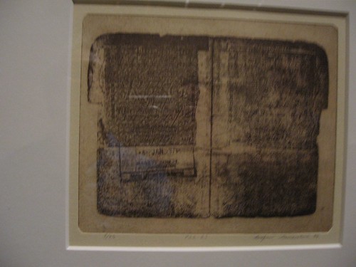
Rudzani Nemasetoni, from Apartheid Scrolls, 1995, etching on paper, inspired by his father’s offical South African identification document
Three pieces by Rudzani Nemasetoni were inspired by his father’s offical South African identification document. I immediately thought of Mark Shetabi’s painting of his passport that was at Jeff Bailey Gallery in New York. Shetabi’s image reflects a confusion of identity even though the document is proof of an identity. The African document is proof of outsider status, and the art is about the government’s shameful imposition of an inferior status, sort of the equivalent of the yellow Stars of David the Nazis required Jews to wear.
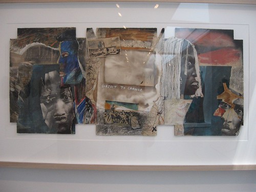
Garth Erasmus, Subject to Change, mixed media on cardboard 1990, South African
Another piece, Subject to Change, by Garth Erasmus, reminded me of the Georges Adeagbo installation at the Philadelphia Museum of Art. Some of the sense of flux, of instability, the whirlwind of information and changes, was present here too, but on a smaller scale.
I loved the piece of factory-made fabric (see top of post) with computer mouse and pen-in-hand medallions–an expression of modernity and tradition woven into the cloth.
These and other works in the contemporary exhibits broached on issues of race, politics and culture. But so did the traditional work. There were items made from Czech glass beads and intricate carvings on ivory that reflected European presence. Even the powerful god Shango was carved as a pipe-smoking Englishman in a pith helmet, riding a motorcycle, in one of the pieces.
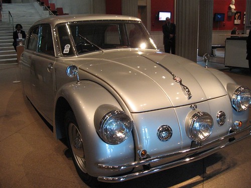
This is the only picture allowed at the Modernism exhibit. The 1938 Tatra 77a was designed by Hans Ledwinka with Paul Jaray. The car was the glitziest object in the show, other than a few teapots and fashions.
Power of the state, modernist style
We also went through the Corcoran’s Modernism exhibit, an exhibit with few visual rewards although the information was interesting. The main thing I came away with from the exhibit of objects, architectural models and art from the Victoria and Albert Museum is that Modernism was inspired by totalitarianism. The highlight was the Vladimir Tatlin Monument to the Third International model, which managed to project exuberance and optimism for all its totalitarian ideology. I also enjoyed the vintage movies, including some Chaplin and Leger work. One of the movies, Dziga Vertov’s `The Man with the Movie Camera,’ seemed like the direct ancestor of William Kentridge’s all too human camera which becomes the spying eye of the state. The museum didn’t allow pictures. For the most part, not a big loss.

Beth Cavener Stichter, i am no one, Stoneware, 32 in. h x 37 in. l x 30 in. d, photo: Noel Allum, 2006
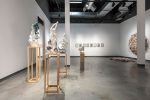
The Renwick, also was down on cameras. Too bad. There were some nice pieces there, but Murray, by now was done with art. He waited for us in the lobby, as we got an impromptu tour of this year’s Craft Invitational by the security guard. I don’t have his name–I’m really sorry. He was informative and enthusiastic. The exhibit featured four artists (selected from 400 applicants)– glass artist Paula Bartron, paper artist Jocelyn Châteauvert, glass artist Beth Lipman and ceramicist Beth Cavener Stichter. Stichter pondered the power of life and death in beautifully built ceramics, and Lipman worried about excess and over-consumption in a profusion of glass objects on a banquet table, but Jocelyn Châteauvert looked to the clouds. Her paper waterlily installation overhead was a show-stopper.
The other occupation in Washington was a movie Saturday–the Julie Christie movie, Away From Her. Christie and her co-star were excellent, but the film was totally depressing. A hanky is not enough for this one. All in all, I’d rather look at art.


