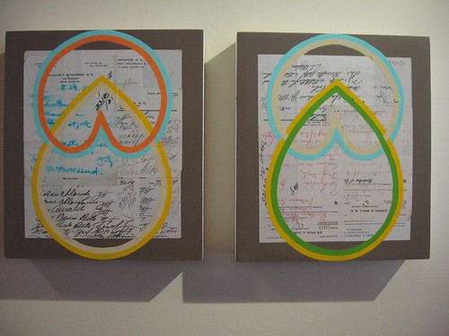
Timothy Gierschick, Remission 1 & 2; latex and enamel on collaged prescriptions on panel
Local artist Timothy Gierschick’s small (and one not so small) paintings and collages on panel glow with sweetness and yummy colors over at the Green Line/Powelton Village.
Gierschick has been developing a sort of iconographic language of logo-like, elusive shapes over time–shapes that come close to but avoid universal icons like hearts and teardrops. They kind of remind me of Richard Tuttle–letters to some unknown alphabet–and the runic marks of Warren Rohrer across a field. This time, Gierschick puts his arcane vocabulary to especially good use.
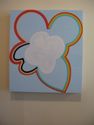
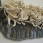
Knot; in this one the brush’s gestures turn the iconographic white cloud into a knot. latex and enamel on panel
Several of the works show the shapes layered over old prescriptions, and suddenly the icons made a lot of sense to me. They became ideals, some kind of perfect thing, as well as some kind of arcane language. This is pure Plato made lovely with color and meticulous craft. The prescriptions beneath are imperfect and about sickness; they are things that no longer have the power to heal.
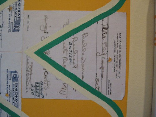
Vector, W, detail, showing one of the old prescriptions is for belladonna. latex and enamel on collaged prescriptions on panel
The prescriptions by the way are found items. I bumped into Green Line owner Douglas Witmer when I was headed for the exhibit. He mentioned that he himself had found the prescriptions a number of years ago in the metal draw of a pharmacy cabinet that he keeps on his desk for the cubby holes. After hanging on to them for a while, he gave up hope of finding a use and passed them on to his old schoolmate Gierschick, who, two or three years later, found a use–these works on panel.
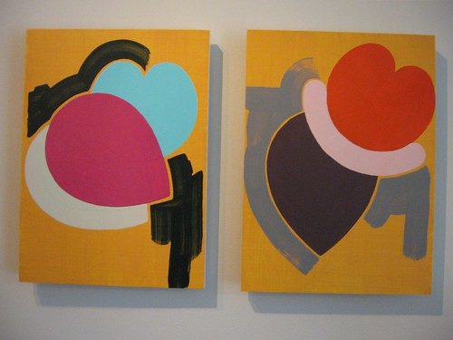
The juiciest pieces in the show have no prescriptions. Fruit 1 & 2, with their mango backgrounds and repeating rosy globular shapes are vertical still lifes, an oxymoron in art historical terms. The shapes, although they do evoke fruits, also evoke figures and seem at some level to be portraits. Again, the painted shapes are signals, a sort of language.
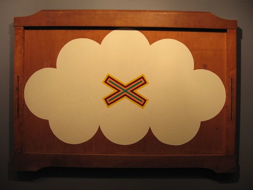
Voice (small); this is a bed footboard.
Even Gierschick’s clouds manage to avoid being trite and sappy because their shapes are reduced to icons, which, again, suggest language and idealized forms. For all that, they are awfully sweet; I wondered if they were some kind of self-identification. The x over the cloud in Voice (small) is like a harsh stamp, its small size having surprising impact over the white fluff behind it.
In this show, Gierschick has tipped his hand a little more than usual–to good effect. It’s humanizing. It’s like he has come down to earth and discovered his own heartbeat.


