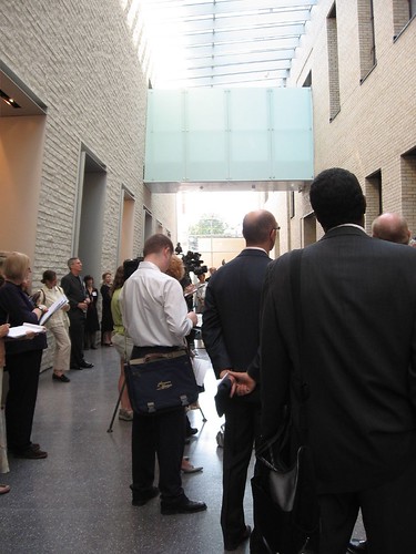
Press listening as they stand in the Skylit Galleria of the Art Museum’s new addition, the Perelman Building
The thrill shined through this morning at the press opening for the new Perelman Building addition to the Philadelphia Museum of Art. “I stand here pinching myself quite hard,” normally unflappable PMA Director Anne d’Harnoncourt declared into the microphone to a crowd of cameras, microphones and people, all gathered in the Skylit Galleria.
A ribbon cutting ceremony Sept. 15 will mark the opening of the new Ruth and Raymond G. Perelman Building to the public, she said.
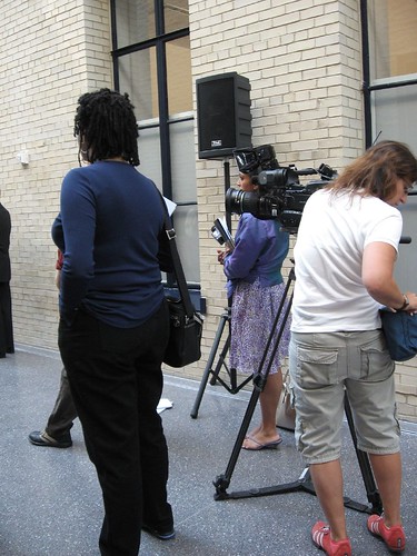
more press, Skylit Galleria, and cameras
The galleria, indeed skylit, links the original building that was once a temple to life insurance with the new construction. It’s a glorious space, quirky enough to be interesting, yet calm and grand all at once.
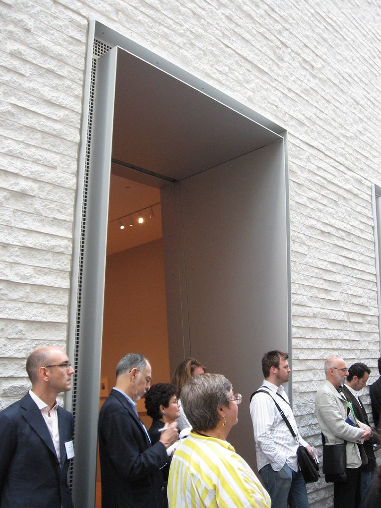
The doorways to the galleries are thick and look kind of Inca.
“Two weeks ago, only two or three things you see today were on view,” d’Harnoncourt said, adding that the museum ran out of space about 30 years ago! By next year, 180,000 works of art will move in.
PMA CFO Gail Harrity stressed how the two buildings were linked–among her examples, she said the original building’s designers–Zantzinger, Borie and Medary–together with architects Horace Trumbauer and Julian Abele, also designed the PMA parthenon, and that both buildings share color advisors as well as stone from the same quarry. “So this moment today was meant to be.” On a less poetic note, she mentioned that the museum hasn’t expanded its footprint since 1928!
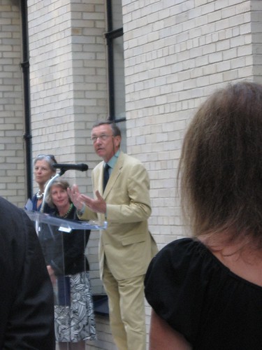
Architect Richard Gluckman, principal of Gluckman Mayner Architects, responsible for the building’s design.
Then the man of hour, the day, and the week–architect Richard Gluckman spoke about the issues the architects faced in coming up with a design that preserved the light provided by the “highly perforated” original building (i.e. it’s loaded with beautiful windows) at the same time the design protected and displayed the art. He said the “warped wall [of the galleria] was a poetic and pragmatic response,” because it keeps the skylight a perfect rectangle, something that its glass elements require, at the same time that the floor fans out into a trapezoid to accommodate crowds at one end.
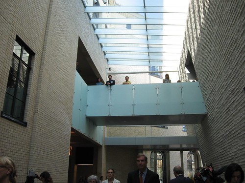
The space reminded me of a ship.
Then d’Harnoncourt took the microphone again to announce the Wachovia Bank had donated $500,000 to provide free admission to the new building through December 31st.
It wasn’t just the administrators and the architect who were filled with pride at the opening. All the curators and the volunteer tour guides could barely contain themselves. One of the volunteers–she had seen me look puzzled during the speeches– buttonholed me after to share a fact she divined I might not have understood.
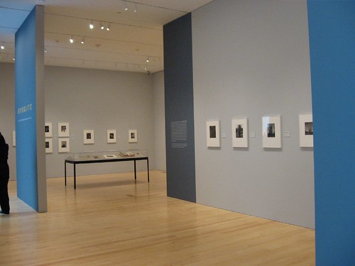
The Stieglitz show, installation shot, in the new Julian Levy Gallery. The space includes a bench (oh wonder of wonders) and wonderful shots of Dorothy Norman and Georgia O’Keefe. O’Keefe’s 1949 donation of Stieglitz photographs became the cornerstone of the PMA’s photography collection.
PMA Curator of Photographs Katherine Ware, who curated the Alfred Stieglitz show in the new Julian Levy Gallery (yesss, out of the hallway into a real art space), was thrilled about not just the new gallery space but the storage and work space which has expanded exponentially. We stopped in the Center for Prints, Drawings and Photographs and admired the gazillion card files and wondered when we had last seen card files in the age of computerized record-keeping and searches.
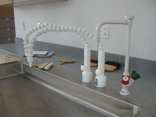
in the art conservation lab for paper, one of the high-tech faucets.
Another behind the scenes treat was the art conservation lab for paper. The high-tech equipment expressed wonderful design. And looking out the window, there was a Miro sited at the narrow end of the galleria.
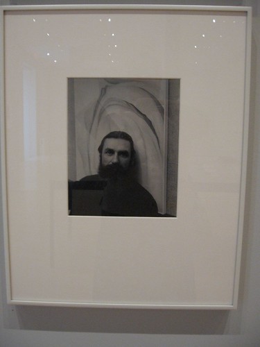
Ware thoughtfully included a photograph by Stieglitz of popular PAFA art teacher Arthur B. Carles, dating to 1923.
I think Andrea and Roberta are going to talk about what’s in the galleries–Stieglitz, three Philadelphia-born fashion icons (James Galanos, Gustave Tassell and Ralph Rucci), modern and contemporary sculpture, and 20/21st century design landmarks. I’m not a fashionista (duh), but even to me, seeing the fashions on display was a treat.
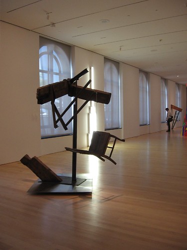
Although these galleries have a need to be windowless–not necessarily the exhibition space for sculpture. With its windows on either side, the space took my breath away. I was especially happy to see the early di Suvero, from a time when he still had a sense of humor (he hadn’t yet broken his neck; that would make a difference). I also was glad to see Richard Long’s Limestone Circle, of real rock, next to Sol LeWitt’s Splotch, plastic fantastic stalagmites.
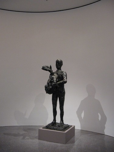
Picasso, Man with a Lamb, in the rotunda entry to the sculpture gallery
Nearly a year ago, when we took the hard-hat tour of the space, the walls were only framed out with metal lathe, but it already looked spectacular. Seeing the space walls in place is the cherry on the cake.
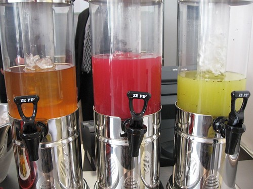
Even the cafe was beautiful in this new building, each detail carefully considered.
But the building is just the beginning of a number of expansion opportunities for the museum. Modern art Curator Michael Taylor, who was part of the sculpture gallery team, was looking forward to the museum commissioning sculpture–for a sculpture garden that will be atop the new parking garage. “We don’t have a good deal of large sculpture,” he said, relishing the prospect of both the garden and the Frank Gehry expansion–Taylor described it as the big dig under the fountain.
“This is part of a moment where there’s more energy and more life,” he said.


