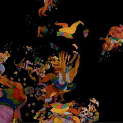
Joyce Kozloff, Helium on the Moon, 2007, acrylic, colored pencil and collage on canvas, 60 inches
I was wowed by two very different artists last week in New York–Joyce Kozloff uptown at DC Moore and Gordon Moore in Chelsea. Yet two more different painters would be hard to find.
Joyce Kozloff
Roberta and I have been great admirers of Kozloff’s work since we first came across it by accident at DC Moore Gallery several years ago–pre-blog, which means prior to 2003. Kozloff small, heavily detailed maps, based on real ones plus a lot of imagination and a love for pattern and color, transcended all her sources as she not only referenced real historical maps, but also overlaid a geo-political conversation about maps as representations of cultural and economic hegemony. This was beauty and the beasts of power and invasions.
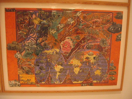
Joyce Kozloff, Going Global, 2004, etching, collage, watercolor, pigment print, acrylic, colored pencil, 32 3/4 x 47 7/8 inches
Kozloff’s collaging of borrowed imagery from colliding cultures was the perfect representation of mergers of ideas and social systems.
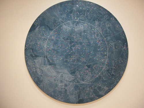
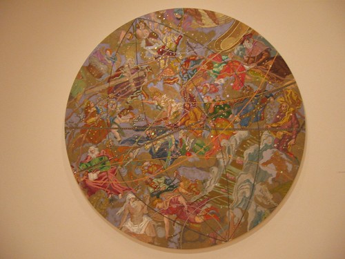
Kozloff’s the moments and hours and days of our lives, 2007, acrylic, colored pencil and collage on canvas, 60 inches; the arc lines depict satellite orbits.
This time, Kozloff’s exhibit at DC Moore contains several bodies of work,including maps and appropriated imagery piled on in layers. The work–70 pieces in all–is dense with ideas and patterns and color. Kozloff pulls the hat trick of wearing her politics on her sleeve at the same time that she sustains enough ambiguity to leave lots of room for interpretation and exploration.
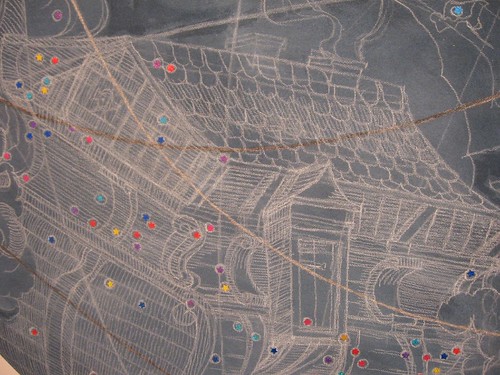
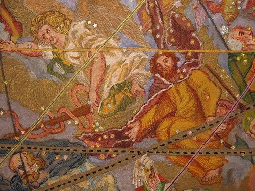
Kozloff’s the moments and hours and days of our lives, detail
What I liked best were the American History series of collage/prints and the five large tondos (60″ diameter and a pair 48″ diameter) in which the circular form becomes a metaphorical map for the shape of the globe or for the star-studded dome above. Her pieces “the moments and hours and days of our lives” and Helium on the Moon are a kind of day and night, the heavens of science and the heavens of art history, plus people and maps. They are crowded with people and places and a sense of solid-packed action and decoration. There’s a Brueghel-like exuberant excess and earthiness in the works’ starry space.
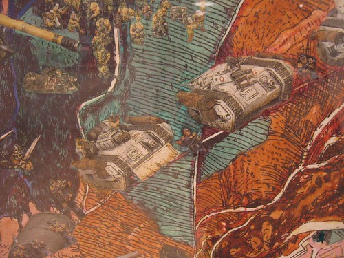
Kozloff, detail, American History Going Global
The American History series–layered collaged images printed on rectangular paper–include episodes like the discovery of the New World, American expansion westward, and recent wars. While you can pretty much predict what Kozloff has to say about these issues, avowed feminist and liberal that she is, you can’t predict how she says it, other than she will layer and decorate and borrow imagery–from our culture and others, and, in the amalgam, will find a new way to make a surface by its nature flat into something with plenty of intellectual depth, without stinting on beauty.
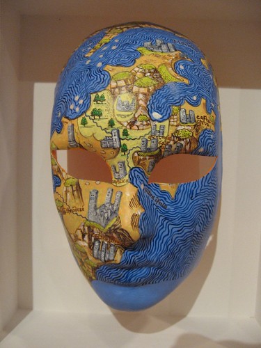
Joyce Kozloff, from the Voyages series, cast paper, watercolor and acrylic
Although the maps painted on paper masks in the Voyages series were beautiful, I wasn’t too crazy about the masks–not because they are masks, but because of the kinds of masks they are, very stylized and fashion mannequin-like. Yet the mapped surfaces are so beautiful, it’s hard to just dismiss them. The banner-like Voyages: Carnivale I-VIII seemed more like studies than finished work.

Gordon Moore, Road Work, 2007, latex, ink pumice on canvas, 30 x 66″
Gordon Moore
In utter contrast to Kozloff, with her non-perspectival layered, heavily wrought surfaces and borrowings of imagery from cultures around the world, was the work of Gordon Moore at Betty Cunningham Gallery. Moore’s totally Western-tradition paintings of macho scale and subdued colors call to mind skin and the walls of houses and buildings–the inside and the outside. Depth is expressed with economy of means–a shadow, a darker tone, or a line disappearing behind the edge of a rectangle. The rectangles suggest a grid–of buildings, streets, windows and walls that extend beyond the edges of the canvas. The space that’s not really space reminds me of Richard Diebenkorn.

Moore, Clothes Line, Latex, ink, pumice on canvas, 90 x 66 in
The paint is an insistent presence, sometimes wrinkled, sometimes flat as a pancake, often with gradations of color that announce themselves before they announce
what they represent spatially. That flip-flop between paint and representation is done with stunning economy. The large scale creates a relationship between the viewer’s body and the space and surfaces of the paintings.

Gordon Moore, untitled, 2006, Ink, acrylic on photo paper in artist steel frame
I don’t often like work this reductive. But these are smart and pretty terrific. I’m sold.
In a way these two artists represent to me two opposing views of art making. Yet the two together were the high points of my day in New York.
Other stuff of interest that I saw–
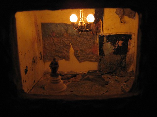
One of Adia Millett’s small constructions inside mud coated boxes
Adia Millett’s exhibit Blind Premonitions at Mixed Greens is all about the back room, a darkened space filled with doll-house scale scenes glowing from within small mud covered boxes on pedestals. The scenes are mysterious and surreal. The photos of these same scenes are in the front room. The photos might discourage you from going the distance to see the three-D pieces in the back. That would be a mistake.
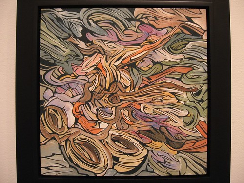
Emilio Perez; this is a smaller piece, maybe 12″ x 12″, acrylic and latex on wood panel
Emilio Perez’s paintings on wood panel at Galerie Lelong are terrific, reminding me of comic book action drawings and Japanese woodcuts and topographical maps. I was with Diane Burko, who suggested Kate Bright for comparison, with her slick paintings of watery patterns.Perez’ paint control and sense of color are terrific, and give his work a tactile, almost ridged surface. The scale varies from small to extra-large, and I want to see more of this guy’s work.
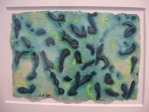
Lee Krasner, from Seeds, Earths, Waters and Hieroglyphs series, gouache on paper
Works on paper from Lee Krasner have been far too long in hiding. In her exhibit of gouaches, pastels and collages at Robert Miller Gallery, the gouaches, from her 1969 series Seeds, Earths, Waters and Hieroglyphs, take the prize for fresh color and ebullient, unforced handling of materials. They looked good as new.
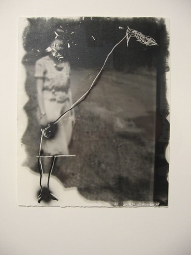
Gerald Slota. The fish on a string rescues this photo from harsh graffiti and makes it fly.
At Hasted Hunt Gallery from contempory artist Gerald Slota as well as vintage work from Lisette Model and Aaron Siskind. The Siskinds were my favorite, from the Pleasures and Terrors of Levitation series from 1956. The figures in air are calligraphy against the sky. But you probably know what I might think about both the Models and the Siskinds–same as you. Slota scratches and draws on found snapshot negatives. The markings pinned an added layer of contemporary casual aesthetics to an image emerging from times past and lost. Some of the marks reminded me of a moustache drawn on an image of the Mona Lisa, but these Mona Lisa’s weren’t cultural icons but personal ones. In some cases it felt a little like playing a prank on someone really nice.


