Post by Andrea Kirsh
A Gem in Beijing

The National Grand Theater in Beijing, otherwise dubbed the Pearl or the Egg, etc. All photos in post by Andrea Kirsh
My first trip to Beijing, it turns out, was at an important moment for its contemporary architecture: the National Grand Theater was finally open (more-or less; the building is not entirely finished and regular programming will only begin in December). The building, first proposed by Zhou Enlai in 1958, was designed by Paul Andreu, the Frenchman who won the international competition in 1998. Known as “the Pearl,” “the Egg,” or other less flattering monikers, the world’s largest dome is sited on the imperial axis of the city between the Great Hall of the People (the center of government) and the Forbidden City.

Reflection of the theater and the Great Hall of the People in the moat
I can only comment on the exterior, as it’s not entirely open for business, but I think the theater is a smashing success. The elegant dome is surrounded by a moat whose water mirrors its glowing image from all directions. It is set within a very large and beautifully-landscaped park, and while one can see the Great Hall of the People behind, with suitably-militaristic giant columns in formation across its façade, the two buildings do not compete. That intervening space is an ideal solution to the problem of siting ambitious modern buildings in the midst of significant older neighbors.

Steps descending from the park to the entrance
The dome covers four performance halls, which are underground. Only a third of the building is visible at ground level and the entrance is via a bank of steps that descend from the park. This is civic architecture at its best: the building is grand, imaginative and memorable, and its surrounding setting is a magnet for the public, which encourages them to spend time there. It was already a popular background for family photographs on the day I saw it, and my guess is that its user friendliness will quickly win over its critics.
The public landscaping throughout Beiing was a great surprise. I don’t know whether it’s part of the Olympics mania that has already taken over the city, but every square inch of visible land was planted: not only all the median strips on the roads but even the banks of land at the sides of highway entrances. And very beautifully-planted, I must say.

floral Olympic cyclist outside the Temple of Heaven
Then there were the floral displays: endless large arrangements of potted plants in bloom, some of which created recognizable images (many on obvious Olympics themes, although one at Tian’anmen Square recreated the Temple of Heaven). I wondered about the aesthetics of the repeated combination of red, yellow and purple flowers, and asked my guide. Turns out they weren’t chosen for aesthetic reasons, but because the colors have particular meanings: yellow is the imperial color, red connotes good luck and purple is auspicious for some other reason I’ve forgotten. I learned to inquire about everything.
Tse Dang, Tibet: Further Architectural Wonders

The Spa and Health Club, Tse Dang, Tibet
One of the more surprising buildings I saw was in Tse Dang, Tibet (or Tibetan Autonomous Region, China). Tse Dang is an improbable, modern Chinese city which obliterated a Tibetan town west of Lhasa. The building in question was one of the complex of Western-styled structures that constitute the Tse Dang Hotel, billed as Tibet’s only five star hotel (but run like Fawlty Towers).

a window form that never occured to Sangallo or Michelangelo
The Spa and Health Club was clearly intended to recall a sixteenth-century Italian palazzo, but everything was slightly wrong: the windows were square and bisected by horizontal sash windows; the columns were squat and the capitals had swags from I know-not where; and the entrance was flanked by very-Chinese lions.
I caught myself thinking that European Chinoiserie must have looked equally absurd to the Chinese; but then, when William Chambers designed the Pagoda at Kew (1761-62), he did so for an English audience at play, whereas I suspect that this hotel was intended to impress important Western visitors. Well, impress me it did! I’ll never forget it.
Of Art and Gardens
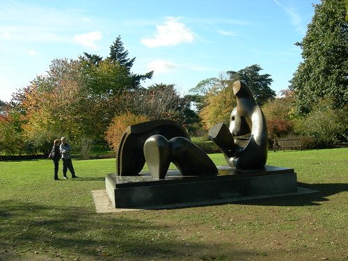
In London, on my way back from East Asia, I visited Kew Gardens (hence the Pagoda photo) which has an exhibition of 28 works by Henry Moore. They were absolutely beautifully-sited, to the benefit of the Garden and themselves, and I suspect that Moore had just such surroundings in mind for them. The last time I was at Kew there was another an exhibition, that by Dale Chihuly, who made the unfortunate mistake of trying to compete with the plants, so that in the tropical plant house his forms resembled tropical flowers, etc. Well, the plants got the better of him.

“Double Oval” 1966 sited in the lawn outside the Orangery (now a cafe) at Kew at Kew in London
The exhibition showed Moore as more diverse than I’d remembered, but then, the last time I saw a substantial number of his works was in 1972, at the Belvedere overlooking Florence. The bronzes showed a luscious variety of patination: golden yellow, blue-green, various browns and brown with green highlights. I was surprised by four, vertical pieces from a series of 1955-6, known as “Upright Motive” which had obvious references to totem poles. I thought the strongest works (and Moore is an artist who produced both good and bad throughout his career) were not the reclining figures, for which he is usually known, but several works with more compact form, such as “Double Oval” (1966) and “Knife Edge Two Piece” (1962-65). Still, it was an ideal pairing of artist and site. Further information is available at www.kew.org/henry-moore, and the exhibition is on view through March 30, 2008.
–Andrea Kirsh is an art historian based in Philadelphia. You can read her recent Philadelphia Introductions articles at inLiquid.


