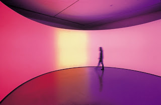
Olafur Eliasson 360̊ room for all colours (2002) stainless steel, projection foil, fluorescent lights, wood and copntrol unit, private collection courtesy Tanya Bonakdar Gallery, New York, all photographs courtesy MoMA, © Olafur Eliasson
Olafur Eliasson’s art is unapologetically built of smoke and mirrors. If you love the part of The Wizard of Oz where the film shifts from black and white to color you’ll delight in the similar charge Eliasson evokes from manipulating elements as simple as light, water and air. The material of one piece is labled mono-frequency lights, another label reads moss, wood and wire. If you were lucky enough to catch Your Colour Memory at the Arcadia University Art Gallery in 2004-5 (see Roberta’s review), you’ll know what I mean. His first large survey exhibition in the U.S., Take Your Time: Olafur Eliasson (organized by the San Francisco Museum of Modern Art), is spread between the Museum of Modern Art (MoMA), New York and P.S.1 through June 30. As many have already discovered, it’s a great outing for the entire family.
Eliasson works in a Romantic tradition of celebration of the senses, reminding us that in our multi-tasking environment accompanied by the pre-recorded soundtrack of our Ipods we are ignoring the magic that surrounds us in real time. He has obvious precedents in the light manipulations and installations of Robert Irwin, James Turrell, Anthony McCall and Dan Flavin as well as paintings by Frederick Church (whose Heart of the Andes was originally exhibited on its own, with theatrical lighting and opera glasses available to better see the details) and others, including creators of various nineteenth-century spectacles such as painted panoramas.
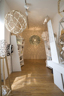
Olafur Eliasson Model room (2003) chipboard display cabinets and mixed-media models, maquettes and prototypes, dimensions variable, lent courtesy of Tanya Bonakdar Gallery, New York. In the rear hangs Inverted Berlin Sphere (2005) stainless steel, mirror, bulb and dimmer, collection of Martin Z. Margulies, Miami
I’d actually suggest starting at P.S. 1, where five large installations are accompanied by both photographic work and by two rooms full of Eliasson’s models; they ground his practice in an interest in relating time and space (the photographs) and in process. Once you get beyond the challenging geometry of the display shelves, which I’d love to have (I hope Eliasson will offer do-it-yourself instructions), the models, prototypes and maquettes demonstrate a process akin to architecture – but with no program. Eliasson is free to develop forms for their own sake; they don’t need to function as houses, museums or schools (but what an inspiration a school designed by Eliasson would be!). And he has a crew of engineers and fabricators who can make certain that the final design will actually stand (or function, in the case of light and water-based works).

Olafur Eliasson Beauty (1993) Fresnel lamp, water, nozzles, hose, wood and pump, collection L.A. MoCA
I’m partial to the water pieces and two are in P.S. 1’s basement. The bubbling stream of Reversed Waterfall jumps up four steps like salmon swimming upstream to spawn. Beauty, across the hall, creates an endless rainbow in an environment of mist. It’s hard to out-do nature when it comes to rainbows, but Eliasson gets serious credit for domesticating one and bringing it indoors.
Another fun piece is Soil Quasi Bricks (2003), which covers the walls of a room with bricks that are a riff on an old Roman device of illusionistic floor tiling which I’ve always loved. The Romans implied that two dimensions were three and the floor was a bed of up-ended cubes; Eliasson restores the third dimension while maintaining reference to its 2-d form.
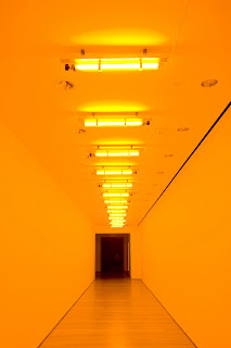
Olafur Eliasson Room for One Colour (1997) monofrequency lights, dimensions variable, courtesy the artist
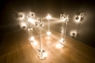
The visitors to P.S. 1 were sparse on a weekday so they actually heeded the artist’s title and took their time. At MoMA the crowds of all ages (including many infants) behaved as though they were at a fair: they danced, jumped and indulged in the sort of kissing I associate with the back of the movie-theater. This probably contributed to their lack of patience with the subtlest works (such as 1m³ light, above) and favoring those installations with lots of color, motion , flashing lights and mirrors.
From the lobby you catch a glimpse of Ventilator (1997) which is hung in the multi-story atrium that begins on the floor above. The piece consists of a fan suspended on a long cable, which veers like an anarchic pendulum through the space. For those who would give in to its hypnotic effect the museum has helpfully provided a large number of modular ottomans; this is highly unusual for MoMA, which favors its visitors standing.
The exhibition leaks into the escalator, tinging it with the yellow light from Room for One Colour, installed in a third-floor hallway above, where its monochromatic light plays visual tricks and drains all the color from the people passing through the corridor.
Space Reversal (2007) provides the effect of an endless vertical house of mirrors, the perfect environment for our culture of narcissism. Moss Wall (1994), actual moss which looks like a thick pile carpet hanging on the wall certainly attracted a lot of touchers. I suggested to the first man I saw that it was art and shouldn’t be touched, then I queried a guard who said gentle touching was ok. Allowed to sit and to touch the art; more new experiences at MoMA! When I passed the wall again there was a group of wriggling 7-year-olds at its foot, being given a tour. I asked one little boy if he’d been to museums before (he had) and what he thought of the exhibition. It got a high rating.
I’ve come to think that Eliasson’s work is more powerful one piece at a time (he’s not alone in this respect) and that a large survey diminishes its impact; it certainly works against the artist’s hope that viewers will slow down and allow their senses time to float free of everyday concerns. I’d be surprised if most visitors spent more than 20-30 minutes in the entire exhibition at MoMA which encompassed 13 works, so if they spent even five minutes in an exhibition devoted to a single work that would be a significant gain. A large survey sounds more important, and museums find it hard to get a lot of mileage (in fundraising or press attention) out of a single installation; but Eliasson’s The Weather Project in 2003 in the Tate Modern’s Turbine Hall demonstrated the potential of a single grand idea. I hope he gets that sort of opportunity again.
Earlier Art of Light and Motion
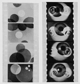
Hans Richter Filmstudie (1926) still from 35mm film (transferred to video for projection in the gallery), collection MoMA, New York
Around the corner from Ventilator is a small exhibition, Geometry of Motion (through June 23), in which Roxana Marcoci and Klaus Biesenbach, MoMA film and media curators, have selected work from the museum’s collection which preceded Eliasson’s in dealing with motion and projected light. It includes work by Hans Richter (continuous viewing of Filmstudie of 1926), Marcel Duchamp (a film of Anémic Cinéma, 1926, and the mechanism for creating rotary motion, which wasn’t working, unfortunately), Robert Irwin (one of his discs from the 60s), Robert Smithson (the artist’s film of light effects on Spiral Jetty, 1970), Anthony McCall (a dance he choreographs between images projected via a slide carousel and their viewer-generated afterimages) and others from El Lissitsky to Gordon Matta-Clark. The obvious omission is Thomas Wilfred’s color organ, which was on view in MoMA’s basement in the 60s-70s where it was seen by everyone who attended the film programs. Still this show, while small and quiet compared with the Eliasson extravaganza, shouldn’t be missed.


