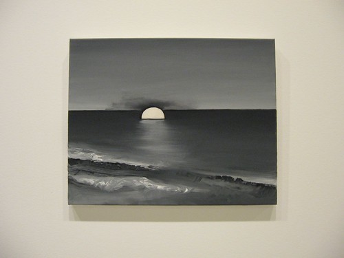
William Sasnal, Untitled, 2007, (I hope this is the right label for this piece). 15 3/4 x 19 11/16 inches, courtesy of Anton Kern Gallery, New York, and Fundacja Galerii Foksal, Warsaw
That truth is stranger than fiction seemed to me proven–and disproven–over and over again at the 2008 Carnegie International, a utopian gush of what might be or might not be a better world.
The exhibit, dubbed Life on Mars, dissolves reality and reconstructs it the way every decent art work on earth does. In other words, the theme might as well not be the theme, or might better be called Life on Earth, except that it helped the curator, the exuberant Douglas Fogle, make his choices. (Fogle, the Carnegie Museum’s curator for contemporary art, had been curator of visual arts at Walker Art Center in Minneapolis until barely a year ago).
Setting the name of the exhibit aside, the work by the 40 artists in the exhibit is full of pleasures. The show piqued my interest, gave me some new artists to add to my short list of interesting people to watch, and it left me cogitating for days.
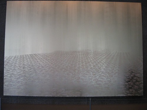
Rudolf Stingel, Untitled, 2008, oil and enamel on canvas, 132 x 192 x 2 inches each, courtesy Paula Cooper Gallery, New York
High on my list for cogitation–Rudolf Stingel’s pair of voluptuous, silvery-gold paintings of layered, cut canvas that resemble flocked wallpaper, not dissimilar in technique to many of the works he showed at the Whitney last year.
The decorative quality falls apart at a dissolving horizon line, the pattern becoming a runway to the ends of the earth. The paintings are shape-shifters, the contrast between figure and ground almost disappearing during daylight, and coming out to party by night, reestablishing the quality of this work as human as well as spatial.
In the looming space of the enormous lobby where the work is on display, the paintings’ human and voluptuous decorative qualities are diminished, unfortunately. This didn’t stop me from loving them.
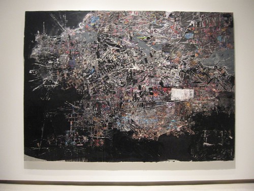
Mark Bradford, I don’t know which piece this is, but it looks like all his work is courtesy of the artist and Sikkema Jenkins & Co., New York
Mark Bradford’s two map-like collages, Across 110th Street and A Truly Rich Man is One Whose Children Run Into his Arms When his Hands are Empty, were also all about skin and layers of civilization. These are scratched into and scraped at and fierce representations of skin, of people, and of their cities.
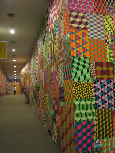
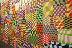
Barry McGee, Untitled (Geometric Panels), 2005, acrylic on wood panel (192 panels), courtesy the artist, Deitch Projects, New York; and Stuart Shave/Modern Art, London
Stingel’s and Bradford’s meditation on skin and place talked to Barry McGee‘s patchwork of exuberant patterning that references Roman floor tiling, Op Art and grafitti all at once. McGee, too, makes clear though that his architectural wall installations are coverups. The bumps pushing away from the walls suggest the canker of urban realities, and all at once I found myself thinking more about skin than about architecture, more about the act of decorating and dressing than about buildings.
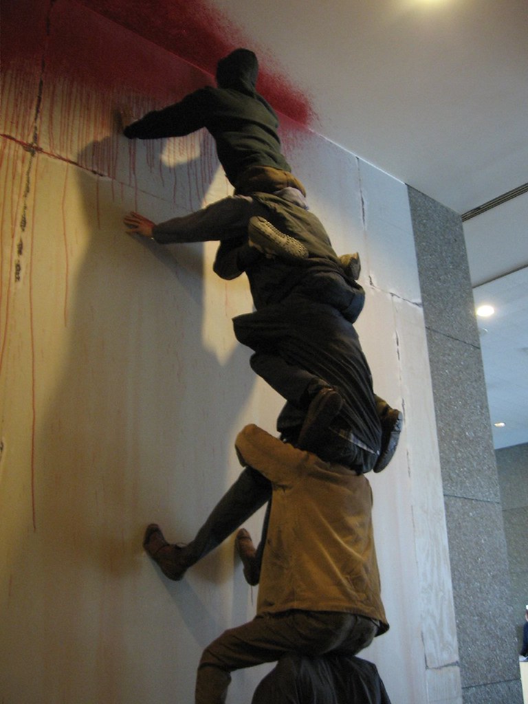
Barry McGee, untitled, 2008, detail, mixed media, courtesy the artist, Deitch Projects, New York; and and Stuart Shave/Modern Art, London. Commissioned by 2008 Carnegie International, Carnegie Museum of Art, Pittsburgh.
And just in case you missed the human side of what was hopping and popping across the walls, McGee provides a group of spray-painting automata–a graffiti-artist posse, a rag-tag crew who look like every kid I know, forming a human ladder to spray paint the very top of the hallway wall.
And if that wasn’t enough, banks of hopped-up video versions of the patterns and McGee’s drawings add a Nam Jun Paik vibe to the installation. McGee’s work (installed with some help from Philly locals Isaac Lin, Andrew Jeffrey Wright and Thom Lessner, whom we saw at the opening festivities), for all its Pop, street aesthetic, ended up being as serious as anything in the exhibit.
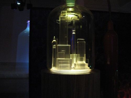
Mike Kelley, from the Kandor series, one of the cities in a bottle with one of the approximately 10-foot tall mixed media video projections in the background.
On the other hand, Mike Kelley‘s gorgeous installation of Superman’s Kandor seemed short on thought, long on calculation–tame!!! A fabulously spectacular, shameless light-show of bubbling cauldrons and glass metropolises under glass bell jars–inspired by the various comicbook drawings of the capital city of Krypton that Superman rescues from Brainiac–it’s almost slavish fandom, an adolescent boy’s full-bore copycat model. Each bell jar, each version of the shrunken city, each bubbling light-show bottle and comic strip device for providing an air supply, seemed more like an individual set piece, available for sale.

Mike Kelley, detail of the installation, which comes courtesy of a number of different places, including Jablonka Galerie, Cologne/Berlin, Glenstone, Potomac, MD., The Jill and Peter Kraus Collection, New York and another unnamed private collection.
These are ideal for collectors who are Superman fans. So the installation fell apart as a whole. Yet I loved the individual parts, cool and calculating though they were, situated in the gorgeous Hall of Sculpture (perfect siting).
Sigh. I guess I just am a sucker for spectacle. For all my misgivings, I enjoyed it. But its secondary quality, it’s fiction based on fiction, took it too far from reality for it to seem important to me.
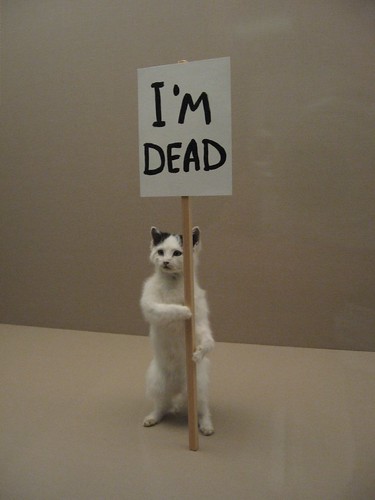
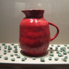
David Shrigley‘s objects in vitrines are the diametric opposite, humorous humble artifacts of a lost civilization (us?). I thought these were great, so unlikely, so in touch with how the world around us is made up of ordinary, weird stuff–a throw-back version of Darth Vader’s helmet, looking more like clunky plaster than polyester; a group of DIY-looking silver balls, so not round, not smooth, not sleek, and made of bronze (who knew?)
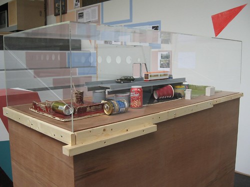
Manfred Pernice, “deja vue 12,” detail of model highway to nowhere with real trash, 2008, mixed media, dimensions variable, courtesy of the artist; Anton Kern Gallery, New York; and Galerie Neu, Berlin. Commissioned by 2008 Carnegie International
While Shrigley’s objects are endearing and goofy and deadpan, Manfred Pernice‘s installation of inscrutable, ordinary stuff is the opposite of endearing. Pernice (who we met by chance at the Mattress Factory the same afternoon we pondered his work) shows the depressing truth of a civilization leaving behind skeletons of its overblown infrastructure. I found this installation interesting (and depressing), if difficult. I wanted to know what the holes in the countertop could possibly be for (I was reminded of the holes the trash goes down in Starbucks, or the holes for the soup urns at the cafeteria). Whose report was arrayed on the wall, and what was it for? Why was the railroad trestle a fragment, unattached to any larger system?
Both Shrigley and Pernice are making work just a step away from the world as we know it, a rebellion against slick, cool, manufactured objects.
Here are some pictures of other things I liked:
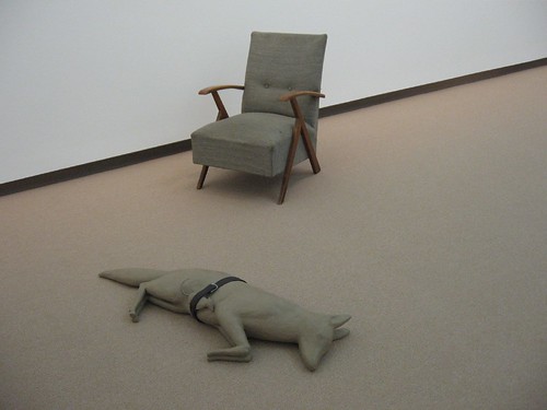
Mark Manders, Fox/Mouse/Belt, 1992, painted bronze, belt, 5 15/16 x 47 1/4 x 15 3/4 inches, Courtesy Zeno X Gallery, Antwerp; and Chair, 2003, Wood, fabric and various materials, 27 9/16 inches x 35 7/16 inches x 35 7/16 inches, Courtesy Tanya Bonakdar Gallery, New York and Zeno X Gallery, Antwerp.
The relationship of the mouse to the fox, the belt to them both, in Mark Manders‘ Fox/Mouse/Belt is so quirky and beyond explanation that I loved it. As for the chair, its interest to me was similar to the belt–as a domestic presence near the wild fox.
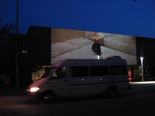
Doug Aitken, Migration, 365 Hotel Rooms, Here’s one of a number of bunny rabbits out of its element. 2008, 4-projection outdoor video installation, dimensions variable. Courtesy of 303 Gallery, New York; Gallerie Eva Presenhuber, Zurich; Victoria Miro Gallery, London and Regen Projects, Los Angeles. Aitken made this specifically for this exhibit.
Doug Aitken‘s video, perfectly sited for night viewing outside the museum on the front and back facades, like Manders, brings wild animals into motel rooms. The beaver was my favorite–wild and human all at once. I could have skipped the deer (I’m on strike vis a vis deer as symbols of unspoiled nature in art works). The white peacocks were spectacularly beautiful, even on a bed. Best of all was the traffic whizzing by! Now that’s dislocation for you.
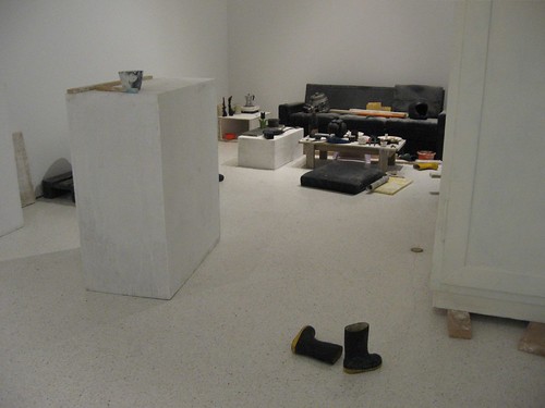
Peter Fischli and David Weiss, Untitled, 2005, 105 carved and painted polyurethane objects, dimensions variable, Private foundation, Oslo, c/o Peder Lund, Courtesy of Galerie Presenhuber, Zurich
Recreations of rooms are a definite art motif, lately, and I’m worried they’ll soon surpass the overkill that has ruined the innocent deer motif. But I did like this piece by those witty, existential devils Fischli and Weiss, for its scruffiness and its excess and its unromanticized view. I also liked Rosemarie Trockel‘s incomfortable ceramic sofa with a not-quite friendly knit portrait resting between the pillows. And Thomas Hirschhorn‘s survivalist Cavemanman also fits this category, but we’ve been inside the packing tape tunnels before, at Gladstone Gallery.
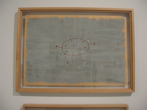
Paul Thek, Proust Faust, 1975, enamel and acrylic on newspaper, 22 3/4 x 33 3/8 inches, Fundacao de Serralves–Museu de Arte Contemporanea, Porto, Portugal
Paul Thek‘s paintings on newspaper couldn’t have looked more contemporary, except for the yellowing paper. The surface, the imagery, all suggested a vulnerability that pulled me in and made me pause.
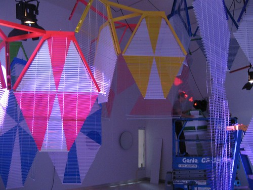
Haegue Yang, Three Kinds, 2008, mixed media (venetian blinds, light, mirror, and slide projection), dimensions variable, courtesy of the artist and Galerie Barbara Wien, Berlin, Commissioned by 2008 Carnegie International
This installation by Haegue Yang was still being installed, but boy was it fun! I’m sorry I didn’t get to see the final product. I had to compare it to the formal issues being explored in Barry McGee’s installation. The environment of vernacular materials transformed into a spectacular disco room made me want to dance.
Yang, who was new to me was not the only noteworthy new name for my mental vocabulary. Marisa Merz‘s aluminum Untitled (Living Sculpture) was a wow–the female id quality of Lynda Benglis without the chance wildness! Also new, Matthew Monahan‘s strapped caryatids of foam; Maria Lassnig‘s painted cartoons (she’s the oldest artist in the exhibit at 86 years young); and Daniel Guzman‘s goth-surreal cartoons–all of these were worthy additions for me. Here’s my Flickr set for more images, or just click over from one of the images above.
I feel like I can’t write any more for fear of having already bored you all to death. This will have to do.


