It’s that time of year. The graduates of local art colleges — and even some who are not yet grads — are putting up public shows of their art. Public exhibitions of student work were scarce 10 years ago but more recently with the market all crazy for newer, younger art and with art schools opening themselves up to the possibility now you can’t turn around in the Spring for all the senior shows and MFA shows. That’s not a complaint–far from. I’m just saying.
As with everything there’s an exception — PAFA‘s student show. That’s been a very public affair for 107 years. PAFA, which is expert at this by now and has always marketed the event as a way for collectors to get in on the ground floor with up and comers, just announced that they had record sales for the 2008 student show — 413 works of student art sold for a total of $355,557! Happily, students get 80% of the sales price and PAFA takes 20% (which it plows back into next year’s show).
Libby told you about the Penn MFA show at the Icebox and the PAFA MFA show and Slought and more in her post. I’m going to touch on the Tyler MFA show (also at the Icebox) and the PAFA certificate show and talk about the Penn show’s catalog.
OVERALL
Previous years the zeitgeist was easier to read. One year, hovel-making with cardboard construction seemed to be all over the place. This year, cardboard’s gone, wallpaper is in, painters are still painting abstract or figuratively and sculptors are making finely-crafted figurative things or installations made from assembled multiples (or sometimes assemblages from newspaper, sticks and clay.) The human body with all its diseases, psychological distresses and vulnerabilities is a big worry. This has been the case for years now. And no surprise at our time of war and recession where horizons seem closed and the future uncertain.
Two of the shows I saw (Penn MFA and Tyler MFA) were at the Icebox — a terrific space for a show. There’s something about the big pristine windowless space that elevates just about everything. And the Grey Area (next to the Icebox in the Crane) has wonderful light coming in the big warehouse windows so sculpture looks especially good there.
Tyler’s Curated MFA show “semi”
April 30-May 11
Icebox
Here’s a curated MFA show that puzzled me. There’s a curator, Elizabeth Grady, a well-respected gallerist and curator from New York and she wrote an essay. (Grady, by the way, curated the wonderful show Parts to the Whole at Vox Populi a few years back. — see posts here and here. )
I thought the show, “semi,” was the MFA thesis show but then saw that not all the graduates were included. Since when are we excluding some of the graduates from the MFA thesis show, I wondered. So after hunting around a bit on the tyler grads blog and piecing it together (it is nowhere clearly stated) I figured out that this show was indeed not the thesis show but was just a curated show at this time of year for Tyler MFA students. Now it happens that of the 15 students in the show, 12 are 2008 MFA graduates. So it’s almost a thesis show and I’m just going to not say another word about it except that 41 students applied to be in it and the 26 young artists who were rejected got an early taste of the real world.
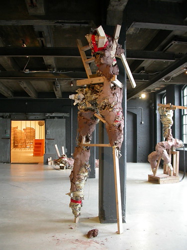
Louise Radochonski. Greenware Project. clay, wood, newspaper, string, tape. In the Crane’s Grey Area outside the Icebox.
Louise Radochonski‘s oversize figures from her Greenware Project have a brut monumentality and striking, injured postures that made them speak to our times of bodily woes and broken dreams.
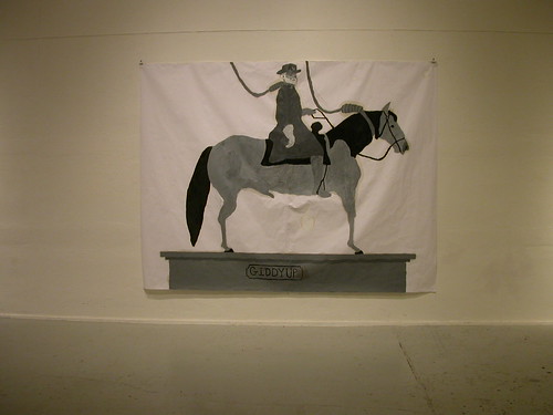
Nick Barbee, Hung Horse. oil on paper
Nick Barbee‘s suite of oil paintings on paper point to fallen heroes (General Lee and his hung horse) and to human failure itself. I love the scale of the piece which is monumental, and the way the oil paint bleeds out on to the white paper — the whole art work will disintegrate at some not too distant time, perhaps a failed work?
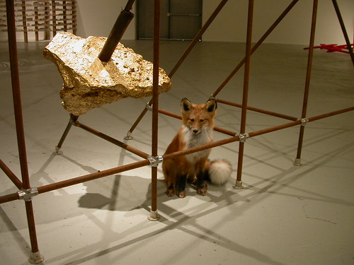
A beautiful taxidermied fox in Daniel Bruce’s Fabulation reminded me of how popular animals are (they never go out of fashion and of course animals r us so very usable in art about humans). Right now we’re more animal crazy than ever — Doug Aitken‘s wild animal extravaganza, Migration, at the Carnegie International being the biggest recent instance. This fox, looking out from his space in a rusting metal frame he shares with a faux piece of gold reads pretty much like Aitkens’ piece–it’s humans and the world we’ve messed up and the poor animals.
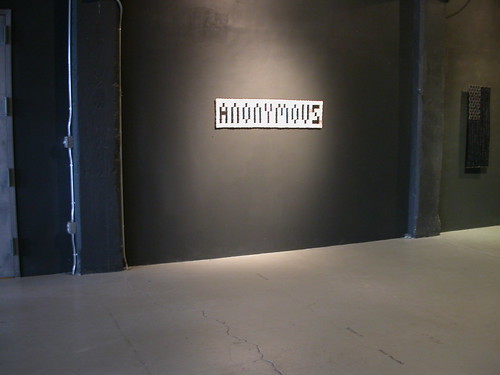
Joan Dryer, Anonymous, dental x-rays, thread.
Joan Dryer‘s works — a flag, a sign, made from stitched together dental x-rays — make for an almost too direct connection with the human. The loaded found material (dental records –the last resort in determining who’s who in situations with mass loss of life) is a little too direct a commentary on today.
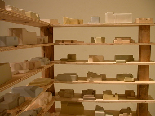
Dylan Beck‘s cast ceramic buildings (all cast from throw-away styrofoam packaging from computers and other electronics) reminds me somewhat of Mark Campbell’s obsessive arrays of suburban tract houses conquering the land. Here, Beck’s made a kind of Ikea-esque storage unit for his little rectangular structures. You could walk among the shelves and the overall feel is of museum as well as department store storage, a nice twist on what art is (product and — some of it — destined to be stored by museums).
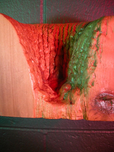
Jenny Buffington, The Look of a Generation.
Jenny Buffington‘s wall-mounted mini-landscape diorama spotlit with lurid red and green lights takes the genre to a horror show level that feels new. Whether the piece is a dry Niagara Falls or some earthly vaginal crevasse, the work, called The Look of a Generation, evokes both sublime and ridiculous.
Christopher Hall‘s art-referential paintings are fun and Dave Kube‘s deadpan photos of someone with an existential problem are intriguing.
There seemed to be a spark missing from the show, maybe due to the lack of excess or mess. What mess there was was very tidied up. It was a very tidy show.
Many more pictures of the Tyler MFA show at flickr.
PAFA CERTIFICATE SHOW
PAFA — Hamilton Building
May 11-June 3

Birds eye view of the demolition of the building across the street from PAFA. Taken last week.
One of the things that grabbed my attention upstairs when I saw the MFA show was the view out the floor to ceiling windows of the demolition of the building across the street (going, gone — to make way for the convention center expansion.) Which is not to say the art work inside didn’t catch my eye as well. Much of it did, especially the paintings — Alana Bograd‘s swirly psychedelic paintings; Kenneth McClellan’s old masterly dog paintings; Holly Storlie‘s candy landscape paintings; and Ted Sare‘s room installation with the faux 3-D movie still paintings — all great to look at and interesting works.
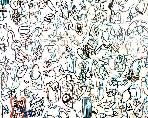
Mia Pastore, clothes horse, pen and ink on paper.
And here’s a shout out to Mia Pastore whom I ran into when looking at the show. Mia’s works on paper all but sold out! Her works are taxonomic — one drawing (things with wings — purchased by the museum) has all creatures that fly and another is devoted to sea creatures — with no two creatures repeated that she knows of in either work. The icon-like drawings seem very cyber-designed but the work’s all done freehand with a micron pen — very labor-intensive. Pastore told me she’s working on a new piece — a thousand great inventions — that should be fun, and a drawing challenge. I asked her whether she’s staying in Philadelphia after graduation and she gave me an emphatic yes and said some of her classmates were staying as well and that they’d already decided to form a group for support, critiques and whatever else.
Of course you’d expect to see figurative work at the Academy where students draw from plaster casts of old master sculptures. So indeed there is plenty. And let me just say I’m not against figurative art. I love it. Nowadays, figure work has got to be conceptually-loaded to win a place for itself in the discussion. Students know that and thus much of the figure work transcends academy studies.
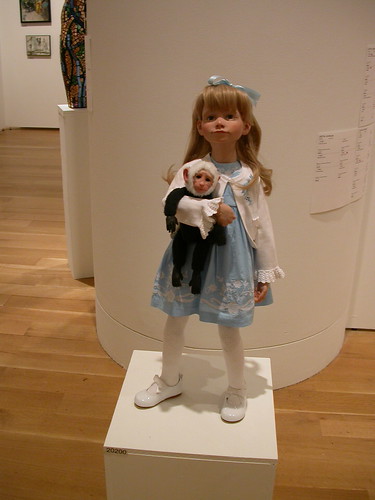
Katelyn Greth‘s ensemble of resin figures are great little monsters. This young artist is following in the wake of Patricia Piccinini’s emotionally-charged human-animal hybrids. The craftsmanship in these works is outstanding (and the artist received many PAFA awards for the work). Part of their charm lies in their scale which is small (they are all pedestal sitters.) And part of it is that they are children, indeed infants in two cases so they immediately pull at your heart. Underneath it all there is a sense of a lost civilization people in crisis. No smiles allowed.
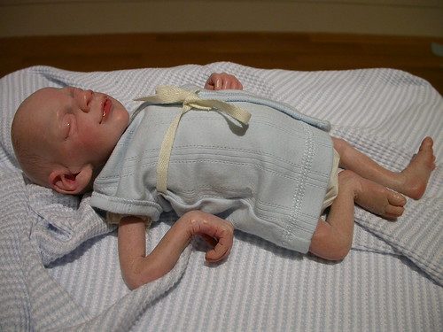
As accomplished as she is with materials and subject matter (vulnerability of human stock, genetics, and the human psyche) I would expect this artist to have a solid future.
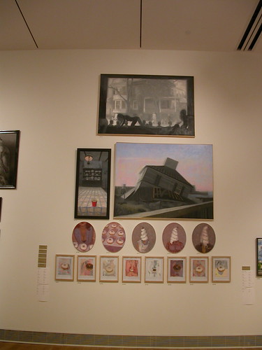
P.J. Smalley‘s wry paintings of soft serve-headed humans and other cupcake-infused fantasies stand out in the painting department. The painting that tops his salon-style hanging is the one that interested me most. The work depicts a kind of Saturday afternoon horror flick atmosphere at the movie house with kids in the audience and a movie featuring a scary house on the big screen. However, crawling on all fours in front of the screen is a nude female whose submissive posture evokes a porn industry standard pose. Wow. I know why it is placed high in the rafters and not down at eye level but I wish it was right in your face.
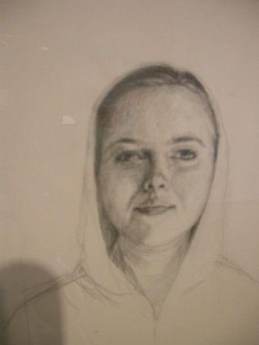
Emilie Keim‘s self-portrait series in pencil on paper ($90 each, most sold) interests me for how different the artist looks in each work, capturing the mutability of character.
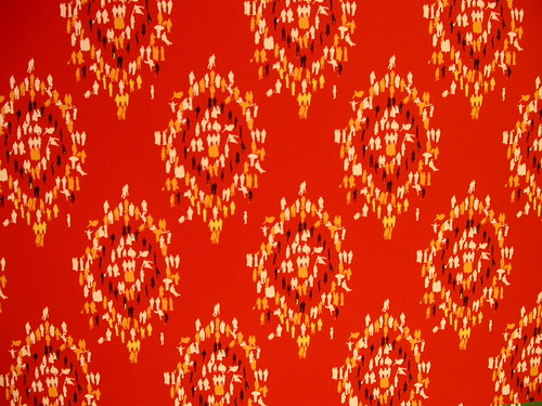
Itsuki Ogihara‘s demographic wallpaper is unexpected — and don’t miss it. It’s downstairs with a bunch of other students’ work behind the clothes closet and separated from the rest of the show. Ogihara’s wallpaper reflects a research project on city demographics. She seems to have used the demographics to create designs with tiny figures representing the numbers. There’s a wallpaper sample book with data from the various cities represented. Atlanta, GA, for example, has these numbers: a total population (416,474) whites (60%) African American (3-%) Latino (7%) Asian (4%) Native American (0.2%); median income ($33,175) and below the poverty line (21.3%). The wallpapers all seem similar except for their colors so I’m not clear on the motivation for the work. But the old-fashioned ornate patterning done with tiny figures in various colors is pretty great.
Ogihara has a video in her installation space and it shows her project to beautify Philadelphia by cleaning outdoor walls in various spots. The artist had been in touch with me months ago asking for advice on getting funding for her urban beautification project. I thought she should contact Mural Arts since the project involved city walls. I am not sure she got funded but she absolutely did the job and took some film of it. I love the take-charge spirit.
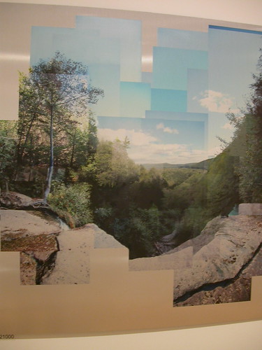
There wasn’t much photography in this show (I don’t believe they offer the subject at PAFA). But Marcus Balen‘s photo-collage on aluminum is interesting because it maintains the academy’s landscape tradition although this collage is far more intimate than standard plein air landscapes.
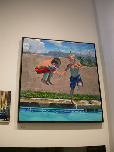
I’ll end with Brian Guglielmi’s painting of two boys holding hands and jumping into a swimming pool. This work has an ebullience largely missing from the student work I’ve been seeing. With its lovely gesture of the held hands and its airborn exuberance of youth and energy the work evokes what might be an antidote to today’s inward-looking, angst-feeling spirit of art.
More photos from PAFA’s certificate show and MFA show at flickr.
Penn MFA thesis show
May 16-June 6
Icebox
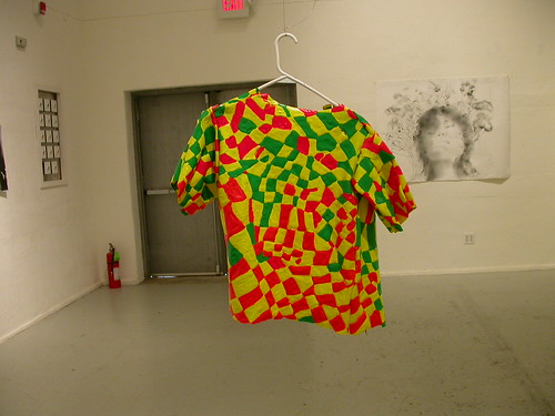
Simon Slater’s acrylic paint shirt at the Penn MFA show.
Meanwhile, just a note on the Penn show. The Penn MFA thesis show — this year curated by WIlliam Pym, exhibition director at Fleisher-Ollman Gallery — always has a lot of painting in it. This year, one of the artists used paint and dispensed with the support and made objects from dripped and coagulated pools of candy-colored acrylic paint. The works, by Simon Slater, could be considered 3-D paintings, or not. They’re very much fun and their tossed-off affect is perfect. Other delights in this show include Jamie Diamond‘s faux family photos and Sarah Zimmer‘s autobiographical videos (both artists will be in the upcoming show ID at Projects Gallery that Libby and I curated so I’m partial to their work). See my photos of the show at flickr.
Meanwhile, I’ll tell you about the Penn show’s catalog in another post since this is already too long. The good news is that you can get out there this weekend and see the Penn and PAFA shows. Highly recommended.


