The art schools spring a passel of students on the world every April, May and June. I’ve seen a lot of stuff. But here are a few things and moments that stood out in my mind–
The Penn MFA thesis show at the Crane, curated by Fleisher-Ollman’s William Pym, had its share of work that stuck to where it was hanging on the walls, but a few things caught my attention:

Damon Reaves, Entertaining, video, TV
I got lucky when I arrived. The gallery sitters that day was Damon Reaves. I stopped to talk to him. Turns out Reaves, who is from Ohio, was awarded the Locks Foundation Post-Graduate Fellowship, and will be using it to work on an artists book here in Philadelphia next year. He said the people who will be mentoring him through the creation of the book, which will include poetry as well as images, are artist Luca Buvoli and poets Tracie Morris and Charles Bernstein.
As it happens, I was rather interested in Reaves’ work–especially his drip piece, Entertaining, a video of ink dripping. The drops splattered a little and made tapping sounds that brought tapdancing to my mind. And the pool expanded to fill the tv screen.
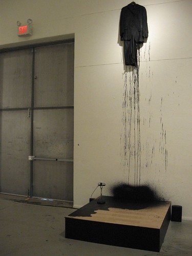
Damon Reaves, After Intermission
I later learned from Roberta (is this whispering down the lane?) that the ink dripped from another piece in the exhibit, After Intermission–an ink-dipped suit hanging over a platform with a mike (and with drips from the suit on the platform). Looking at this latter piece was like looking at documentation of any performance. Once I understood the background, I found it quite interesting–the idea of the ephemeral performance, the idea of assuming an on-stage identity, the idea of blackness as a performance identity, all resonated for me. As for the video, which also was about blackness, even without having the score card this one worked and was quite open to numerous interpretations (again about blackness as a performance identity, just for starters).
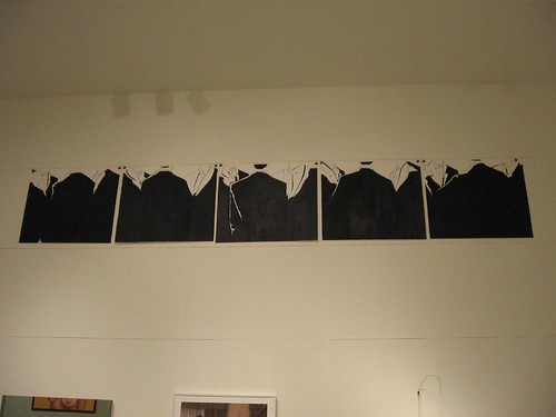
Damon Reaves, Conference, acrylic on paper
Reaves also had a 5-panel drawing, Conference, of men in suits, mounted just below the ceiling–all black suits and outline faces. The men’s suits merge and look like an unsurmountable mountain range.
Several of the artists in this exhibit, like Reaves, were interested in their identity.
Ivanco Talevski‘s fabulous Eastern European-influenced paintings and prints, with their fantastical historicity tickled me, and reflected Talevski’s own search for who he is and his historical and art-historical roots.
The shifting sands of identity behind Jamie Diamond‘s so-called family portraits I will hold off on because Roberta and I curated her into ID, the upcoming exhibit of emerging artists at Projects Gallery.
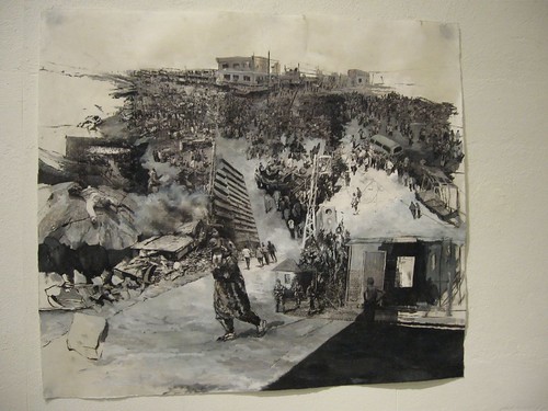
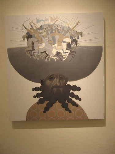
Shanjana Hahmud, City on the Other Side, transfers and oil on paper
Shanjana Hahmud‘s City on the Other Side, rises from literal to Cecil B. DeMille through the use of transfers along with painting to create a grand landscape of armies and people on the move.
I also loved Simon Slater‘s work, but I think Roberta is going to write about him, so I’ll leave it at that. I just want to add how exciting it is that the Penn show is also traveling to Chelsea June 10. That’s a really smart thing to do.
While I was at the Crane, I somehow got into the University of Delaware MFA thesis exhibit, and my efforts were rewarded with some interesting things. I want to thank Steven Weber of Kelly and Weber for helping me out.
Apparently, the Delaware folks are having a hard time keeping the space manned for all its hours, but I was super interesting in getting in because of an unusually wonderful note I received from one of the artists–Michael Kalmbach (I’m so easily seduced by the personal touch).
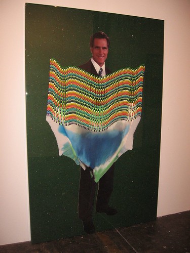
Romney, 84 x 54, acrylic on plastic wrapped over felt and cardboard cutout
It turns out Kalmbach’s work was an almost. The giant pieces with their seductive layers of glitzy materials and what-is-it juicy paintings were undercut by his insertion of images of presidential candidates. Without those cardboard cutouts, the materials were seductive promises, like presents, and kind of made me think advertising and packaging and Jeff Koons thoughts.
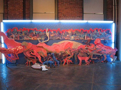
David Carlyle, untitled, front view
Best of all to me was the completely out of left field Hollywood billboard drama by David Carlyle, surrounded by neon, with an endless skyline and night sky glowing above a sort of diarama of cut-out pink and blue animals, fake and real, running for their lives. I’ve never seen anything quite like this before, and the sense of wildlife in motion reminded me of footage I’ve seen of animals fleeing fires and floodwaters. Epoxy critters are also part of the mix, and the shifting from 2 to 3-D and back again was absolutely mad.
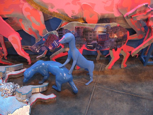
David Carlyle, untitled detail, front view
On top of this Carlyle gives you some rewards for visiting the back side of the movie set. There he has a number of critters hanging out, including one epoxy large-eyed “animal” draped over the scaffolding.
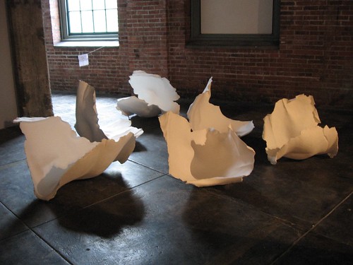
Lauren Vanni, In the Valleys, porcelain; This was the more photogenic of Vanni’s two pieces, but the one I really loved was a set of nesting porcelain containers that looked like a cross between giant ashtrays and petri dishes.
On a more traditional note, a couple of large porcelain sculptures by Lauren Vanni were nice–one quite austere and elegant, one relatively frilly–both quite nice.
While I was there, Lance Winne, Delaware’s coordinator for the graduate programs turned up. He told me that they were upping for another year at the Crane, in the duplex space that BusyBee was using. I asked him how the school could sustain the energy to fill that much space, but, without brushing aside my concern, mainly was excited about continuing with a venue in Philadelphia for the students in the program.
I missed the Tyler MFAs at the Crane, but I did make it to two other exhibits. At Slought was a little show called (it closed May 18), 239 years (divided by 12 artists), with lots of newbies, including Marisa Baumgartner, Mariya Dimov, Donovan Entrekin, Lily Gottlieb-McHale, Faye Kendall, Joyce Kim, Kai Pedersen, David Romberg, Laura Velez, Billy Dufala, John Greig and Lauren Comito.
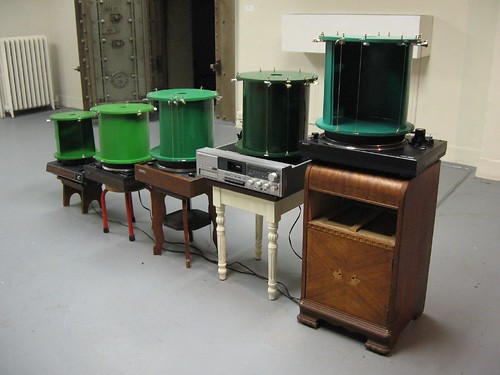
Lily Gotlieb-McHale’s turning drumps plink and pluck like a music box, but the piece itself is irregular, low-key, and rather Zen. Very nice.
Two works were exceptional.
One was a musical/sculptural piece by Lily Gotlieb-McHale. The technology mixes mechanically plunked notes with computer programing; the composition sounded almost Asian and like rain water. It was wonderfully cosmic and reflective, combining going around, and going nowhere.
The other piece I wasn’t expecting was a movie by David Romberg (yes, that would be Slought curator Oswaldo Romberg‘s son), but it turns out it was pretty darned interesting, began with what seemed like a jejune premise of two young women in a small room behaving seductively in front of the camera. But then a second video lets you see who comes in to interact with les girls. It also gives a view out the door to the gallery behind, with people just walking by. The screening of both videos is side-by-side, in the room where the filming took place.
Filming those who walked in was rather transgressive, given how tarty the girls were being. The gallery setting raises any number of questions about what’s real, what’s inappropriate, who’s in charge, and who’s peeping at what, and just who the performer is and how everyone relates to cameras. The piece also becomes an examination of who controls space.
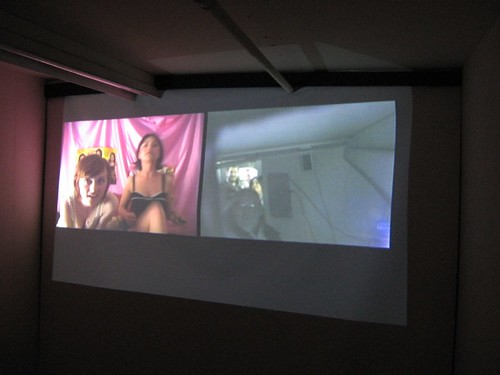
David Romberg’s video at Slought
I don’t know if the gallery thought it was doing Oswaldo (and David) a big favor by including this work in the exhibit–it certainly could be argued that the decision was ethically dicey–but I thought the video was great!
PAFA, in its 107th Annual Student Exhibition, continues to have a growing number of its students–both MFAs and certificate students–finding the road to contemporary art.
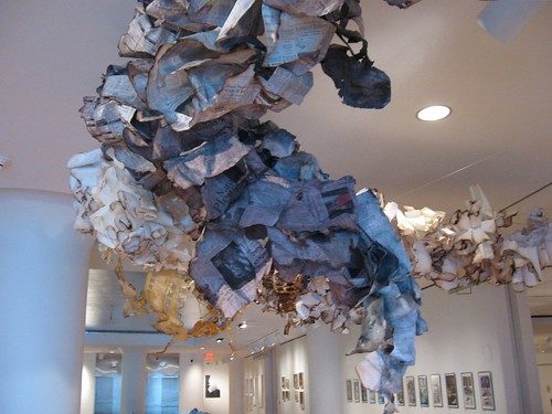
The MFAs offered up a lot of installation:
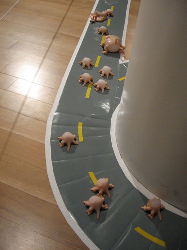
- Aki Torii’s wonderful little mutant creatures shuffling along a two-way highway that climbs the walls, plus his ultra-creepy television-viewing electric chair (eeeeek)
- Ted Sare’s gritty den or p.i. office with 3-D images, 3-D video and 3-D glasses (I’m still rubbing my eyes, but I was disappointed that the effects didn’t work better)
- Adam Hall’s burnt city scape with burnt newspaper clouds (9-11 anyone?)
- Colleen Rudolph’s waltz of the skeleton marionettes (dance step instructions included)
- Becky Potter’s tangled root garden
- and Simona Josan’s window treatment of views of windows.
There was more but I’ll stop there.
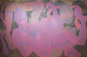
Also in the MFA group, Alana Bograd’s paintings have taken on the heavily curtained look of proscenium stages and castle interiors without losing their crazy psychedelic stacks of biomorphic shapes.
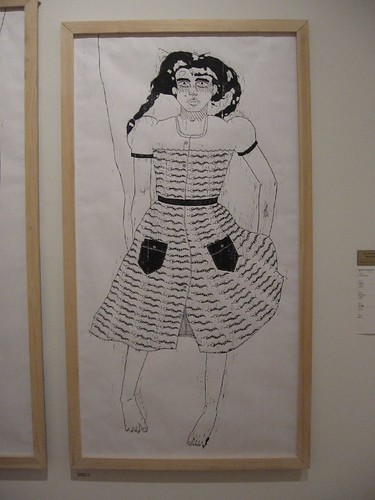
Rebecca Ayscough, walking to the wolf day parade (girl)
The certificate students are all busy creating work around a single theme. I especially liked some oversize, loopy, goth prints and a really scary wolf mask by Rebecca Ayscough, with long titles and some sort of mysterious back story with bears and a grandmother. These captured the scary side of myths and fairy tales.
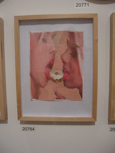
Also on my like list, some paintings by P.J. Smalley, all about food, including people with Mister Softee swirls for heads, and a couple of ideal beauties–possibly advertising models from the ’50s or a couple of modern-day hipsters–licking a donut together. The painting is glorious, the food-obsessed subject with its implied sexuality rather disturbing. Nice combo.
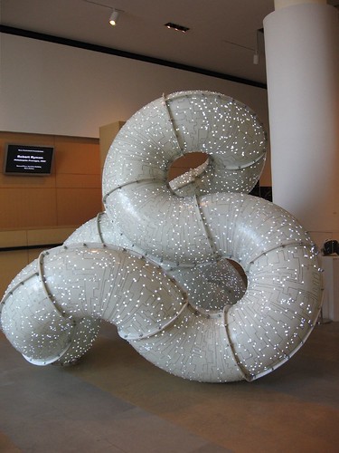
The other standout on my list is Jordan Griska.
I loved the techno-mobius-strip endless tubing, which is the first piece you see in front of the grand stairway of the Hamilton Building. It has twinkly lights and markings suggesting circuit boards and is in the Modernist tradition of looking totally fabricated. Yet for all it’s out-in-space technological look, it also manages to suggest intestines, and I suspect it’s handmade. This is the largest of this body of work. The others are drawings and either smaller versions or maquettes.
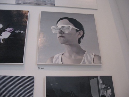
And then there are Michael Ciervo‘s paintings side by side with Griska’s sculpture, also with a brave new world aura. People land in space, and an Alex Katz-like billboard girl wears venetian-blind-striped eyeglasses, her shirt repeating the stripes in its drape. Here, too, there’s the cool, crispness of Modernism. What a surprise!


