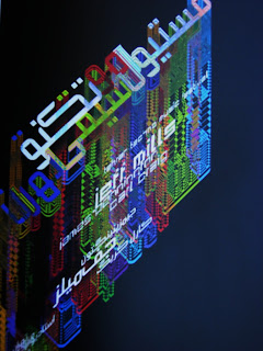
Behrouz Hariri (Iran/Canada) Tehran Techno promotional poster (2005), from Arabesque, © the artist.
When Arabesque; Graphic design from the Arab World and Persia (Berlin: Gestalten Verlag, 2008, ISBN 978-3-89955-206-5) landed on my desk I didn’t know what to expect. I knew that Arabic calligraphy is central to the visual arts of the Middle East, often serving as a decorative element for architecture, textiles, ceramics and elsewhere in a use of script unknown in the West. But its contemporary use? A black hole in my consciousness. The book makes for very interesting reading and looking and adds another chapter to the current saga of globalization.
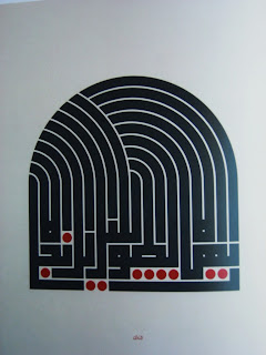
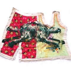
Mouneer El Shaarani (Syria/Egypt) come clear, long night, This example is calligraphy, not printed text, but El Shaarani is unusual in creating a modern and personal form of Arabic script. The title is the translation of the work’s text, from Arabesque. © the artist.
While Arabic calligraphy was a major art typography, the printed form of the language, has been a step-child. But that is changing as Middle Eastern graphic design is developing. There are several major tendencies in Middle Eastern typography: the need for legible fonts that can be used for television, mobile phones and other digital devices; the need for dual-script fonts with compatible size and character for Arabic and Latin alphabets for use in bi-lingual signage, newspapers, advertising and branding; and the recreation of elaborate calligraphic styles through digital technology.
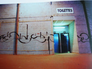
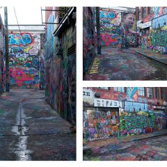
Alexone (France) Lille (1999) This photograph captures one of the more interesting examples of the book’s broad approach to design, from Arabesque. © the artist.
While Arabic graphic design has been influenced by mainstream Western fashions the influence has been reciprocal; some Western fonts adopt Arabic letter forms such as connections between letters and decorative terminals, and Western design has adopted various Eastern patterning as well as the curving interlace known, in acknowledgment of its source, as arabesque. Perhaps the ultimate exchange appears in graffiti and street art in cities such as Paris, Lille, Cairo and Tehran, all of which are illustrated. This unusually broad interpretation of design yields a book on a little-studied area of visual culture that should be of interest beyond the graphic design field.
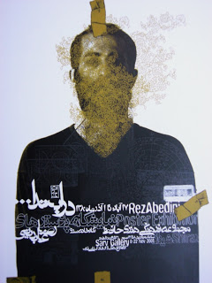
One section documents the Khatt Foundation’s Typographic Matchmaking in which Dutch and Arab designers collaborated on a series of font families for associated Latin and Arabic scripts. The project is a model for the use of design as diplomacy as well as an example of cross-cultural accommodation through typography.
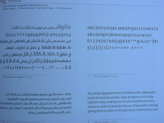
Tarek Atrissi (Lebanon, The Netherlands) and Peter Bilak (The Netherlands) This is an example from the Khatt Foundation’s Typographic Matchmaking project. The Arabic was inspired by informal handwritten texts and carries over some of the curves from the Latin type, Fedra. Sorry about the blue image – it’s an artifact of my photo.
The book is handsomely designed and printed; it contains a foreword by Huda Smitshuijzen AbiFares, interviews with ten designers or design firms conducted by Ben Wittner and Sascha Toma (eps51) and a useful index of all the designers whose work is illustrated, with web addresses and contact information for each. It comes with a cd ROM containing a typeface by Wittner and Toma.


