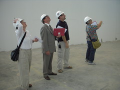
Photo by Hillel Hoffman. Roberta; Greg Murphy, assistant dean for development; John Coll, project superintendent; and Libby, looking up at the soaring atrium ceiling.
Tyler School of Art has been Temple University‘s best kept secret division for years. But now that the scrappy little art school–arguably the best incubator for new artists in a region filled with great art schools–has been forced by the mothership to give up its bucolic Elkins Park campus and move to 12th and Norris, the connection will be clearer.
It’s a good move!!!
Tyler’s $75 million new building, still under construction, is space-age spectacular. Even with some windows and doors and finishes missing, it’s a beauty, with rakish angles, airy spaces, and dramatic light, designed by architect Carlos Jimenez, with support from Philadelphia architects H2L2.
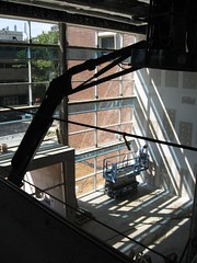
We know all this because we took a hard hat tour, led by Gregory Murphy, Tyler’s assistant dean for development; John Coll, one of the three project superintendents; and Hillel Hoffman, assistant director for Temple p.r. We thank them for rolling out the terrazzo floors and the makeshift wood ramps for us.
The building is not just another pretty face. It’s a gift to the city as well as to Tyler and Temple.
The new professional gallery space, where Temple Gallery will relocate, is not only beautiful, but is enormous and equipped to handle 4,000 pound sculptures. The studios and equipment and high-tech air-handling (a must in a field like art, where toxic materials are commonplace) almost made us wish we were back in school!
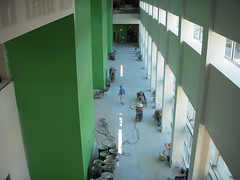
Looking down on the atrium from the 2nd floor. Note green color on pillars. There will be bright colors all over the public spaces (white in the studios of course). photo by roberta
If you’ve been used to Tyler’s old campus, with its cubby-hole studios and cramped exhibition spaces, you will jump for joy at the amazing equipment and the wide open spaces. Here are some examples: eight glory holes for cooking glass, up from two in Elkins Park; a whole room filled with potter’s wheels; loads digital equipment for photography–plus high-tech safety-minded wet-process equipment; vast spaces and cranes for sculpture; nearly a whole side of the building with advanced painting studios with palatial doors and celestial ceilings high enough to handle enormous paintings).
We’re not even talking about amenities like decks for lounging and a cafe for cafe-ing and looking out the windows.

Entrance to new Tyler School of Art. Just picture your name above the door for a $75 million donation. photo by roberta
The building is scheduled for completion in October, and expected to go into use January 2009. While we were walking through, we learned that 160 workers were on the job. Everywhere we looked, there they were, practically tripping over each other to finish the building in time for its impending completion date. Six of the workers were women, and we saw three of them at work as we toured.
The building has about 240,000 state-of-the-art square feet of space, many of those with naming rights still available. For instance, for a $7.5 million donation, you can get the building named after you. A gallery’s naming rights, $1.5 million. Or, if you are a more typical Artblog reader (just kidding), you might want to consider having graduate studios named after you, for $25,000 each. Why stop at just one?
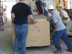
Workers moving a stack of plywood. Everywhere we looked, people were working to finish the building. photo by Libby
Green is big in this building. We’re not just talking about the green accent walls; or the green gardens for exhibiting sculpture. The building includes a number of green and health-conscious and art-conscious features. We especially like that the rain run-off from the roof gets redirected to slowly dissipate into the ground, said project superintendent Coll. The air handling system is massive because of the toxicity of art materials. It’s a closed building, said Murphy.
We took a lot of great pictures–of studio spaces, equipment, building mechanicals, and just things we liked looking at, but it was tough to capture the vastness of the spaces in this building. Here’s a link to our flickr sets to see more: Roberta’s pix. Libby’s pix.


