As an ongoing assignment for their Senior Projects class at St. Joes, my students have to write gallery reviews of shows they’ve seen. I got three little gems in the first batch of reviews, and I’m sharing them with you here since they present fresh commentary on shows many of us have seen.
A Look into R. Crumb’s Twisted World
by Lisa Hanson

Robert Crumb and Aline Kominsky Crumb
Aline & Bob on Human Depravity, 2004, ink on paper
As an avid reader and fan of Calvin and Hobbes and other comics, I pride myself on my appreciation for cartoons. After visiting the “R. Crumb’s Underground” show at the Institute for Contemporary Art, I found that I cannot fully appreciate this particular comic due to its lewd context. While I find his depictions of men, women and sexual activities to be a bit abrasive at times, I can acknowledge his drawing skills and techniques.
The walls were lined with Crumb’s work displayed in clean frames which contrasted the physical state of the comics behind the glass. Most of his drawings were on paper ripped directly from his sketchbook while others were on placemats, notebook paper and graph paper. I feel that each type of paper almost served as a backdrop for his cartoons and gave the comics a familiar appearance. Crumb also employed Wite-Out to cover his mistakes as well as doodles, stains and scribbles around the borders. I feel that these little quirks and tactics made the show more personal, as if I had stumbled across the artist’s private stash of drawings.
Crass narratives and characters aside, Crumb is talented at depicting meticulous detail. In most of his cartoons, his mark-making shapes the entire scene. He accounts for each hair in a beard, every fiber of a sweater and each wrinkle on a face. Crumb crosshatches and varies the length and width of his lines in order to create believable three-dimensional forms in a two-dimensional world. On the other hand, he also has the ability to carry over his drawings from paper to objects as seen in his “Spoolmen” collection. Crumb illustrated faces with different features and facial expressions on bare spools. Again he gives each piece a personality and character through mark and color.
Crumb’s most refined work at the ICA is his 1985 collection of “Early Jazz Greats” trading cards. He leaves behind the raw ink from his comics and uses watercolor to delicately and realistically portray musical celebrities like Bukka White and Eddie “Son” House. His portraits are rich and vibrant with color and appear to have more substance than his cartoons. Deep shadows and bright highlights reveal a sophisticated side to Crumb. His appreciation of jazz and blues culture is clear through the great care taken to create these images.
“R. Crumb’s Underground” uncovers how one artist found a way to express his haphazard nature and vulgar humor through complex comic strips and detailed drawings. His keen eye for detail is readily apparent in every single piece of his work.
R. Crumb’s Underground
Sept 5 through Dec. 7
ICA
Marble Paper Paintings
by Anna Vascellaro

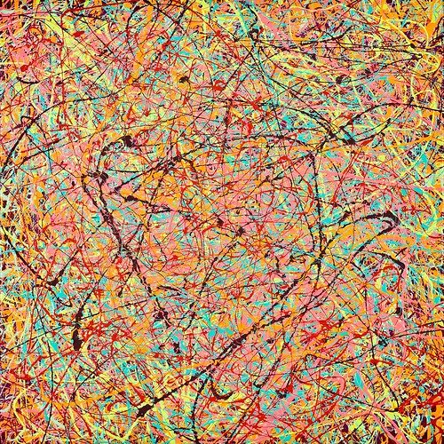
At first glance, I viewed Carol Wisker’s paintings as imitations of Jackson Pollock’s, but as I looked closer and walked up and down along the wall of acrylics, I picked up upon her distinctive style. The paintings have the marbled paper effect. The color choices seemed to be conscious, each painting contained about five or six different colors that complement each other. Some paintings would be bright where others would be dull. Iin her statement about this particular exhibition the artist describes her technique as dripping. The “drips” resembled individual strands of multi-colored hair bundled together. Each canvas was completely covered by this drip technique; I could not imagine the time and patience that this must take.
I was also surprised that the paint hardly rose above the canvas. Even though there was so much layered paint, it lay flat on the canvas. Perhaps she thinned the paint with water, but the colors seemed too opaque for this technique. I am still puzzled at how she managed to produce the thin paintings without losing the boldness of her colors. To me, this added a sense of mystery to the exhibition. There were two paintings where the paint was thick and raised off the canvas, but it was obvious that the decision was conscious on her part.
There were two prints, both framed. I wasn’t as interested in them. The prints, although brighter, had less variety in the colors and used a lot of black. Instead of the flowing hair-like strokes, the shapes were geometric and felt almost too confined. I didn’t feel like they belonged in the exhibit although they do reflect her painting style. To me, the prints were not very aesthetically interesting. The prints had a digital look, almost like printed on regular paper, off a colored printer. They seemed a little odd next to the organic acrylics.
Carol Wisker’s New Paintings and Prints
Sept 3-29
Third Street Gallery on Second
Michael Bell-Smith “On the Grid”
by Yachiyo Kaneko

Michael Bell-Smith, On the Grid, at Screening Gallery.
The work by Michael Bell-Smith called “On the Grid” is a video work. I have no idea how to make this kind of animation composed of only straight lines, and plus and minus signs. There is no curve anywhere.
Thick black lines create the city with a sky behind. Nothing happens but sunrise and sunset. Although it is about the city, living creatures never show up. Lights from the windows of buildings tell us there are people living in the city.
Sometimes, people could feel lonely in a crowded city like New York. We could say loneliness and a city equal each other. However, in the video, I could not feel loneliness but emptiness. That implies that the society or economy does not need individual human beings.
Now we, especially students, are struggling to find out our individuality, or identity. But, society does not require that. We, the human beings, just go to work everyday, do our jobs, and go to sleep. Society does not care about individuals. The earth revolves on its own axis once every 24 hours, and although some individual dies, it still rotates. This is my understanding of Bell-Smith’s work.
Personally, I do not like it. As an art work, it is beautiful because of the contrast of black buildings and changing background color of the sky. However, it is just beautiful; there is nothing more to attract the viewer’s attention. I left the room after the second sunset.


