Linda Yun, Incident, 2008, mylar, fan, sound, reflected light and color, dimensions variable, as installed in A Closer Look 7 at Arcadia.
Usually sensory experiences are things I think of as juicy. And I can sense there’s something sensory going on in the work of all the artists in A Closer Look 7 at Arcadia. But juicy is not the operative word here. There’s a coolness, a conceptual reflection on the nature of things.
The five artists were selected by Sheryl Conkelton, Tyler’s director of exhibitions and special programs. The A Closer Look series of exhibits was created to allow a more in-depth look at the work of some of the artists who had been in previous “Works on Paper” exhibits at Arcadia.
Hands down, my favorite piece in the exhibit is Linda Yun‘s deadpan piece, Incident–a kinetic sculpture of gold mylar streamers powered by an ordinary fan and lit by a utilitarian light fixture. The piece has a circus like exuberance in the fluttering streamers that fly off a ring–reminding me of the ring of fire lions are trained to jump through. But Yun’s description of her piece is telltale: “mylar, fan, sound, reflected light and color.” Also telltale is her title. There is no incident in Incident, and the focus gives gravitas to what might otherwise be incidental–the subtle glints of light reflected onto the wall, the rustling sound of the streamers and the fan. The gap between two levels of sensory experience–the glitz and the glimmer–is the magic of the nature of things.
I was reminded a little of the way Jackie Winsor and Sigmar Polke uses the materiality of an object to capture an experience. I was captivated.
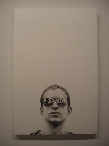
Phillip Adams, Solipsist: Wil, 2008, charcoal on paper mounted to panel, 50 x 32 inches
Phillip Adams, whose charcoal drawings are technical wows of draftsmanship and control, also is after the gap between the presentation and the experience. His triad of large, deadpan portraits, against white backgrounds is about the disorientation between no-space (the fashion- photography-inspired white backgrounds) and faux-space (the reflections of scenes in the mirrored sunglasses of the subjects). The window into someone’s eyes have been replaced by distorted substitute that sends me reeling. I may be reading too much into it, but I take these pieces as criticisms of a certain Elizabeth Peyton-ish coolness and self-absorption. I experience a sort of vertigo of the soul as I peer at the displaced persons and the reflections of displaced places. Like Yun, Adams is making me conscious of my take-for-granted understanding of reality, and in this case the reality is space and place, rather than color and sound.
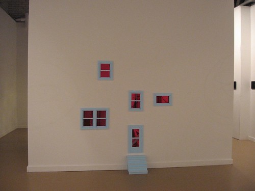
James Johnson, House, as installed in A Closer Look 7, at Arcadia University, 2008, foam insulation, existing wall, 144 x 144 x 48 inches. The pink interior light is a byproduct of “Promise,” a neon piece inside the house. To the left, behind Johnson’s house, you can see the golden aura from Yun’s Incident. To the right are some of Kocot & Hatton’s Night/Time
A similar gap is also part of James Johnson‘s House and Promise (courtesy New Money), both pieces offering something beyond reach. The house’s pink interior is just a wall interior filled with sheetrock scraps; and Promise (courtesy New Money) is a pink neon sign stating, “I can give you everything you want.” You have to crane your neck and look through a couple of the small, low windows in House to access what Promise says. Like all neon signs, the shiny promises can never live up to the physical flashiness. The sweet blue trim of the windows and door and steps turns out to be cheesy blue insulation foam.
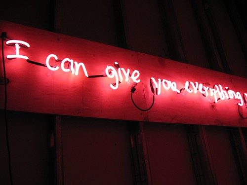
I’m a little surprised that when I looked at this work, I didn’t get the connection of glitz and aura to Yun’s piece, yet it is connected. It’s almost as if the wall that the house represents blocked what should have been an obvious relationship.
Unlike the longing for some Ozzie-and-Harriet past that has infused Johnson’s work until now, this piece communicates the hidden mess and frustrations of life inside the child-height windows, and also communicates everyone’s desire for more material goods.
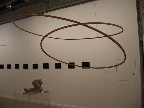
Installation shot, with Kocot & Hatton, from the Night/Time series, lined up on the wall. In front is one Hole of the three in Lucy Pullen’s piece Hole, and on the pedestal, Pullen’s Being and Event.
Windows into the mind are what Kocot & Hatton‘s Night/Time is about–a sort of New Age body art, but this time the shots are harmless and photographic, unlike Chris Burden’s bullets.
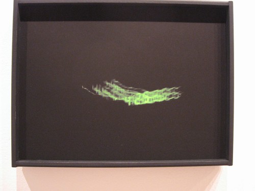
Kocot and Hatton, 25 November 2007 (4:25) from the series Night/Time, 2007-8, a series of 16 digital prints, each 8 x 10.5 inches framed. In the exhibit courtesy the artists and Larry Becker Contemporary Art, Philadelphia
It’s a series of blurry photographs of LED clock read-outs. The idea is to get at the semi-awake state-of-consciousness of the photographers as they rouse themselves barely enough from sleep to snap the photos. In this piece, process seems to overwhelm the idea, and the experience never becomes the viewers’ but remains the artists’.
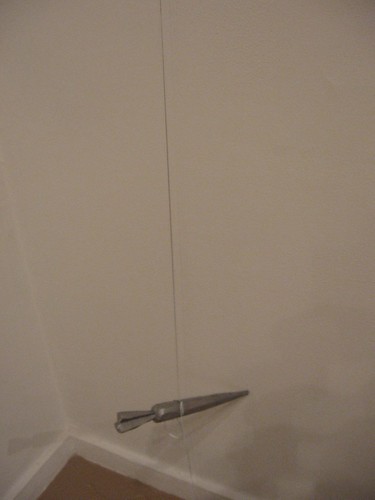
Lucy Pullen, Sonorous Carrot, 2008, cast aluminum, 8 x .5 inches diameter
What overwhelms the idea in Holes, work by Canadian artist Lucy Pullen, is the material–sinuous rings of bent ash. I was more interested in her sculpture Sonorous Carrot, a deadly looking carrot of cast aluminum, hung by a string to point at the wall. The title made me think I’d find a sound here. But I could not figure out a way to ring it, pluck it, or whatever. Too bad. I did like the idea of a singing, killer vegetable.
I don’t know why the whole of this show felt less than its parts, even though there was some interesting work here that certainly deserved the closer look. I think I might have better enjoyed some of these pieces in a different context or setting.


