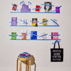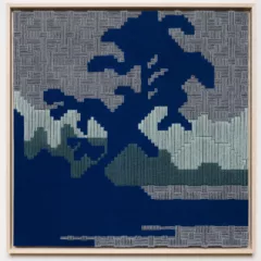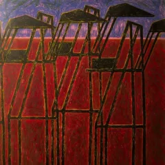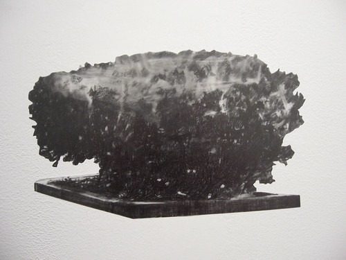
Kim Beck, my favorite detail from Buoys installation.
Most of us live in urban and suburban streetscapes. Yet so much art focuses on more romantic notions of nature, neglecting what the familiar paved zones offer in subject matter and imagery.
Work now on exhibit at Pentimenti is grappling with its own take on what these human interventions in space and structure mean.
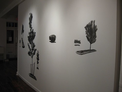
Kim Beck, Buoys installation at Pentimenti
One that nails it is a piece by Kim Beck, a Pittsburgh artist, who has created a terrific wall installation of a suburban, parking-lot-ish landscape. We don’t see the parking lot, just the specimen plantings, a la a James Audubon bird-on-branch specimen in front of the plain, white-paper, unarticulated sky. What we do see in Beck’s landscape is an expanse of unarticulated wall dotted with trees and shrubs planted in concrete-curbed bits of earth. The greenery is expressively drawn with graphite on mylar, the shapes cut out and arranged on the wall. The arrangements seem provisional, and we get to envision in our minds’ eye the space where the islands may have been planted.
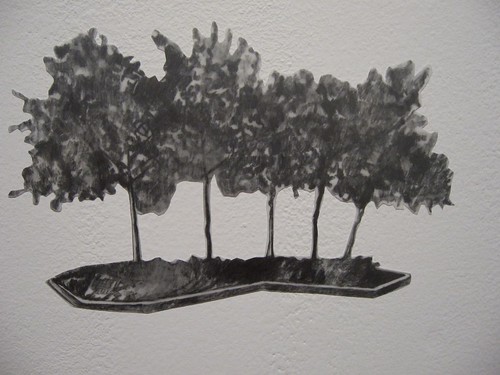
Kim Beck, detail from Buoys installation
Beck helps us out by using different scale items, to suggest distance. But each of the little shrubs and trees, each given the name Buoy plus an identifying number, can be purchased alone or with others and a new arrangement is as close as your living room wall!
The shrubs, especially, remind me of little domesticated critters, so their mobility from wall to wall, position to position, seems just right. They are also just right in suggesting the arbitrary placement of city green spaces, dictated by the architecture in which they are placed, and not by the laws of nature.
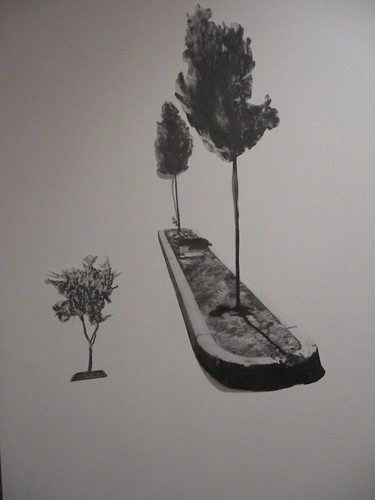
Kim Beck, detail, Buoys installation
You think you’ve got a garden, and before you know it, some planner comes along and says it’s time for a change, for a new design. He cuts and digs up mature plantings. If we’re lucky, he plants in some new location puny new, baby greenery. Often, the old stuff gets chopped and nothing takes its place.
But without these small salutes to nature, the landscapes we humans have created are grim and lifeless.
City trees and shrubs are like people. Sometimes they flourish in the unhospitable environment, sometimes not.
The drawing, basic and unfussy and spontaneous-seeming, also seems like a good fit.
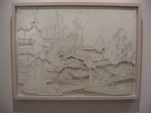
Kim Beck, Tree Lot 2, 22 x 30 inches, graphite with cut paper, 2008
This work eclipses Beck’s other pieces, which feel more labored. Three cut paper landscapes teem with too much information. A series of laser etchings burnt onto paper of urban tree islands seem too spare and short on information. A video based on the laser etchings does take the spare work a step further–and closer to the idea of the provisionality of nature–now you see it, now you don’t.
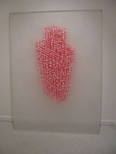
Steven Baris, Ruse of Transparency 1, 66 x 48 inches, oil, acrylic on plexiglas, 2008
New work from Steven Baris, a perennially interesting artist, is also up at Pentimenti. In his pair of exhibits, Baris has gotten experimental and looser. In the small Project Room, Baris’ Ruse of Transparency series explores the force fields exerted by massive urban buildings, which he expresses via building shapes on thick plexiglas slabs that rest their top edge against the wall. The plexiglas is reclaimed from building and demolition sites. Behind each building image is the shadow it casts, painted directly on the wall, and glowing from behind. Some of the buildings are expressed as solid polygons. Some are loose webs of undulating, griddy lines that suggest girders and other architectural features, as well as the watery reflections mirrored in skyscraper walls of glass.
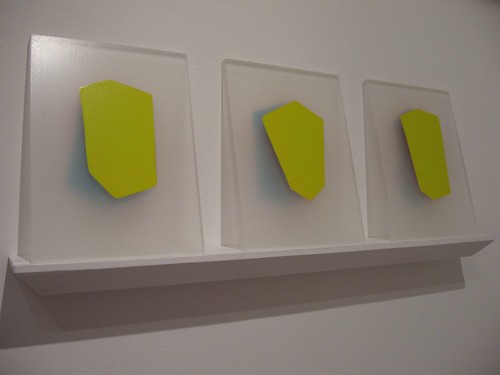
Steven Baris, from the Ruse of Transparency series, oil and acrylic on plexiglas, 2008
These pieces have an aura about them, a juicy beauty that captivates at the same time that it explores the intrusive presence of the glassy urban behemoths.
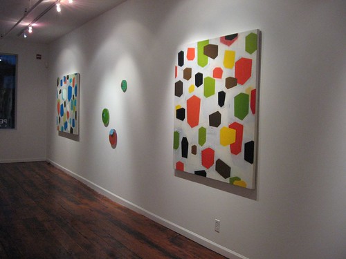
Steven Baris installation shot detail of his exhibit, Urban Compression.
Baris’ exhibit also has other work in the front large gallery space–several works from the Urban Compression series of large oil and acrylic on canvas paintings and several from the Whole New Distance series of small, circular oil and acrylic paintings on plexiglas.
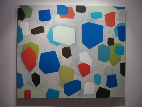
The large canvases are covered overall with buildings abstracted into flat polygons shaped to suggest how we view buildings from different angles. Behind the layers of polygons is a layer of linear markings suggesting eclipsed building structures and again, the force fields that the buildings exert on the city around them. The loose ghostly shadows and lines are a departure for Baris, whose previous body of work at Pentimenti was almost wholly based on floating lozenges of color suggesting spatial relationships. The layers of buildings, and the layer of background marks and shadows, suggest that you, the viewer, are the third dimension, with a fifth dimension of unpredictability. (The fourth is the material of the painting itself–the canvas and the paint). While I did not love these quite as much as the plexiglas pieces in the Project Room, they held my interest .
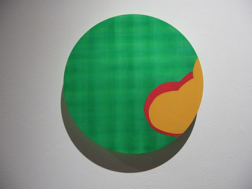
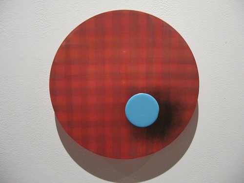
Steven Baris, Whole New Distance A7, 10 inches dia., oil, acrylic on plexiglas
On the other hand, I deeply loved Baris’ Whole New Distance paintings–small round bubbles of plaid-painted plexiglas. These are comic, with shiny, raised blobs of pop-colored paint sometime falling off the edge, sometimes creating the only focus. The blob shapes raise these pieces above the plaid decorativeness, and make me think of older work by Thomas Nozkowski, whose abstract forms recall the iconography of the comics and whose colors recall bygone eras of home decoration. Baris pares the abstracted shapes down to icons.
Some of them are just round, suggesting clown noses or googly eyes. But some of them suggest cloud forms and bubbles colliding and blue skies–the wild distances of nature domesticated by the plaid fields behind them.
In all cases, Baris reminds you he is challenging the way we perceive space–and color–nearly always in the context of the man-made.


