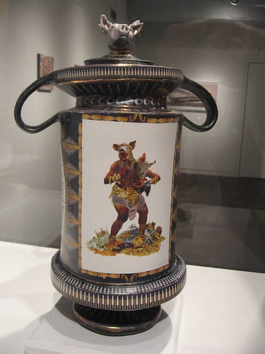
Nicholas Lenker, Sacrifices Will Be Made, 2008. clay, glaze, enamel, wood, metal. 16x8x8 inches
“You Open so Late, You Close so Early” is Amy Adams first outing with the Fleisher/Ollman winter invitational, and although she is only one part of the curatorial team (see comment at end of post), there clearly is a difference.
Previous shows were kind of like the show titles–daring you to figure out what the hell they meant, but invariably they showed you work you were really excited to see. In its place is a show that feels like it belongs in Fleisher/Ollman, for starters. For seconders, it feels like dead-on Philadelphia at its finest (most of the artists are Philly folks). In other words, there’s more of an interest in pleasing here–and please it does. (I’m not saying I didn’t love the exhibits that William Pym helped curate. But they were more uneven, with big surprises that sometimes were exciting and on target, sometimes were just unclear and uncooked).
I’m having a little war within myself as I try to pick out my favorites in this year’s emerging artists invitational. To put it another way, there was a lot in this exhibit that I loved. (If you think you already read this post, it’s because Roberta wrote about it for the Weekly. But I couldn’t deprive myself of writing about it, too).
So here, in no particular order, are my top picks.
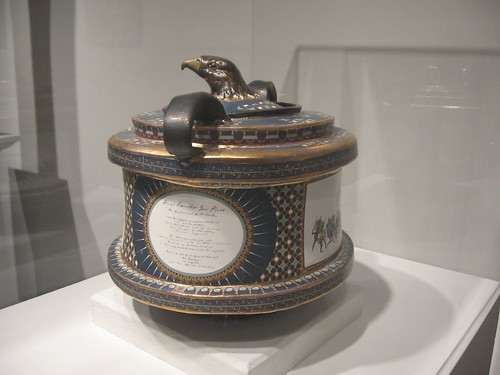
Nicholas Lenker, Always Remember Your Place, 2008. clay, glaze, luster; enamel, wood. 12x14x14 inches
Nicholas Lenker, long a personal favorite, appears to have emerged from an identity crisis and is back mucking around in his natural medium–clay. But he’s using some of the stuff he was doing in other media and making sense of it now.
His Greek-oid trophy-like vases are top-notch wifty, weird, and beautiful, with humanimals, beasts, and exhortatory cryptic writings that have a medieval torture and mythic kind of tone. The Masons ain’t got nothing on Nick when it comes to secret codes and rituals. The work is hell-fire and back again. Brrr. It gives me the chills.
Unlike some of the work about to appear at the ICA in their upcoming show on clay, this doesn’t have the exuberant juiciness of Betty Woodman, Robert Arneson or Kathy Butterly. Nor does it have the financial politics of Jane Irish’s work, about to open at Locks. This is dark stuff that brings to mind funerary urns and museum displays and extreme Olympian athletes of ancient Greece. I thought it was great.
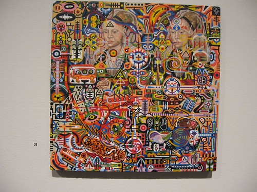
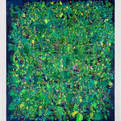
Semiotics of the Alchemical Forest, 2004-2008, oil on panel, 11 x 11 inches (The four year stretch reflects Thornton’s practice of going back in to each painting, over and over again.)
Shawn Thornton, another long-held personal fave of mine, brings visionary obsession to his paintings on panel. It’s Paul Laffoley on acid (oops, Laffoley also looks like he’s on acid, but Shawn takes it way further) in a video game world in which all the layers are visible at once. Try to find your way and you’re lost in Shawn’s mental mandalas, which in part are a product of a tumor on his pineal gland and the therapy that ensued. Honest, you can’t write stuff like this and get away with it! Some of the pieces have portraits in them (one’s a self portrait) that remind me of Russian icons.
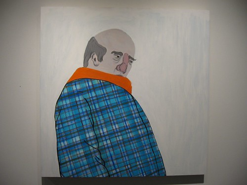
Josh Rickards, My Dad if he Lived up North, 2008, acrylic, flashe & oil on paper, 36 x 36 inches
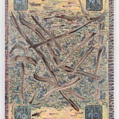
And speaking of icons, Josh Rickards’ ultra-flat portraits with tumescent noses convey a lot without a lot of information. The deadpan plaid shirt of My Dad if he Lived up North, and the deadpan striped robe of Drug Rug are each just flat pattern on a generic shape. But the choices of information nail what Rickards is getting at. I want to relate these lumpy humans to the elegant Pop figures of Barkley Hendricks with those minimal backgrounds and fashion (or in Rickard’s case, anti-fashion) sensibility.
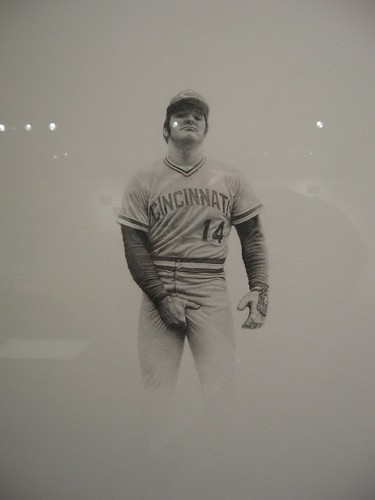
Mark Stockton, Pete 1974, 2008, graphite on BFK Rives paper, 26 x 22 inches
Also in the portraits realm, Mark Stockton’s confrontational portraits of Patty Hearst (her mug shots), Pete Rose (holding his crotch) and a young, pumped-up, 8-foot tall drawing of Arnold Schwarzenegger in a body-building pose–they all combine beautiful drawing with a sort of Pop culture horror! Really, seeing the three in such ludicrous detail is simply chilling. The highlighting of the very thing they are each most unappealing for is a smart move–and a commentary on the celebrity circus.
In the realm of sculpture, there’s a surprising amount of wood. Steven and Billy Blaise Dufala’s bunyanesque Sledge Hammer is similar to a piece they showed at their Fleisher Challenge, but this one takes the idea even further, and adds a touch of anti-macho commentary (at least that’s how I read it). That same sly undercutting of macho extremes is personified in Long Chuck, an altered digital image of an endless sneaker. Both pieces out-Oldenburg Claes Oldenburg with a lot less bombast and a lot more material pleasure. The work carries a self-deprecating, boyish charm that might fool you into thinking that’s all there is. Not so.
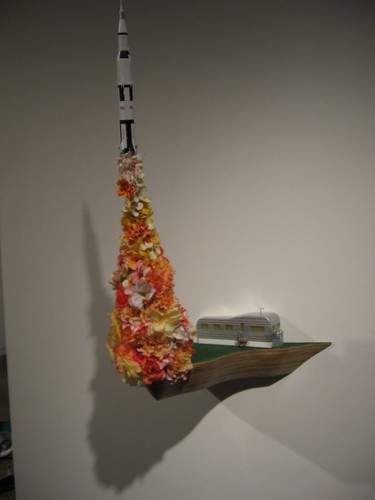
David Clayton, When I Grow Up, 2007, plywood, grass paper, ABS plastic, silk flowers, 30 x 16 x 12 inches
While we’re in the zone of boyish charm, David Clayton’s models of Americana and space are first cousins to Nick Paparone’s blow-up pickle in a box and his orbiting fried eggs in front of a digital print of space. At the other extreme, Charles Hobbs, who used to make models, surprised with ultra-crafted wood snakes and tree forms, all calling for a caress of the hand.
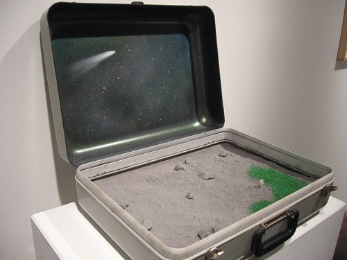
David Clayton, Neil Armstrong Dreams of Ohio, 2006, found object, pink foam, ceramic dry material, 8 x 14 x 20 inches
The one woman in the show, C. Pazia Mannella, offered a sort of counterpoint to the Dufalas’ Long Chuck fashion statement–a boa of multiple sewn-together zippers, displayed as a giant ruffle across the floor.
Also in the exhibit, Jeremy Drummond’s USA map, a bird’s eye view of an “ex-urban development” for each state, and Alex Lukas’ drawn-on prints of flooded cityscapes and other infrastructure disasters. Yikes! The end is near.
All in all, a great show. It’s up until Jan. 17!
(I tried to use images that Roberta didn’t use, so if you want to see more, check out her post, and also you can look at my Flickr set, as usual).


