At what point, I say to myself, does an intervention or displacement of some sort become suggestive of something bigger than the mere act of creating a shift. That’s what I came away thinking about at the Wind Challenge Exhibition #2, which features work by Mark Khaisman, Kara Crombie and Hope Rovelto.
Khaisman and Crombie are both doing something rather similar in a way–displacing and inserting something outside the normal context.
Mark Khaisman
Mark Khaisman
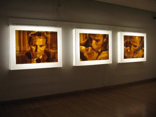
Khaisman, who is known for his packing tape drawings of noir film stills, is pushing what was in danger of being pure gimmick into something juicier in his exhibit, There’s a Frame Missing.
Riffing on the movie frame, he has created serial drawings of consecutive stills. I was surprised that even though I was looking at more information than a single still gives, the work became even more ambiguous. Oh, the action is clear enough. It is the moral ambiguity that increases as time slows to a halt.
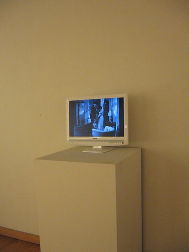
In addition to the packing tape drawings, Khaisman also has included a video installation which plays a compressed-action clip from the source of the stills–Sam Fuller’s noir film, Pickup on South Street–which involves crime, espionage, and a missing bit of microfilm.
Into the video clip, Khaisman inserts his packing tape drawings, so suddenly the black and white action pauses and slows for the sepia-tone stills. The sudden dose of layered unreality and the time shift are funny and startling. Somehow they undermine the suspension of disbelief that sustains a movie. The packing tape pictures, in their lightbox frame, seem believable and realistic until it is inserted in that alien film environment.
With the insertion into the video, there’s a sense of loss–lost time and lost narrative tension. Khaisman is also playing with his own lost past as a Russian native, exploring Cold War politics expressed by this 1953 film, in which good guys and bad guys are not all that easy to tell apart.
Kara Crombie
Kara Crombie
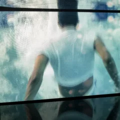
Kara Crombie jettisons narrative in her video installation Portraits 1. She has taken “moving portraits” of people (I’m thinking Andy Warhol thoughts here) and placed them in digitally created faux landscapes and interiors, that she compares to paintings. The landscapes are beautiful, and the interiors have the quotidian ordinariness of young people’s apartments and real lives. The hyped up color of the landscapes remind me of old Technicolor movies, but the people look real enough–almost.
The portraits are on three different screens, so if you don’t like one, you can turn around and look at another.
Crombie relies wholly on the disjunction between the person (reality) and the setting (manufactured) to shake things up. I found myself engrossed in some portraits, bored during others. The one that worked best for me was of Crombie’s fellow Vox Popper Andrew Suggs, sitting in a “kitchen,” looking rather antsy. His antsiness was enough to create a compelling narrative for me.
In the case of CGI in movies, the disjuncture might as well not be there because it is overtaken by the narrative. The disjuncture between reality and unreality, to work as art, needs to be evident enough yet ambiguous enough and wide-ranging enough to create a narrative in the viewer’s head. Crombie gets too realistic and therefore unambiguous in some of these–a cost of technical success.
Hope Rovelto
Rovelto has been casting ghostly white chairs out of porcelain. Some of them are broken down and bent, others in whole condition. They are symbols of people, a traditional metaphor. And they are memories, an idea emphasized by the scratched-into-looking silkscreens of blurry snapshots on the wall. It is the memory part of this installation that works the best.
I was interested to read in the gallery notes that Rovelto mass produces these chairs. That seemed kind of interesting–and surprising, given how the installation looks. I want to see more of that sense of replication.


