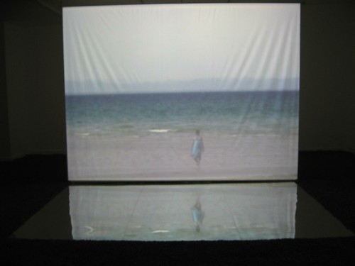
Yumi Kori, ututane, 2009, detail, site-specific mixed media video and sound installation
Japanese architect and artist Yumi Kori’s installation, utatane, at Moore College of Art and Design‘s Goldie Paley Gallery, delivers the experience of the ocean and limitlessness in a pair of enormous video projections and surround sound.
Just when Kori was expected to install, however, the ocean experience was a bit too real in the gallery. A pipe on the third floor froze and cracked, pouring water into the gallery space and pushing back the installation by several days.
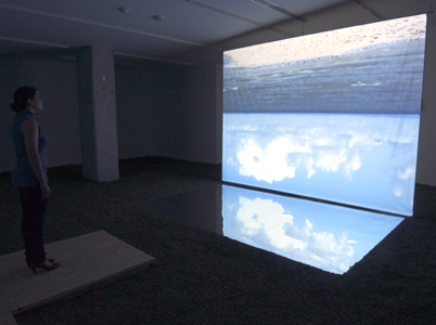
Yumi Kori, ututane, 2009, detail, site-specific mixed media video and sound installation, image taken and provided by the artist
When I stopped by to see the show, galleries Director Lorie Mertes said the bottom two or three feet of the walls had to be torn out and replaced, as well as parts of the ceiling–the new ceiling, recently installed as a gallery upgrade under Mertes. Somehow, the required repairs got done in just a few days.
Even so, that meant Kori had only three days left to complete her installation. Mertes herself, along with student interns, helped to rake into place the rocks, beating opening night by a hair.
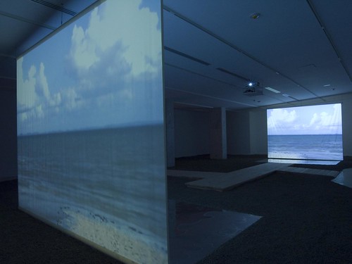
Yumi Kori, ututane, 2009, detail, site-specific mixed media video and sound installation, image by Yumi Kori provided by the gallery
When I walked into the gallery space, the light was so subdued it took me a moment to understand that the floor was covered with rocks and that I needed to walk on the boardwalk. Kori herself was photographing the installation. First I stood at the edge of the boardwalk pier, immersing myself in the experience, between the two video screens, which mirror each other. One of the screens shows the footage right side up; the other, upside down. And beneath each screen, on the floor, a mirrored surface (mylar?) reflects and inverts the video image so sea and sky merge.
After I soaked it all in, Kori and I had a brief conversation in which she told me she took the video during a residency in Bahia, Brazil, where the beach has a slow, long descent into the water.
“I woke up every morning at five [and stayed awake] until the sun sets,” she said in clear, but accented English. “I did some yoga. I was so happy staying in the ocean. I realized water was my body and realized the water in my body and in the ocean become one. I felt I was really part of nature. The [ocean floor] was shallow, and so gradual so you can walk and walk and it never gets deep. The sky and the ocean become one.”
I emailed Kori to ask what utatane meant and she wrote it was a nap or even a daydream–a temporary loss of consciousness.
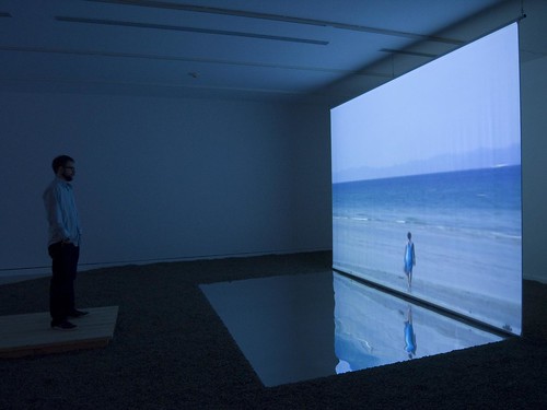
Yumi Kori, ututane, 2009, detail, site-specific mixed media video and sound installation, image by Yumi Kori provided by the gallery
Kori has her own architecture firm, studio MYU architects, in Tokyo. And this site-specific art installation, not her first, is a departure from her usually more architectural pieces.
A year ago, she created an installation in Pittsburgh, at the Mattress Factory–another watery piece called kanata, which means far in the distance. In that one, she flooded the basement (hmmm, there seems to be a theme here of flooding and water). She also made a deck there, similar to the one at Moore College. And there is an escape exit, a door, that she made red. “You don’t know what’s real and what’s a reflection,” she said. The exhibit has been extended to at least April, and Kori will be giving a public talk there next week.
Once Kori got her installation in place at Moore College, she decided to work on a sound track in the three days before the opening. I asked about her background in music. Although she previously worked with a composer so she could focus on just the visuals, she did study music and composition from age 6 to age 18, she said.
She said in most of her projects, it’s important what’s inside the building, “but here, what’s important is what’s outside.” Then she began to muse on the magnetic space between the two projections.
What engrossed me was the sense of a space, at once interior and exterior, and a sense of the body as a small part of the infinite cosmos. Better than the Jersey Shore!
Also showing at Moore, in the Window on Race, artist Devon Dikeou has created a sort of altar commemorating a force of nature who became a force of pop culture. Dikeou, who is also publisher/editor of Zingmagazine and knows a thing or two about the zeitgeist, installed in the front window Marilyn Monroe Wanted to be Buried in Pucci.
The exhibit includes Emilio Pucci-inspired patterns on the wall and a vitrine-encased shrine to the ring Joe DiMaggio gave Marilyn Monroe after their wedding. For the opening, visitors could try on a replica of the ring, lent for the event by Tiffany & Co. When I stopped in the next day, Mertes said Dikeou was creating a paper version for the installation. It’s hard to say which is funnier.
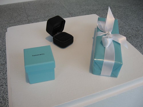
Devon Dikeou, Marilyn Monroe Wanted to be Buried in Pucci, ring detail. The ring display, sans ring. A replica, supllied by Tiffany’s, was at the opening for people to try on and dream a little. A paper one will be added to the display for the duration of the show.
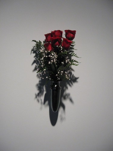
The show has the maudlin tone of fan worship, especially in a series of black and white photographs on the wall, showing flags at half-mast when diMaggio died in 1999, and also in a bouquet of six fresh roses at the entry (replaced three days a week, a recreation of the roses DiMaggio had sent three times a week to Monroe’s grave. Dikeou is using the same Hollywood-based florist.
The installation enshrines the way people fasten on to film and sports icons, love objects, and grand gestures. Affairs of the rich and famous are perhaps more tawdry, less romantic, today. Brangela is/are busy polishing and controlling his/her/their image with babies and good deeds, all to the detriment of sincerity.
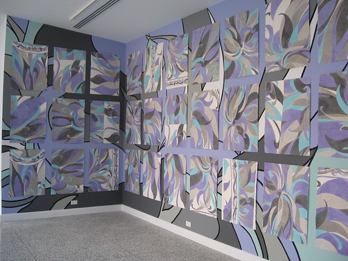
Devon Dikeou, Marilyn Monroe Wanted to be Buried in Pucci, mural detail. The Pucci inspired patterns, directly on the wall and on paper. I liked the visual competition between the two surfaces and multiplicity of patterns.
It’s that taste of bygone values that the installation captures. Marilyn Monroe was of her time, just as Paris Hilton is of this time, and I’m with Dikeou on whom I prefer. But honestly, Monroe was a victim of her own image, while it’s we who are victims of Paris Hilton’s image–and our own stupid yearning for seeing the rich and famous besmirched. Monroe selecting Pucci for her burial seems like an attempt to take control of something, but she was too late–she got buried in the Pucci, but the story of her life was too sad even for a Pucci to overcome.
I have to add here that I totally don’t get Pucci prints and Pucci dresses, and have trouble seeing Pucci as symbolic of anything sexy. My own recollection of Pucci is a hard-edged Pop sensibility in the patterning. I associate Pucci dresses with well-heeled, well-kept women of a certain age. Clearly Monroe felt it embodied who she wanted to be seen as (and perhaps that wasn’t sexy, although Dikeou’s gallery notes suggest it was). Dikeou’s take on Pucci is clearly different from mine.
Either way, both Monroe’s story and the installation are a lot more than Pucci can support, metaphorically speaking. The installation is also a bit too restrained. But the Pucci reference follows hard upon Mary McFadden’s Goddesses exhibition (see post), so Dikeou’s installation seems like it belongs at Moore, with its big fashion presence.
And speaking of McFadden, the Goddesses show is traveling to the National Museum of Women in the Arts in Washington, D.C., opening March 20 and running through the summer. What a coup for Mertes and Moore!


