The Weekly has a Queer issue this week and I’ve got two pieces in it. Here’s the first, about Richard Amsel, this year’s featured Equality Forum artist. The show’s at Rosenwald-Wolf Gallery.
Whether you’ve seen the film or not, you probably know Raiders of the Lost Ark by its sexy pulp-fiction-style poster art. What you won’t know is who created the movie’s brand—its vision of the fedora-wearing Indiana Jones cracking a whip above his head and smirking.
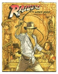
Illustrator Richard Amsel, a Wynnewood native and 1969 University of the Arts graduate, made that poster—and many others in his 15-year career working with Hollywood movie studios. Right now, Amsel’s original drawings for the posters are featured in a retrospective exhibition at Rosenwald-Wolf Gallery. The multimedia exhibit is a celebration of the artist, who died of AIDS in 1985, and an introduction to the Richard Amsel Illustration Collection, recently donated to UArts by longtime Amsel friend Dorian Hannaway.
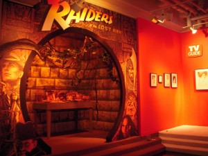
The show is a labor of love by Hannaway and Joe Stewart, who designed the gallery installation. Many from the UArts community, including students and faculty from the illustration department, pitched in to mount the show. The installation transforms the gallery into a movie theater lobby: It’s part funhouse and part Franklin Institute.

A black linoleum floor (trucked in from the West Coast, according to gallery director Sid Sachs) reflects the works in its shiny surface. There’s a spinning disco ball and several walls are painted circus- red. Glittery paper covers the room’s concrete pillars. An Indy alcove sits in the rear space with a cavelike archway, faux finish stone walls, a carpet and low lighting. Illustrations line the cave walls and are projected on a large monitor that plays the Raiders theme song.
The va-va-voom packaging upstages the delicate drawings, but really, it’s very much in keeping with what Amsel was about—creating an atmosphere to convey a story.
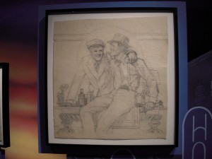
Richard Amsel was a gifted prodigy acclaimed by family and teachers for his ability to draw realistic portraits. While still an undergrad he won a nationwide contest run by 20th Century Fox with his poster design for the movie Hello, Dolly! The poster was used for the movie, and that early commission opened doors for him.
Movies and movie stars were a perfect subject for Amsel, a shy guy obsessed with cinema who, in the ’70s, loved to show bootleg 16 mm films of Disney classics in his apartment while invited friends passed the popcorn and the joints.
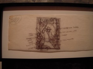
The artist had a spectacular career. In addition to Raiders and Dolly, he did the poster for the Paul Newman-Robert Redford mega-hit The Sting (1973) and was responsible for several early Bette Midler album covers and posters that helped transform the red-headed chanteuse from New York cult figure into a nationally known superstar.
Amsel flourished at a time when pencil illustrations meant real pencil on paper, and studios were looking for crisp hand-drawn images and confident, no-nonsense designs to sell their movies. Amsel delivered both—his drawings are rich and sure-footed, emphasizing the beauty and allure of the movie stars. His aesthetic is romantic, which is perfect for the romance and action adventure movies.
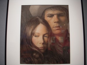
Amsel was acquainted with posters and art of the past and he quotes, for example, from J. C. Leyendecker’s illustrations of the “Arrow Collar Man” in his poster for The Sting. His typography is pitch-perfect, matching old-fashioned serif faces with vintage material (The Sting) and a bold advertising typeface with Raiders.
Amsel worked for magazines as well as the movies. And his best-known magazine works are the 37 covers of TV Guide magazine, all portraits of TV stars from Lucille Ball to Dan Rather. The show includes rough sketches for the magazine covers and finished drawings.
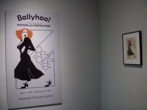
His work for Bette Midler’s album covers and posters are some of his best and stand out for their wonderful graphic sensibility. The 1973 poster for Midler’s show at the Palace (also used as her second album cover) is a three-color design using a silhouette of a Midler who vamps toward stage left in a sexy ’40s-era dress and shoes—all grace, power and attitude. It’s a bold, flat graphic that did well scaled up to billboard size. And Midler, in the show catalog, says the artist captured exactly what she was trying to convey.
Amsel’s original works are valuable today, and after his death some drawings went missing. The stolen works turn up occasionally on eBay, says Carol Hannaway, Dorian’s sister. One of the Raiders drawings on view in the show was recently recovered, Carol says, explaining that her sister uses Google alerts to find the drawings online, then pursues them through legal channels.
Several Amsel portraits, including a Lily Tomlin cover on Time Magazine (1977) and the 1973 Midler poster, are in the collection of the National Portrait Gallery. They represent some of the best and most iconic illustrations—and portraits—out there. Nowadays few are parsing the difference between “fine” art and commercial. All anyone wants is good—and Amsel’s art is very good indeed.
Richard Amsel: A Retrospective
Through May 14
Rosenwald-Wolf Gallery
333 S. Broad St.
215.717.6000


