As in every year, we have seen most of the graduating student shows at the major institutions. We’re going to distill this down to some broad impressions in this post and run a stream of photos with a comment or two in the next post.
There was low energy everywhere, almost.
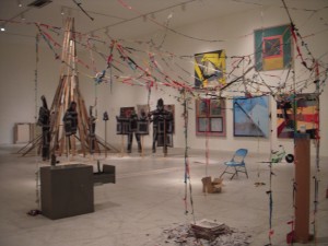
Students seemed obsessed with hearth and home–looking for safety from the disaster around them. Eco disaster and urban deterioration were all over the place, channeling the apocalypse and implosion of life as we know it. The relief came in dark humor, and anti-consumerist themes.
Body imagery was all over the place–it was about not feeling well, not looking good, feeling wounded, feeling threatened, feeling absurd. Architecture is crumbling–we saw a lot of beautiful decay. None of these are new themes or strategies, but they do seem to be obsessions permeating the work we saw.
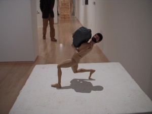
We saw tracks of Web 3.0 all-about-me art all over the place, with the artists featured as the stars of their own videos and photographs. But it’s depressed–the youthful outpourings of Facebook and webcams and blogorrhea. Some of it, although self-focused, still managed to say something big. Some of it, not.
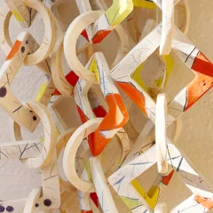
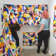
Craftsmanship was off the charts both ways–fabulously crafted and fabulously anti-craft. There were good things in both extremes.
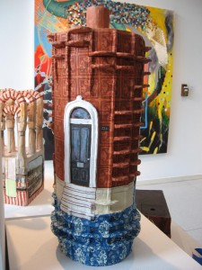
Moore College went high on craft. Penn MFA videos were awesome–when they were functioning. The Penn BFA videos were fine the day we came. Tyler MFAs looked fantastico in their new space, which lent an aura of professionalism and razzle-dazzle that some of the other shows didn’t have. PAFA’s show was more conservative than last year’s show and was actually more conservative than the other college shows we saw, reflecting its more conservative tradition with the focus on still life, figures and landscapes–although we did notice a giveaway–a xeroxed cartoon drawing with a dirty limerick–that broke the mold.
We noticed only one image of Obama–as a superhero–we expected more. We also saw a video and a facsimile of a doctor’s waiting room, touching on issues about our health-care system that we’re all thinking about right now. Boy, was this dark. And all in all, there was not a lot of joy passing around these shows. The kids may not be talking about the economy, but they do seem to be affected by it.


