Amsterdam’s usual venues for contemporary art are currently closed: the Stedelijk Museum is still undergoing expansion – they say they’ll open in 2010; De Appel has lost its space; and SMART Project Space, an alternative venue, was between shows although I had lunch with Hilda de Bruijn, Head of Exhibitions and discussed the situation. That meant the most interesting contemporary art to be seen in Amsterdam this summer involves books.
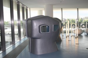
The new Public Library (the Openbare Bibliotheek Amsterdam) opened this spring, a few hundred feet from the central train station (near the temporary space that the Stedelijk Museum had occupied until recently) and it’s the most exciting space for books, music, video and related media that I know. Designed by Jo Coenen & Co (more images can be found on their website), it’s also the largest library in Europe.
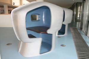
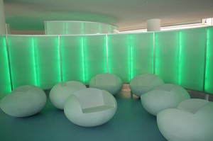
Distributed over seven floors are a children’s area with bookshelves arranged to form large, half-circular enclosures; an exhibition hall as well as display cabinets at the end of book stacks; a media floor that includes multiple computer stations, individual study pods and atmospherically-lighted, womb-like rooms with cushions on the floor; a theater and a penthouse restaurant. The building and its contents are available to anyone, but unlike libraries in the U.S., a membership is required to check out the books.
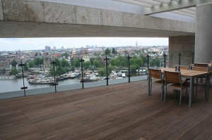
I’d been invited there to join friends for dinner. Barbara, Nico and I met for drinks at the café on the plaza in front of the library before entering the building and making our way to the roof. The ascent, via escalators, revealed views of the various floors with stylish lighting and inviting furnishings, which include upholstered chairs designed with large right-hand arm-rests that can double as lap-top stations (and electrical outlets conveniently nearby). The top-floor restaurant had a wide choice of casual food and drinks and attractive indoor seating as well as a terrace overlooking the city; it’s a spectacular view previously available only to birds, and I found it hard to remember that we were at a public facility.
Graphic design is taken very seriously in the Netherlands, and for 50 years awards have been offered for the best Dutch book designs. The Stedelijk Museum (which is closed for construction at the moment) has exhibited the winners in recent years.
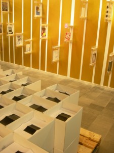
This year the Stedelijk teamed with the University of Amsterdam Library to present the finalists in the library’s new exhibition galleries. A librarian told me that the exhibition was organized with Ann Goldstein, the newly-named director-designate of the Stedelijk (and a long time curator at L.A. MoCA), and the presentation of this year’s winners as well as a survey of several hundred years’ of Dutch book design was itself presented as an installation (the concept and design of the exhibition are by EventArchitectuu).
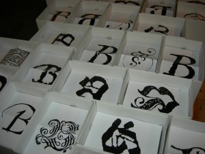
The catalog was free but had to be assembled page-by-page and then bound by the visitors. Its double-page spreads were in separate boxes in two front galleries, while a rear gallery offered a choice of covers (with “b” for “bibliotheek” in varying typefaces) set out on steps, and gold string for binding.
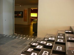
The exhibition enabled the current year’s books to be seen front and back in the first room and each to be handled in the second gallery. It acknowledged that book design is predicated on the experience of handling and sequential viewing. This should be obvious, but it’s an extreme rarity in exhibitions based on books. Between leafing through the books and putting together the catalog it was a thoroughly hands-on experience.
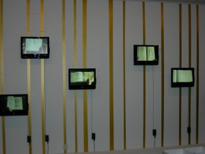
Since the historical material could not be handled there were wall-mounted video monitors displaying each book spread by spread (and unfolding several that had pop-ups or other unconventional designs and bindings).
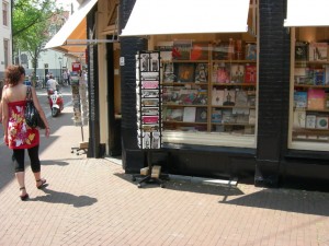
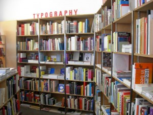
Nearby is Nijhof and Lee, a favorite bookstore of mine and of an international audience interested in design (they do a big web business). It’s a major resource for graphic designers and enthusiasts such as myself. I know of no place else with an entire wall devoted to books on typography (separate from another devoted to graphic design); I spent a couple of hours flipping through an international selection of books I could never find elsewhere. I’m one of many visitors who use their stock for educational purposes – a use the staff encourages. I was given a pamphlet created on Nijhof and Lee’s 20th anniversary; it’s composed of four quarter-fold sheets with text on the rectos, visible as bound, and an array of favorite book covers on the versos. I haven’t had the heart to remove the staples so I can see all the books.
