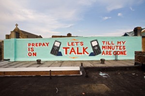
The Mural Arts Program has been adding some new, contemporary tactics to their mission to paint the town red and blue and yellow.
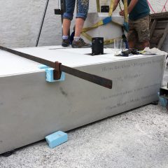
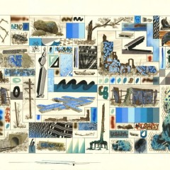
Here’s the link to a small story from yesterday’s Inky about an interesting MAP program that is distinctly contemporary, and a welcome change in tactics–featuring art that is, like the story, small enough to miss: ‘Quick and dirty’ street art drawing viewers to river
Thanks to Miriam Singer, who alerted us to this story, which features a MAP program she herself participates in. Although the online version at the Inky has only two images, they clearly have a very different flavor from the bread and butter of MAP.
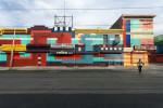
It’s also a departure from MAP’s Steve Powers project, A Love Letter for You along the Market Frankford line in West Philadelphia–dedicated to Philadelphia graffiti meister Cornbread. This project, too is somewhat of a departure, with its hip content, hip artist, and its return to graffiti roots.
(Murray distinctly remembers a Tony Auth cartoon that ran in the Philadelphia Inquirer 40 years ago depicting the first astronaut landing on the moon and finding an inscription reading, Cornbread was here).
If you’re wondering why we didn’t write a word about Love Letter, why rehash what was all over the main stream media?

Love Letter is way ambitious. The content and imagery of the Powers images are billboards and advertising across buildings along the length of the West Philadelphia el. It is a narrative across real time and real space–along the train line. But it is also a narrative that moves across another facet of time and space–back through Philadelphia graffiti history, to the true tale of a boy who woos girl with graffiti.
Nonetheless, the project is less of a departure than you might think. Love Letter, like the other murals, is huge, even as it inserts itself slyly in the urban cacophany of words and come-ons.
Large murals–whatever their style and content–domineer the public spaces. The small new works in the Inky article avoid that salespitch of the billboard scale. They are more like having a small artwork in a corner at home. And the imagery included in the story has the peppy look of grassroots political street art–screenprints and wheatpastes that seem scattered around the cityscape.
With this modest approach–a sort of anti-graffiti graffiti with permission from the residents–somehow MAP has found a new way back to its original mission and out of the corner in which it had painted itself!


