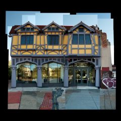
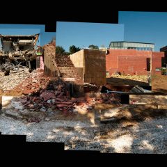
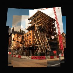
Las Vegas Studio: Images from Robert Venturi and Denise Scott Brown at the The MOCA Pacific Design Center, Los Angeles.
Learning from Las Vegas was a real watershed moment— or maybe I should say a real Waterloo moment— in architectural history. This book was the first, fully-formulated backlash against the dictates of Modernist architecture, however polite in its tone. Running contrary to every last tenet of the International Style, the polemic warmly extolled the symbol and ornament, fun and dysfunction, the ugly and ordinary, the redundant and duck-shaped— and nearly everything else that had been shaved from the severe, honest, and “functional” forms of the era.

The book itself was the result of a 1968 architectural study by Robert Venturi, Denise Scott Brown, Stephen Izenour, and several of their students at the Yale School of Architecture. For months, the group studied and documented the commercial vernacular of Las Vegas, as symbols-in-space taking precedence over forms-in-space. Architecture, they insisted, always has and always will communicate. Architecture always blends meaning and form. Even the proponents of Modernism, who purportedly banished the symbolic, were like it or not, still communicating with an end-of-the-century industrial vocabulary. So Las Vegas wasn’t novel in this regard, but it was, in all its flash and distraction, “the phenomenon at its purest and most intense.”
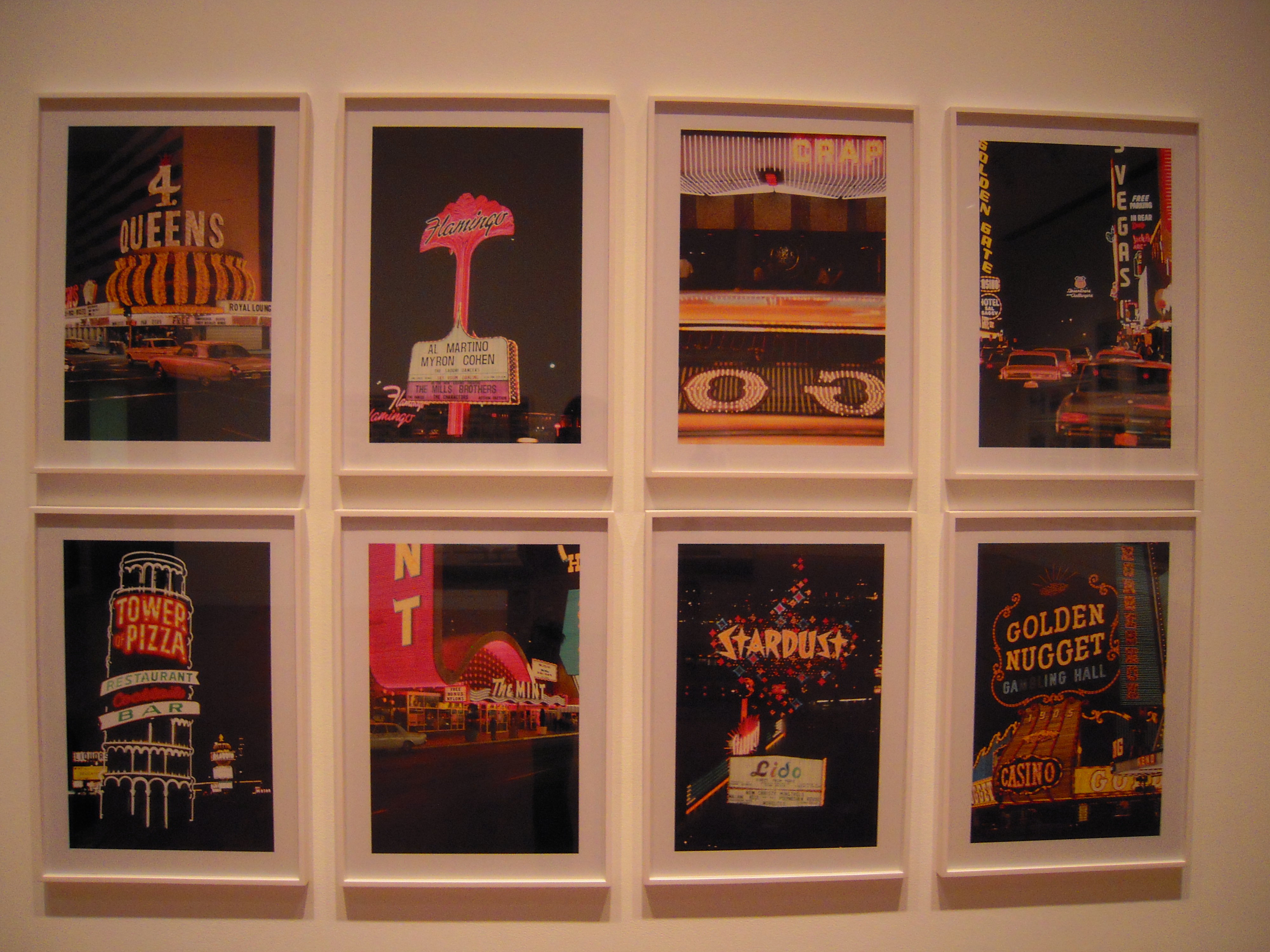
The group thunk and studied and documented the Las Vegas Strip, trying to discover the “system behind flamboyance.” They studied signage, motels, diners, casinos, parking configurations, void-to-fill ratios, and funny photomontages resembling Mexican bingo cards; trying all the while to absorb its lessons with a fairly Pop disinterest of its baser aims.
Considerable evidence from this study is now housed in a satellite of the MOCA that sits in the shadow of César Pelli’s blue-glass leviathan, the Pacific Design Center. The exhibition itself offers little new to readers of Learning from Las Vegas, aside from the films playing on the back wall and a few other knick-knacks. The exhibit is pretty much the book made life-size in gallery form. I paid a visit nevertheless, along with fellow Philadelphian transplant, Jesse Moynihan, more as a gesture of sympathy than anything else. Venturi and Brown are Philadelphians, as you may know, and their Eastern engagement with Southwestern architecture mirrors my own recent experiences within the Angeleno landscape.

Which makes sense. Los Angeles and Las Vegas are of a piece. Venturi and Brown were themselves contiguous with much of the Pop theorizing going on then in Los Angeles— that attempt to make sense of a young, new, exploding American Baroque. Ed Ruscha had already, in 1965, created long photomontages of the entire Sunset Strip with a camera strapped to the back of a truck. Venturi and Brown borrowed this “autoscape” documentation to grab the rhythms and hidden order of the Strip and city in Las Vegas, and you can see these on display at the MOCA exhibit.
When you wander around Los Angeles, you still see plenty of those mid-century, much-denigrated styles like “Googie” and “programmatic” architecture. Googie architecture— or “populuxe” as it’s supposedly also known— is a style that you all recognize: that semi-Jetsonian space-age aesthetic of atoms, boomerangs, and French-curvy blobs that springs to mind when you mention “Californian diner.” It’s here on every corner. Even loopier though less prevalent are the vestiges of programmatic, or novelty, architecture where the entire building will serve as a sign. Venturi famously classified this as a “duck,” in honor of the duck-shaped Long Island Duckling. Here in Los Angeles, we’ve got no ducks, but we got donuts, hot dogs, derbies, giant globes, and countless smaller examples of sculpture overtaking honest form.

Angeleno architecture is studded with mythic elements, though many belong to an American mythos generated by Hollywood and television. And thanks to the weather, even funny, little details like lettering and paintjobs still remind us of sixty years back. The California we always pictured before we ever came. This is the prime virtue that ought to be pushed, the phantasmagoria— only in the rich, self-conscious way it is in Learning from Las Vegas.
I get the sense, however, that our mythic shapes are endangered in Los Angeles. In later press, Venturi and Brown mention often how the Las Vegas of their polemic no longer exists, for numerous reasons. Unlike the works of canonical architecture, the subjects of their study were seen purely as commercial fixtures and thereby doomed by innovation to the Neon Boneyard. Sadly, this was the fate of many of the landmarks of googie and programmatic architecture everywhere; torn down as businesses went belly-up.
In Los Angeles, as in most places, I see a once-exaggerated jukebox vernacular succumbing to that committee-approved look we’ve come to expect from the commercial sector and the Land of Beige. This signals an end. As Venturi and Brown put it “Commissions produce mediocrity and a deadened urb. What will happen to the strip when the tastemakers take over?” What has happened is that the American commercial vernacular has run through a kind of dialectic. Once a source of inspiration against the strictures of Modernist theory, it has now formed its own “tastemaking” strictures, its own bland internationalism, and even seems destined to undo all its former doings.
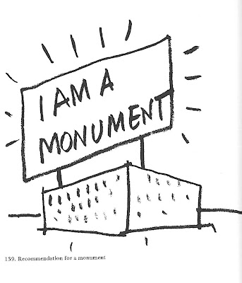
Take the Hollywood sign. Venturi and Brown claimed that the Roman triumphal arch was the forerunner of modern signage, and nowhere is this more evident than with the Hollywood sign. It not only welcomes us, it is the very icon of the American dream factory. Despite all this though, the sign is endangered by the very forces that put it up there in the first place. Originally, it was nothing more than a real estate advertisement reading “HOLLYWOODLAND”— an article of pure enterprise. Only with time and mythologization did it become what it truly is. Now, after some recent real estate dealings, wouldn’t you know it: the land around the sign is once again being considered for the development of luxury homes that would obstruct the view of the sign, but offer a breathtaking view of the city.
These kind of shenanigans are enough to challenge Venturi and Brown’s hope for a true “architecture of inclusion.” Or at least, they force the question of how we might retain the essential boldness we see in both Mies Van Der Rohe and mid-century Las Vegas.


