My motives for going to see a Wind Fleisher Challenge have changed. I used to go to see work by emerging artists whom I either didn’t know or wanted to see more of. That’s no longer the best motive for getting me there, what with all the collective venues showing the cutting edge emerging work in town.
A case in point: I hurried on down to the Wind Challenge #3 not to see the relatively untried artists–Scott Kip and Brenna Murphy–but to see the photos of industrial and urban scenes by photographer Tetsugo Hyakutake, who has a Philadelphia gallery (Gallery 339) and an international reputation that started in his native Japan and has expanded around the wold. I was on his track because I had recently seen Toshio Shibata’s highway photos at 339, and I wanted to do a mental compare and contrast.
But the delight of my visit turned out to be the work of Scott Kip, an artist I had never seen before.
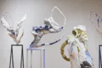
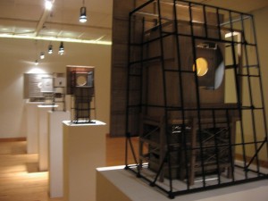
Kip’s room installation is a series of small wood-and-metal structures on pedestals supported by spindly metal legs.
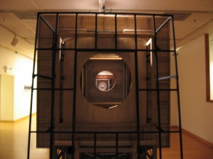
The holes/windows in each structure are lined up across the gallery, so to look through the window at one end allow you to look all of the structures to the other end.
The name of the installation is Past Present Future. The work is charming, a little delicate, a little crafty, a little industrial, suggesting the rural landscape with its techno-silos, barns and billboards. The resulting installation is rich in ideas–about time and space and looking forward and back.
The woodwork is lovely, with textures and layers that defy logic. The skylights in the building tops cast shadows, which are a whole subject of their own relating to memories, portents, moods and the flight of the sun across the sky. The process of walking around and looking through puts viewers in their own time, space, and memory process.
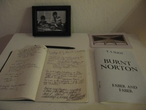
I was not the only one charmed by this work. The log book of visitors was a series of outpourings such as I have never before seen in an art exhibit. People just loved this work.
I am not sure if the work is something you can sell–it would require a space just right for displaying its charms. But what a treasure it would be to own and enjoy.
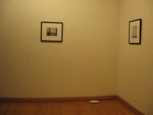
The other emerging artist at Fleisher is Brenna K. Murphy whose hair drawings of furniture on walls have been popping up around town for the past couple of years. In this exhibit, Murphy also tackles time by both gluing the hair lines up to the wall, and then over the course of the exhibit, removing them. The furniture she draws is old-fashioned, and plates resting on the floor look like they were set out for the cat. Really though, they are filled with the hair as it is removed from the wall. Yuck.
The wall drawings, barely visible, are lovely and beautifully done. I wonder at how Murphy tames the hair to do her bidding. As someone with one bad hair day after another, I’m filled with admiration for the control. But I’m not sure that I’m that interested in control over hair. However, the subject does bring me to the idea of our lack of control over our memories.
I keep asking myself, Why hair? I’m not so crazy about hair art (is this because I am influenced by the current fashion of people madly removing every hair from their body, top to toe–something I assume is a kind of self-repugnance as well as a fashion)?
At the same time I find myself arguing that our furniture is an extension of ourselves and our taste, as is hair. I also know that hair was a Victorian choice for remembrance (but didn’t those darned Victorians have some really bad taste?) And speaking of taste, the dishes make me wonder why hair deserves comparison to food, or the cat’s milk–or even the orts of meals past.
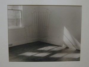
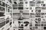
I liked the look of some small, photographs of spaces onto which Murphy stitches with hair the similar drawings of furniture in otherwise empty rooms. The stitches are perfectly even and look machine-done, but in fact the artist tells me the stitches are done by hand. Here the hair becomes a stronger-looking material, almost losing its hair qualities, tamed as it is by the seemingly mechanical evenness of the stitching. I liked these as an expression of marking spaces with our presence via hair. They have a material pleasure and the magic of the 2-D drawing in the 3-D picture.
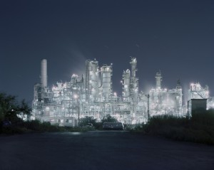
Back to the reason I went–Tetsugo Hyakutake. His photos have a high-contrast hyper-realism that glorifies the structures that our societies have created–at the same time suggesting they may be toxic and not so good for the human spirit. This latter idea however is not expressed with much emotion. The work is cool, largely formal, and quite beautiful. His Pathos and Irony: Industrial Still-Life in Jaman #3 is a fairy land of what looks like a refinery in all its illuminated glory. It’s better than Disney–a twinkling pleasure garden. While I’m happy to look at this work, I am disappointed in the number of older works here. I think the Challenge needs to be considered like a play try-out in Philadelphia, not like a traveling show that has already succeeded on Broadway. If I were writing the new rules, I’d insist on new work. If it doesn’t bomb in Philadelphia, send it to the world.
The exhibit runs through June 25, 2010


