The show at Jolie Laide on First Friday included the slick, decorative surfaces of Robert Horvath in the main space, in the alley the funky DIY installation by Tim Eads, and in the project space the mechanical torture rack of Heather Ramsdale.
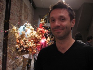
Horvath is the artist of the month at the gallery, and the other two were there for one-night installations. But all three seemed to be cogitating the relationship of surfaces to substances and to the body itself. (Another installation by Jessie Hemmons I completely missed, alas–hand knit socks covering some of the city’s street lamps; they will be up for a while, so I can go back to look–and so can you).
Starting with Horvath, his two related bodies of work–six sculptures and seven paintings–have a Jeff Koons-ian merchandise feel, except Horvath’s objets are abstract.
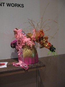
The sculptures–earbobs for an Amazon, chandeliers for the cosmos, or maybe costumes for the Oscars–have cheap underpinnings–disgusting globs of canned insulation foam, wires and plastic, transformed with luscious colors and metallic surfaces.
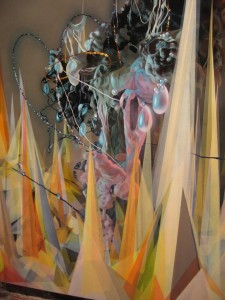
The sculptures serve as models for the paintings, which are equally focused on surfaces. Horvath, who lives and works in Indianapolis and had recent shows in Chicago and L.A. was born in the Slovak Republic (he retains a charming trace of an accent). I asked him if he uses an airbrush, but no, he uses a regular paintbrush. And he works from photographs of the models–these are not computer generated images. Reproduced in paint, the objects take on a boyish gothic fantasy style–stage sets and costumes for Star Wars. The tour-de-force painting is all surface, all formal. The joy in the gorgeous trompe l’oeil trumps any cynicism about celebrity culture. It’s mainly the excess that suggests these paintings are more than kitsch.
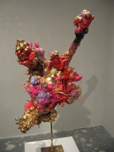
The sculptures, on the other hand, maintain a tension between the crappiness and the gorgeousness, between the awkward hand-made cheesiness and the shiny perfection of manufacturing. Parodies of consumer goods, they are at once fabulous and awful and seductive–take the merch home, sweep the dirt under the rug, and decorate.
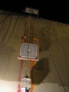
Tim Eads‘ pair of painting machines installed in the alley for the evening are neither slick nor beautiful, yet they are equally useless. The gizmos create a couple of paintings by fanning streams of dripping paint on a blank wall. The resulting works are two colored stripes from one gizmo, and a splatter painting from the other. The two gizmos glory in their their inelegance, in one case requiring human intervention to move up and down the wall via a rope-and-pulley system. Tim gave us a demonstration, unwinding the rope from a nearby bollard and tugging. Here the mechanical looks and is handmade, and the mark-making looks and is mechanical. For all it’s art-insider jokey content about creating paintings, the work is charming and friendly enough for anyone. And so is Eads, who seems to be making friends with everyone around and showing everywhere. Last month he was at Grizzly Grizzly (with his wife Tiernan Alexander). And in the spring he was at FLUXspace.
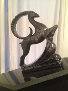
Using a very different aesthetic–the look of high-tech mechanics, Heather Ramsdale invites a viewer’s body into a thoroughly unfriendly, minimalist structure, all fluorescent lighting and metal right angles. The one-night installation was in the project space right across the street from the gallery. Next to the white-light torture chamber–kind of like a tanning booth–a white upholstered trolley invites a viewer to take a ride into the belly of the structure. The trolley is a swell version of what a mechanic rides to slide beneath a car chassis. When I was there, no one took a ride. In the push-pull of the approach/avoidance situation, avoidance seems to have won the day. That’s a shame. But I suppose it shows that the torture chamber gets its point across. Ramsdale had this piece at the Penn MFA show in the spring, and the fellow who was gallery sitting gave us a demonstration of the slider in action. I only looked.
More First Friday pix at Flickr.


