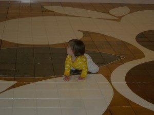
Sometimes people animate the art, which was certainly true of Beatriz Milhazes’ The Sun (2010), a baked tile floor exhibited by the Beyler Foundation, Basel which was irresistible to visitors who moved on all fours. As stunning as the large floor piece was, Galerie Gmurzynska, Zurich was my choice for best looking space (given the caveat that I hardly saw the entire exhibition).
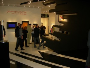
That shouldn’t be a surprise; it was designed by Zaha Hadid (who clearly should consider more interior projects) for an exhibition she curated exploring the influence of Suprematism on her own aesthetic. It’s hard not to make a wonderful exhibition of the Russian material, and interesting to speculate what the artists would make of Hadid’s work, her technical possibilities and her budgets.
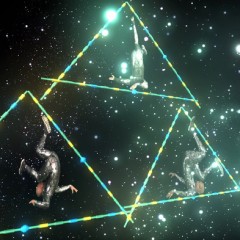
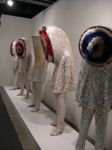
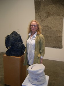
A group of five sound suits by Nick Cave made a striking impression on one of the walkways alongside the booth of Jack Shainman Gallery, N.Y.C.. Unusually sober and monochrome for Cave, they sported enormous heads with targets for faces that somehow read as single eyes – like a minotaur band from outer space. Within the booth I was drawn to two pieces on plinths: the black one looked like a pile extruded by huge worms, to such a height that it began to topple. The white piece might have been the Mad Hatter’s fez. When I saw that they were by Arlene Schechet and mentioned to someone in the booth that I’d see her work in Philadelphia (at the ICA ), the woman introduced herself as the artist. This was the first time she’d been in Miami and, in contrast to her experience of fairs in New York, she was enjoying the relative peace since she wasn’t running into one colleague after another.
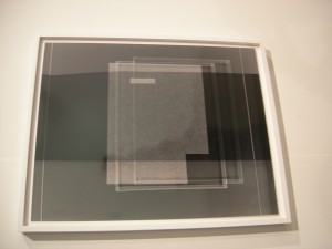
I was quite taken with a group of photographs by Josh Brand at Herald St., London, abstractions that hinted at being photograms, but weren’t quite. I rarely inquire about photographic technique since it’s not a subject I’ve mastered, but did here. It turns out that some of them incorporated photograms but they were more properly described as mixed technique, often with multiple over-printing (all darkroom, not digitally manipulated), although the labels described them simply as gelatin silver prints. Brand manages to invest them with something of the deliberation of drawings, so they demand close and slow reading.
Katarzyna Kozyra’s video, Summer’s tale (2008), was stopping people in their tracks at Zak Branika, Berlin. This may have been partly because the large screen was oriented towards a pedestrian intersection, but Kozyra’s work manages to be visually and narratively compelling even in the very short clips glimpsed in passing. Summer’s tale is a modern fairy tale that takes the form back to it’s often violent roots (as in the un-Bawdlerized Grimms’ stories). Its characters include a group of dwarf women dressed in semi-traditional folk costume, a male singer, a drag queen and the artist herself attired more or less like Teniel’s Alice; a tantalizing trailer is available on YouTube . Kozyra, who is also a performance artist, is obviously a force to be reckoned with and I’d like to see much more of her work (two videos were included in Global Feminisms, at the Brooklyn Museum in 2007).


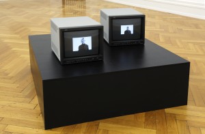
Max Wigram Gallery, London was showing several video installations, including Pavel Buchler’s inexplicably compelling Nodds (2006), a double screen animation of Richard Avedon photographs of Samuel Beckett. They also had a portfolio of his word drawings, which combined beautiful use of watercolor with fairly esoteric references to color theory, and caught my imagination.

By the way, the billboard I illustrated in Art Basel Miami Beach; part 1 (Dec. 9) was art and not commerce, as I’d suspected on first sighting. It’s by Geoff Hargadon, whose work has been written about elsewhere. It was sited just where one might have expected to see CA$H for your CAR (although the more common sign in Miami these days, apparently, is CA$H for your HOUSE). In the midst of the most frenzied, commercial aspect of the contemporary art world, it was wonderfully plausible – and funny.


