When is a magazine not a magazine? Maybe when it’s got so many good things in it you don’t throw it away. Or maybe when it looks more like a book than a magazine.
Issue 1 of the brand new LPV* Magazine looks like a soft-cover book, and when it arrived in my mailbox in April, I immediately questioned its designation as magazine. The 54-page photography publication, which you can order through Magcloud, is a like a small cocktail table book devoted to street photography. With its perfect binding, nice photo spreads inside and minimal amount of writing: It’s a keeper.
A project of Bryan Formhals, photographer, writer and internet community organizer, LPV is a curated publication with photos selected from among various Flickr communities like the LPV group and another group, HCSP**: There are 21 photographers included in the debut issue, three of them given in-depth spreads of around 10-13 pages each and 17 artists in a “group show” in the middle.
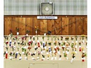
The magazine’s photo placement is somewhat free-form. The photos are not consistently sized or consistently placed on the page. I’m not sure that it matters, but in a book-like publication without much text, you notice the white space when it varies from page to page. Most of the photos are mid-sized, fitting two to a page, although in a couple cases a picture is allowed to sprawl over two pages, centerfold-style. Formahls has added red-pencil editing marks here and there, underlining a name; circling a phrase, putting an “x” next to a photo. The marks imbue the magazine with a sense of urgency and hint at incompletion, as if you’re seeing the editor’s mark-up copy and not your own. It doesn’t add to the experience of the photos is all I want to say.
But these are small complaints for such an earnest labor of love that’s committed to offering street photographers exposure to new audiences. Basically, this magazine is based on the proposition that the internet (and Flickr in particular) is a hotbed of great new photographers. It’s also based on a desire to bring new thoughts, ideas and energy to photography in general. Formhals studies the artists he’s selected and has interviewed a bunch of them. The interviews are online only, although they would make a wonderful addition to the magazine’s print edition. (True confession: This issue showcases my friend Chuck Patch‘s work, of which I’m wildly enthusiastic, so I am very up on this publication.)
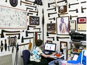
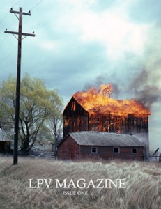
Formhals, who is himself a photographer, picked work for the first issue that skews to the humorous and deadpan. Pictured over and over, in works by many different artists, are those moments in life that are odd and evocative, like the cover image by Chuck Patch of a barn on fire in an otherwise pastoral setting where you question what the hell happened and where is everybody; or the photo by Simon Kossoff of an office whose walls are covered to the ceiling with Native American artifacts — hatchets and arrowheads — and almost completely invisible amidst the aggressive wall display is a woman at a computer, a historian, presumably, dwarfed by history.
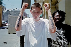
As with much street photography, the images are human-focused, with people, house/habitat and pet pictures predominating. This is recent color photography and it looks like it could have been snapped anywhere in America.
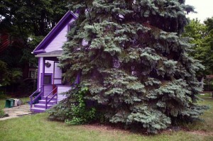
Mark Alor Powell, one of the artists featured in depth, is a portraitist. His portrayals are both empathetic and quizzical. The images range from people to a non-human odd couple (a purple house almost swallowed up by the enormous evergreen next to it). A photo of a youngster smoking a cigarette with smoke coming out of his open mouth and little puffs of smoke covering up his eyes is striking, in spite of the “smoke gets in your eyes” reference.
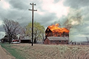
Chuck‘s photographs stand out for their beauty and for the ease with which they haunt you. That cover photo, from 1981 — a rare instance of early color photography by Patch — is full of death in rural America or maybe the death of rural America. Following the recent spate of twisters in the Midwest, Plains and South, this image of what probably is a disaster (do people intentionally burn down barns to get rid of them?) achieves that rare sublime beauty that horrifies as well as seduces.
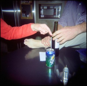
Blake Andrews‘ photos are highly interiorized views of people, places and things. They are like snapshots, with flash, of small moments or things that may not seem important to you, but might have been important if you were there. A shot of disembodied hands (and a foot) coming together around a beer bottle is part of a larger scene but you don’t get to see the big picture; that’s irrelevant in Andrews’ almost secret-coded enterprise. The pictures don’t feel like “bad” photos or toss-offs that wouldn’t make it in your photo album, however. They are deliberative, and each has something weirdly expressive of the human condition that keeps you looking.
The idea of a DIY curated magazine like this is very exciting. With print on demand venues like Magcloud and free digital layouts keeping the costs of production/distribution down, publications like this could be the beginning of a whole new level of “exhibiting” and distributing art to a wider audience.
Single issues of LPV magazine are available from Magcloud for $14.99 plus shipping. Or you can subscribe at their website and get 3 issues in 2011 for $49.99. Photographers, if you want to be considered for LPV Magazine, submit through La Pura Vida Flickr group or email editors@lpvmagazine.com. Guidelines for submission here.
____________
*If you’re wondering, as I was, what LVP stands for, the initials stand for “la pura vida” the idiomatic expression of Costa Ricans that means “full of life,” “going great,” “cool!” and is used as a greeting, farewell or thanks.
**HCSP is the Flickr group Hard Core Street Photography. Here’s how Chuck, who participates in the group, describes the work selected for the highly selective HCSP: “…small camera, off-the-cuff, straight shooting with a good dose of humor and a sense of complexity, without being doctrinaire.”


