By Joshua Weibley
An image of a set of conditions (as in “medical imaging”) is an overview of these conditions which summarizes them. In this way, generally, images are the concise products of analysis; they simplify to explain and provide summary.
This simplicity is due in part to the substance of an image: an image is the singular, unified impression produced by a set of elements working together. This “working together” can be seen in the interrelationship of brushstrokes in a painting and between the individual words of poetry.
This is why it makes sense that images come to be called “works” of art, but when someone steps back from a work of art to say, “It just works,” they are expressing not only the labor occurring in this work, but also the ease.
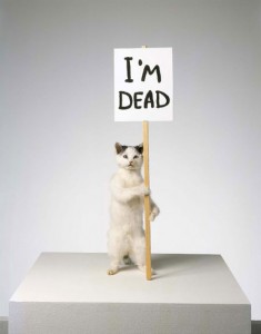
The experience of taking in an image is always simple and direct, like “getting” a joke: when you understand, the understanding appears as a kind of completion all at once and you begin to laugh (if it is a good joke). In the same way, if an image doesn’t “click,” it doesn’t work as an image. It stays as just a picture or just a collection of plain objects without any relation to each other.
The image of a work of art is actually made of many smaller ones (think of the many frames in a film or the many vantages around a sculpture or adjustments to the lighting on a painting and etc.). Unsuccessful work is merely a collection of images which together do not create a cohesive larger one.
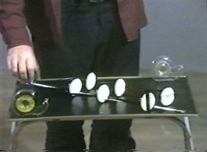
These larger images may not make themselves immediately apparent, however, and the best usually hold their viewers at a distance. Often they do this by surrounding themselves with smaller images that seduce a viewer into sticking around long enough for that tantric “ah-ha” moment to occur in its own time. For example: if something looks enough like a classically “good” piece of art, someone might look at it long enough to suddenly notice something else about it. The moment can linger or fade or expand or echo from that point but, whatever the case, the “ah-ha” explodes into being within an instant.
The act of suddenly simplifying the parts of an image is necessary because what an image’s elements do together on their way to becoming one is naturally cumbersome, incommensurable and difficult. In other words, the working together of images’ materials is not clear to begin with: work, like life in general, is a discontinuous, messy process that is inherently not simple. Though it may seem obvious to say so, work is not naturally easy; for the purposes of an image, however, one’s work must become easy (for the viewers, at least).
In art as in writing, style is a kind of varnish that conceals this discontinuity: written words don’t form sentences together without style between them, and the use of style toward this kind of simplicity decides a sentence’s effectiveness. The images then evinced by a sentence are more or less evocative—more or less vivid—as an effect of style.
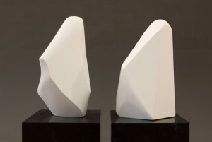
The same is true of the forms employed in the service of every other art. Style smoothes over the work of bringing elements together into a singular, continuous whole or, in other words, it conceals the work in an image and brings it ease. Even though it necessarily strips away meaning in the simplicity it provides (which is something that happens in all summaries), style is what makes images work at all. In the end, art is about finding a form to accommodate messiness, fitting it to stylization.
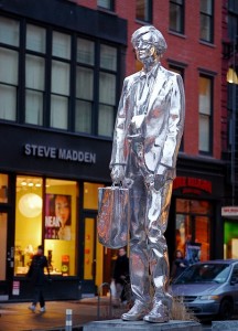
At the same time, the idea of being an artist is itself an image, and it too is subject to stylization: this is the purpose of things like artist’s statements and CVs. The most effective artist statements give the impression that one’s work is consistent and coherent, and the most effective CVs convey the singularized impression that one’s experiences with and relationship to art are continuous and direct (like a story that can be concisely told in a straight line from beginning to end).
In presenting either or both in various forms, most artists’ websites make the same claims about life and artwork, additionally presenting documentary images of works which (hopefully) back up the simple claims a statement or CV make. Better yet, like the smaller seductive images surrounding those grander images which need time to make their slower impact, these documentary images can teasingly refuse to expand on or verify the claims of a CV or of an artist’s statement. In fact, some of the most successful artists live without a web presence at all: the less direct information about an artist’s work that is widely available—and the less direct what information that is widely available is—the better.
In creating the image of an artist’s life in the arts, the choice to present or conceal information is a stylistic technique. When successful, it makes a working process that is necessarily disjointed appear seamless, eliding this work’s relationship with the discontinuous messiness of one’s life. CVs, statements and websites help make the image of just being an artist “work.”
The expression “The pros make it look easy,” however, simplifies all of these ideas about work. Just like an image that works, this expression turns paragraphs and paragraphs into a few concise words, even if much of the meaning is lost in translation.


