Collaboration is a road paved with landmines, and the way to avoid those is to stay focused on the goal. Luckily for the artists involved in the Institute of Contemporary Art’s “One is the Loneliest Number,” they have their eye on the prize. The exhibit features five collaborative teams, each comprised of two emerging artists who’ve been working together for four, six, even 10 years. Some of the work feels like the call and response of two individual voices, while other works sing with one voice. The show is haunting, as several pieces focus on isolation or miscommunication, shedding light on the solitary nature of the human condition.

Local artists Matt Suib and Nadia Hironaka portray loneliness in a crowded setting in a piece that’s both political and poignant. “Provisional Monument for the New Revolution” is a large, multi-channel video projection with sound that wraps around two walls and envelops you in a black-and-white, barely moving image of protesters in an urban square in some Middle East country. In the grainy, X-ray-like scene, it’s impossible to tell exactly where these people are. The ambiance is spooky. The sound, which is not the sound of the crowd, swells from a quiet hum to a rhythmic ticking that grows so insistent it commands the air space in the gallery. What little motion there is has been frozen into a never-ending stuttering. If you approach the wall, your shadow gets projected on the video and you become a giant black hole in the crowd, a piece of the puzzle that doesn’t fit. You are alone in their crowd.

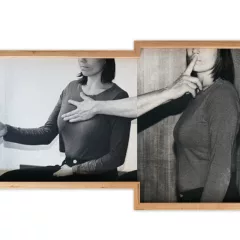
Julien Bismuth’s and Lucas Ajemian’s work features side-by-side video monitors that show them talking during their collaboration, often like a couple on the verge of divorce. The pair makes videos (as part of the show they’ve made bright green metal sculptures that echo foam-core sculptures in the videos), they write (you can take a free selection of their newsprint zines from the downstairs lobby), and they seem obsessed with alphabet letters and symbols. The art seems argumentative without reason, but the zines contain a lot of good writing and are much more personable.
The companion totems of clay and wood by Nicole Cherubini and Taylor Davis are a palette cleanser in this show. The way the materials are put down—a glob of clay here; a stick of wood there—makes the pieces likeable, albeit not as memorable.
Less likeable is Nick Mauss’ and Ken Okiishi’s “One Season in Hell,” an update of the 1873 Arthur Rimbaud poem A Season in Hell. The framed book pages are displayed on the wall but it’s far too much to read or even look at in a gallery. Perhaps a little desk and the book itself to flip through would have been more in keeping with the intimacy of the piece. Framed pages are not engaging and make the book more precious than it maybe is.
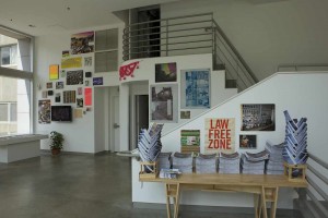
The opposite of precious, Megawords collaborators Dan Murphy’s and Tony Smyrski’s raucous installation on the mezzanine has a jumble of photos, adolescent-boy memorabilia and a handmade display desk and chair. The installation is upbeat, energetic and affirmative about life lived, times experienced and collective memory.
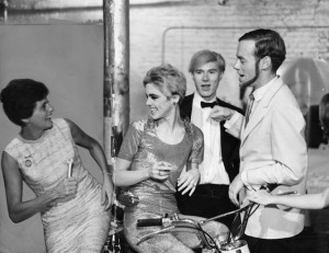
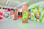
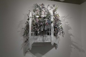
Don’t miss the Andy Warhol documentary show in the Project Space, which tells the story of Warhol’s 1965 exhibit at the ICA and includes a great piece by Alex Da Corte (a Romeo and Juliet-style balcony filled with a large silver bouquet.) It’s a fabulous tribute the pop artist would love.
Read this at Philly Weekly.
Through Aug. 7. Institute of Contemporary Art, 118 S. 36th St. 215.898.7108/5911. icaphila.org


