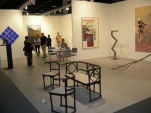
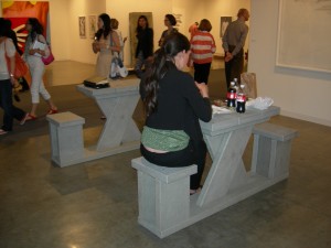
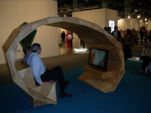
I decided to take it easy at the fairs this year, assuming that, as with large conferences, I’d certainly discover interesting work but was unlikely to predict ahead of time just where I’d find it. One obvious new feature of Art Basel/Miami Beach this year was the prominence of furniture. Some of it was part of the work on display, such as Dan Peterman‘s Running Tables at Klosterfelde, Berlin, despite the fact that the staff were sitting on the built-in seats to eat their lunch; I assume his recycled plastics can handle the wear.
What appeared to be a group of vintage Thonet at Galeria Juana de Aizpuru, Madrid was actually Franz West‘s The Power of Papier Mache (2008), and required a hand-written sign to keep visitors from taking a seat. This was somewhat surprising, since I’ve sat upon West chairs in the cafe at the New Museum, New York and a functional couch by West sits in the entrance lobby of the Whitechaple Art Gallery, London. Such intimacy with the displays is unknown in my experience of exhibitions actually devoted to furniture design – I’ve never understood why museums don’t include examples that can be sat upon and handled, when the pieces in question are in current production. Comfort and functionality are surely significant criteria when judging furniture, and allowing visitors to assess those aspects for themselves would enrich their understanding of design.
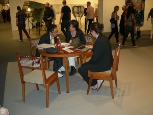
Kurimanzutto had some mid-20th century wooden chairs (by a known designer – unfamiliar to me, however, and I didn’t record the name) which I could happily live with; for the right price, I probably could have taken them home.
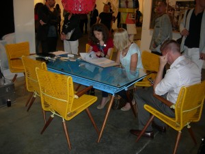
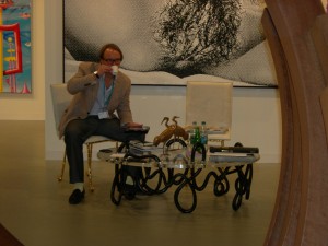
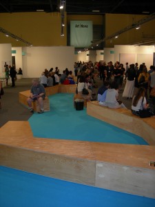
The fair itself had some rather well-designed seating for the crowds, but the designers weren’t identified in any place I could find.
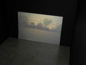
After noting the furniture, I headed to the section devoted to the less well-established galleries where I figured I had most to learn. On the way I peeked into a small, dark, nook with a video monitor on the floor. It was screening Francis Alys‘ Sleepers (2008), arranged by Galerie Peter Kilchmann, Zurich, a slide show of photographs of variously dogs and men sleeping in assorted public places, most looking as though they had no other options. I couldn’t decide whether displaying the homeless to art crowds that could afford the $40 admission to Art Basel/Miami Beach was a salutary reminder of the less fortunate, or poor taste.
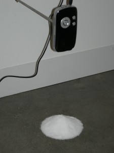
My eye was caught by a small floor installation: Avinash Veeraghavan‘s Short Story: Brine (2011) at Gallery Ske, Bangalore, in which miniature, wall-mounted equipment projected a video of swirling water onto a mound of salt on the floor. The dealer couldn’t provide any back story beside the salty brine of its metaphorical mixture, but perhaps its scale added to its poetic appeal. I did inquire whether Bangalore clients supported the gallery (a regular inquiry I make to galleries outside art capitals). Their sales are mostly throughout India (although not concentrated among the local population), whereas in the past they had primarily been to Europeans.
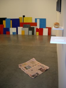
At Annet Gelink I saw what appeared to be a crumpled Financial Times on the floor; it turned out to be a tromp l’oeil by Ryan Gander, sitting beneath tiny wall shelves supporting what appeared to be 1) a piece of toilet paper and, 2) a sandwich of bread stuffed with bread. On the wall behind them, at floor level, a group of painted glass clip frames were arrayed, another Gander piece which read like a deconstructed de Stijl painting.
Meessen De Clercq, Brussels, had a tightly-coordinated presentation of work by three artists, each working with dust. In a free-standing case, measuring one cubic meter, Ignasi Aballi‘s Untitled (dust) contained a fine layer of dust beneath a plexiglass cover engraved with various texts about dust. Seven panels by Claudio Parmiggiani occupied two large walls of the space. They contained imagery of butterflies made with a technique he calls delocazione: he pinned butterflies to the panels and lit a fire, which produced smoke deposits on the areas not blocked by the creatures. Their images flickered in white over the soft, brownish-gray residue of the smoke. The work is clearly about the fleetingness of life, but was so subtly and atmospherically beautiful that the panels would make a wonderful environment in a domestic space, assuming the collector is comfortable with the knowledge that death is the inevitable consequence of life. I was rather surprised that it hadn’t sold already. The gallery’s hand-out referred to the fact that butterflies symbolized the soul in Ancient Rome,which reminded me of a wonderful painting by Dosso Dossi in Vienna, in which Jupiter is shown as a painter, creating human souls as he paints butterflies.

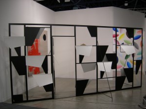
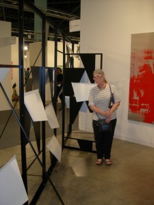
Another work I would happily display in my fantasy palace was Martin Boyce‘s large screen at The Modern Institute , Glasgow [note: just after the fair it was announced that Boyce had won the 2011 Turner Prize]. The screen was wonderful on a purely formal level, but I suspected that the forms had conceptual underpinnings, which sure enough they do: the tilting trapezoidal forms refer to a group of Cubist-influenced trees, made of concrete, that Joël and Jan Martel designed for a garden at the 1925 Exposition des Arts Décoratifs et Industriels Modernes in Paris. Boyce has converted their abstraction of natural forms back into abstract construction.
There was also a lot of dress (and undress) designed to attract attention, including one woman’s tee shirt which commented on the phenomenon of fairs in general:


