How, I say to myself, am I going to write about this show that brings up issues of What is Contemporary Art? and What is art of any kind? It’s a show that wrestles with beauty, concepts, the handmade, and even more narrowly, the made and not made, and the material and immaterial. It also wrestles with group show constraints–the meaning of being jammed into one space with others whose work impinges on your own in some way–and talks to your own, redefining and expanding, in the best of worlds.
The show is A Closer Look 8, the show at Arcadia in which a curator gets to choose three to five artists from previous Works on Paper shows, and then invites them to make something new.
In this case PMA Assistant Curator of Modern and Contemporary Art Adelina Vlas, curated. And she selected Dechemia (artists John Gibbons and Isobel Sollenberger) and three others–Josh Shaddock, Sebastien Leclercq and Brent Wahl.
Thank goodness for the material splendor and unexpected mashup of ideas and imagery in Dechemia’s installation. I’ll get to this farther down–when I visited the show, I saved them for last.
I’ll start with Josh Shaddock, who normally cloaks his conceptual work with a generous, Judd-Apatow goofiness.
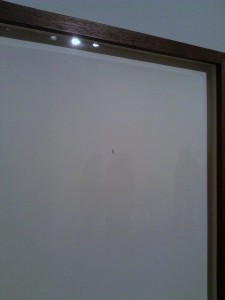
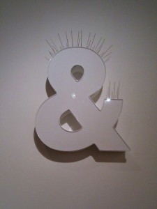
Shaddock has the distinction in this exhibit of making work about what it means to be in a group show. Hence his pieces are entitled Alone Together/Together Alone, Everything Else, and and, per se.
They are all typographically expressed jokes that reverberate beyond the obvious current circumstances. My favorite is Everything Else, a pair of inverted parentheses, belly to belly, typed on a sad sheet of 8.5 x 11 inch paper. That the parens are belly to belly means they are the antithesis of normal parentheses, embracing not what is in the space between them but rather embracing everything else–anti-parentheses, in other words. Why, I asked myself, did he frame his little parentheses on a full 8.5 x 11 inch sheet in an plain brown wood frame? Were they typed via a manual typewriter? or printed via computer? I wondered about the themes of authenticity and history. If language and its symbols are shifty, where am I to perch my notions of the truth? (Surely not on his giant ampersand entitled and, per se, which is protected by pigeon spikes).
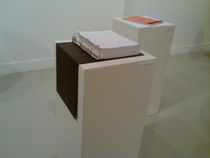
Leclercq drew with colored pencil the perfect blue lines and red margin lines for 500 pages of looseleaf paper, with which he filled a binder. Should I believe it’s truly 500? In another looseleaf paper project, all the pages are an illusion because they are part of one large sheet which he splayed on the wall–along with colored binders. Thanks to the splendid orange cover, I found myself drawn to his facsimile Rhodia tablet, in which he drew the graph lines on each sheet at 1/4 inch, rather than at the original metric measure. Even with the metric/English measure joke, the result is perfect for Ripley’s Believe It or Not. The main relief from these handmade versions of manufactured products is embodied in his Indecision Process, which subverts graph-paper-grid tyranny, creating blind alleys and tangles of lines–not a facsimile but a rebellion against his own m.o.

Brent Wahl, contributed two pieces, both filled with the sadness of loss. His photos of trash are arrayed as specimens on a table top. The bits were recovered from his garden and meticulously cleaned with Q-tips. The resulting oddly shaped bits and piece, photographed against black backgrounds in hand-ordered arrays, reveal luminous colors and pleasing compositions, the colors especially welcome in a show that is mostly black and white. I should mention that Wahl’s father is a scientist and the artist comes by his specimen table approach honestly, as both a salute to and commentary on the science vs. art divide.
At this point I suppose I could wax on about a future time’s artifacts from a past so wealthy and wasteful when trash wasn’t cash. Or I could focus on process and write about integrity in the hand vs. Photoshop approach to making arrangements. But these discussions seem to overwhelm what I’m looking at. The work evokes work (I had previously seen at Arcadia) by Anne Skoogfors, of flowers scanned against a black background. Where have all the flowers gone?

Only Dechemia’s plaster, ink and paper piece lets loose with grand gesture and material, physical drama. The trapezoidal Reflecting Pool on the floor, which was poured in the gallery, plays with perspective–the view from the end closest to the phallic Washington Monument. At the far end, we get to see not so much the Lincoln Memorial but an impression of whiteness, maybe even a window, on which Marilyn Monroe’s face, eyes downcast, offers the Eternal Feminine counterpoise.
Her face takes a bit of work to discern, but like Jesus on a Pop Tart, once you see it, you see it.
I learned at last week’s artists’ talk that the Monroe image is of the star not posing, not performing, but sitting on a chaise longue, reading James Joyce’s Ulysses!
Which brings me back to how I started. Here is a show I greatly admired, a show that challenged more than it entertained. But a lot of the work is tight and drier than Alice’s crumpet. Yet the conversation between the works is worth teasing out. But for me the big reward for all my hard work was reflecting on the mystical black waters of the trapezoidal Blue Pool, which points toward beauty on the other side.
The show is up at Arcadia to April 22.


