Light speaks. And its voice is perhaps never as strong and clear as in the City of Light. La Maison Rouge, the exquisite art space and foundation in the Bastille quarter of Paris, is proving it with Neon, Who’s afraid of red, yellow and blue? Curated by David Rosenberg, this illuminated carnival of flashing and glowing colored light is the first and perhaps largest exhibition of illuminated tubular art works. And it’s noisy, too, with the low persistent electric buzz flowing through the show – think: Flashing Tiki Lounge martini sign after midnight on the Vegas strip.
Over 80 artists were brought together for Neon and their sometimes tautological, sometimes scatological and sometimes geometrical objects span the history of the genre and establish light works as a serious staple of conceptual art. The subtitle of the exhibition takes its name and sensibility from minimalist/abstract expressionist painter Barnett Newman’s famous work of the same name : a “zip” canvas from 1966 combining a bright, fat band of red edged with thin strips of blue and yellow. The painting blares out at you with its pure color, its title referring to itself. The exhibition is almost a thesis on that painting.
Neon is a Gas
Neon is an extremely rare gas on Earth, but very popular throughout the universe. William Ramsey and M.W. Travers first discovered Neon, (Ne), a gas in England in 1898, naming it after neos – Greek for “new.” (1) A quarter century later, the French chemist George Claude trapped it inside a glass tube, ran electricity through it, and patented the thing. Visitors to the 1923 Universal Exposition in Paris marveled at the bright, pure colors Claude’s invention was able to produce. America followed suit. Claude sold Packard (cars) two glowing signs, bent into the shape of their logo. Before you knew it, the expressive capabilities of neon were everywhere, selling us everything from cars to bars to beer.
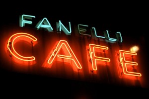
Indeed, our main streets and busy town centers now sparkle with neon invitations. And there’s an entreating magic to the glowing color: Places are open for coffee, wings, subs, burgers, cocktails, girls, guns – you name it. Sin City, no? But we love it, and neon makes us love it more. One of my favorite New York cafés is Fanelli on Prince and Mercer. Seeing its neon sign from down the street makes me feel at home again. I love those yellow and blue signs that blink OPEN. I love the epilepsy-inducing green crosses on French pharmacies, like the one outside my window in Paris. “I’ll help heal you,” it says, “and while I’m up, here’s the time and temperature, too.”
Electric light is everywhere in today’s world. So much so that it’s easy to forget how affecting it can be. Delightful is an apt pun.
Perhaps stating the obvious is worthwhile here: Neon works approach the essence of art in a way that much of 20th Century painting and sculpture does not: Light signs and their texts are often tautological, at least in the sense that they state what they are – signs. Painting and sculpture (notably the minimalist, self-referential works –Frank Stella’s shaped canvases, Agnes Martin’s lined works, Walter de Maria’s broken kilometer, Donald Judd’s painted boxes, or Dan Flavin) had to argue that the work was one and the same with its message: It is what it is. Their works, while cleanly-made geometric abstractions, were obscure. They seemed to be about logic; their attractiveness was inductive.
Flavin’s choice for light, however, altered that argument and found a passageway through the strict, almost mathematical ethos of minimalism to something a bit more hopeful. An artist like Flavin could use fluorescent light to lay out a similar minimalist vision of space; setting industrial office fixtures and colored tubes into geometrical grids, stacks and chevrons. But by adding luminescence into the mix, his work could produce pure spatial effects, and provide something that grazes the spiritual. Perhaps light does shine that sort of stuff on the world, metaphor and all.

When most of us think of neon, we think of words. And if you think hard about it, a Motel sign flashing VACANCY is a pretty interesting artwork in itself. Many of the artists at La Maison Rouge understand the power of such a well-lit statement.
The exhibition touches upon the pioneers in neon art – Moholy-Nagy in the 1930s and a decade later, Gyulia Kosice (Madl néon No. 3, 1946). But Conceptual artists like Keith Sonnier, Bruce Nauman and Joseph Kosuth and their aesthetic offspring provide the core of this show. These artists exploited the gas-filled tubes with poetic and visual texts and sculptural assemblages.
Les Mots
A friend of mine, the curator and critic Benjamin Evans, asks if the neon artists were simply trying to produce an interruptive media during a time when minimalism, then competing with Pop art, dominated the aesthetic landscape. “My problem with the idea of such an exhibition is less with the individual works than the curatorial claim – that such a survey of neon works might not be historically useful in mapping out aesthetic territory. Does having all this work re-contextualized in this way make it more or less interesting?” My take: An exhibition space like La Maison Rouge is perfect in its size and mission to explore and re-imagine these cul de sacs of art history and collections of all flavors. In a sense that is the exact sort of question the exhibition poses.
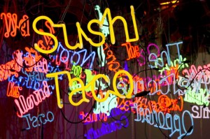
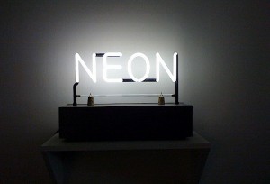
In many respects, Joseph Kosuth is the real papa of all these sign-to-art works. Much of mid-1960s art mirrored a shift in philosophical thinking, with signs and semiotics and irony swallowing all conversation. Words soon came to inhabit the art world by taking over rooms in installations (Lawrence Weiner, among others) and spotlight the plasticity of signs via language games. You can see it in Kosuth’s pioneering language-oriented works such as One in Three Chairs (1965), which reshaped the contemporary take on image and illusion – his use of light seems to be the correct level of lumens to dominate a room. Kosuth has nearly half a dozen works in this new exhibition. NEON (1965) greets visitors as they enter the main exhibition hall, and another 1965 work, FIVE FIVES (for Donald Judd) – with the numbers spelled out from one through 25 – sends them on their way out the door.

Eric Michel, a French artist who has long worked with light (using both neon and LEDs), suggests that such lexical and semantic aspects of the medium are extremely seductive. “My work with neon in La Lumière Parle is very much influenced by Joseph Kosuth,” he says. “La Lumière Parle is a sentence from my manifesto ‘Le Passeur’ (‘The Boatman’). I paid particular attention to the typography and the color – a special white reproducing the temperature of natural light.”
James Turrell, part of a group nicknamed the “light and space” artists, also uses neon to create “space that sees” – although he was not represented in this exhibition, nor was a Jenny Holzer piece snaking through the show, blinking out messages about our own emptiness. I guess there’s always Times Square for that.
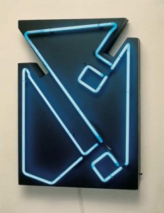
One of the things I found most interesting in this new exhibition was how neon and light can interpret subjects that artists working in paint, paper, wood, stone and metal constantly wrestle with. And it’s versatile, too. It can do abstraction. It can do minimalism. It can do cartoons, Like Laddie John Dill’s Contained Radiance (2011) – a kind of alien ‘force field’ that takes up an entire room – it can do geometrics. And it can also provide a different slant on other mediums. Lucio Fontana, the Italian artist famous for punctuating his canvases in the 1960s and 1970s with a knife, is represented here with Concetto Spaziala #6585 (1965). It looks like his other torn or dotted canvases, but brilliant neon lights up the empty spaces. A new paradigm.

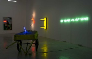
The exhibition is a enchanting in many ways, not just because neon is simply so cool, but because this stuff doesn’t always “look” like art. Jeff Koons’ Pot (1979) is simply a pot hanging in front of some fluorescent tubes. Jason Rhoades’ monumental Untitled (2004) is a bazaar of lighted words, hanging in bunches as if they were fruits or salamis. Bruce Nauman’s RAW/WAR (1970) is a hay wagon with a neon needle stuck in its quarry. Above it, RAW and WAR flash mindlessly. Kendel Geers follows suit with TERROR (2003), a likely comment on 9/11 and the subsequent invasion of Iraq. The text’s buzzy ‘T’ blinks on and off, suddenly spelling ERROR.
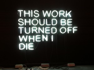
And as if to make the point clear about tripping the light fantastic, Stefan Brüggemann’s THIS WORK SHOULD BE TURNED OFF WHEN I DIE (2010) looks pretty good on or off. A one-sentence take on death, it’s sad, egoistic and impossible to ignore. So, (in a nod to Motel 6 spokesman Tom Bodett), Stefan, we’ll leave the light on for you. Until, of course, we close up and don’t.
The Maison Rouge
Neon, Who’s afraid of red, yellow and blue?
17 February – 20 May 2012
Download the press kit/PDF, a mini-catalog.
See a short video with a good rock and roll track that apparently was made during the installation: by an Italian TV group ARTIBUNETV.
Another video with excellent images, in French is here by: galerietmusees.
(1) One can “capture” neon directly from super chilled, liquefied air (88,000 pounds of it for one pound of neon), by running the frozen gas at – 411 ºF (in liquid form) over charcoal. Neon is one of six noble gases (Helium, Neon, Argon, Krypton, Xenon and radioactive Radon), which when electrically charged emit bright colors. They are rare on earth because they are so light, but Neon is abundant in the universe.


