From quirky lighting design to decoupage and conceptual installations, there is a healthy sampling to feast your eyes on at the Philadelphia Art Alliance this month in three solo exhibitions by Eva Wylie, Michael Fujita and Adam Wallacavage.
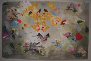
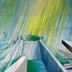
Eva Wylie approaches the art of decoupage with pop cultural sensibilities and an eye for both representational and abstract forms. Her pieces immediately seem like amorphous shapes, somewhat crowded spaces of mostly bright colors with faded backgrounds. The compositions, however, are not painted. They are individual cutouts of various recognizable forms applied to poster-sized paper or the wall itself. Among the silhouettes sampled by Wylie are combs, fern leaves, bows, flowers, and what appears to be the occasional ceiling fan.
The duplication of images is explored in a somewhat archaic process which hails from the 19th Century. In many ways the reproduction of images by way of silk screens and cutouts seems wildly at odds with contemporary image-making, which tends to emphasize photography, Photoshop, and other primarily digital media. Because Wylie lifts her images from sources like magazines and the internet, she bridges a gap that Victorian artists could never have envisioned. The end result is ornamentation that is piecemeal and physical, yet colorfully current.
A mix of environmental concern and structural intrigue exists in the next room, with the sculpture of Michael Fujita. A name like “Periphery” hints at exactly what one might expect from the constructions: They are assembled from materials that many would overlook or even dispose of. Fujita uses glass swept from sidewalks and salvaged wood scraps in ways that utterly transform them.
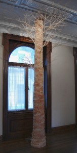
Fujita’s sculpture “Tree” is built of leftover wood scraps from many different trees. It is very much the e pluribus unum of trees. The sculpture is both a splendid use of the material and a darkly humorous end to what amounts to an entire grove. While the recycled materials are put to better use than being thrown into a garbage bin or campfire, it is still a bizarre demise for the many trees that compose this representation of their former selves.
Fujita at once points out the excess and wastefulness of our daily lives, while simultaneously doing his part to utilize the substances that would otherwise wind up as waste. Mirroring the Frankenstein tree is the curtly-titled “Column,” whose height and trunk mimic the wooden work. Its neat, geometric beams produce a synthetic harmony which rivals the natural fractals of tree branches while also nodding to classical Greek architecture.
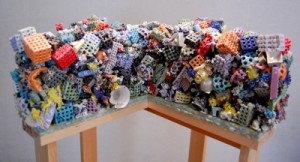
Some of the assemblages composed of broken bits of porcelain like “Mantle” or “Cross Section” are extremely visually complex up close. The forms look like something one would expect to see at microscopic levels, with strange lattices, holes, and knickknacks all melded together. Texturally these globules of shattered porcelain are amazing. They are sharp and rigid-looking, yet shiny and smooth, creating a real sensual dichotomy.
Upstairs, Adam Wallacavage lights the way with chandeliers, light fixtures, and mirrors which draw on surrealist and horror-inspired sources. These specimens actually reside in Wallacavage’s home, which he began custom decorating when he moved in a number of years ago. The mostly plaster or epoxy sculptures are extravagant and rococo, but also kitschy and eccentric. The elements which make up these lights include dragons, an actual mule deer skull, and a wide range of suckered tentacles. The works vary in size and height throughout the room, creating an ambiance that runs the gamut: bright and colorful, dark and soulful, but always full of wonder and curiosity. It’s hard not to examine these chandeliers like an amateur biologist observing a new specimen.
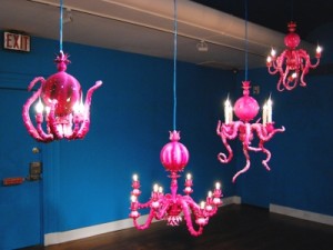
Some of the chandeliers look more like sea anemones than ceiling décor, but together they make for a bright and absurdist design tangent. Although outside of their natural habitat (a gallery instead of the artist’s home) they lack the dialogue with their environment, they are still impressive and creepy sculptures with an edge of grotesque humor.
All in all, each of these shows could stand alone conceptually and stylistically. Plan enough time to see all three.


